Evoke Adaptations


When an app is running on a device (a phone, a desktop, a tablet, etc.) the app knows how much physical screen space is available to it. In devices like phones this will be the entire screen size but on desktops and some tablets it could be a portion of the screen size.

The available screen size is measured in terms of width and height. Equally, each Adaptation is based on the width or the height of the available screen space being at or below a certain size. There are standard screen sizes and also standard screen resize points and Evoke offers these as dropdown options for each width or height option.
A full list and examples of use of each Adaptations available within Evoke is provided at the full list of Evoke Adaptations link.
At each adaptation point (width or height) segments and data can be automatically adapted, including things like:
-
Showing shorter column names or prompts when the screen size is smaller
-
Merging segments into tabs instead of side by side
-
Hiding segments or selected information altogether
-
Showing or hiding different navigation options for the user
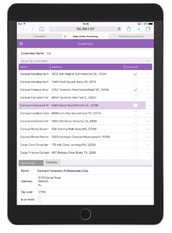
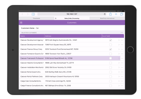
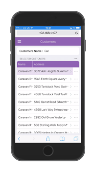
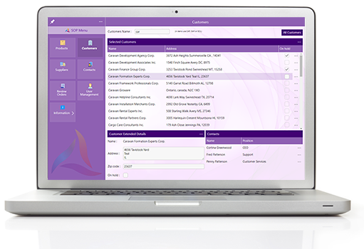
Here you can see how adaptations on the "Accounts" grid and on the tabs at the bottom of the page have adapted the screen to have new navigation options on the grid when the segments at the bottom have disappeared, after first being merged to tabs.
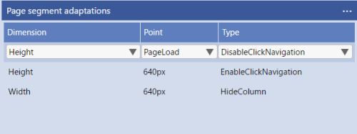
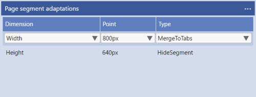
The adaptations set on the Grid (left) and Bottom segements (right) are: