User Interface Design
The UI design section of Evoke allows for the design of Pages that will be used in your App. It is structured by a WhatYouSeeIsWhatYouGet (WYSIWYG) image of the screen on the left and a series of tabs, on the right, that assist with the structuring of the page. The User help, available from the Evoke products, provides detailed reference information regarding the configurations options for Pages and an example of how to go about putting a new App Page together.
General
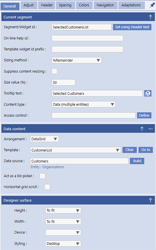
The General tab, within Pages, is structured into 3 sections. the first two provide configuration settings for the currently selected Segment and the Data Content of that Segment; the third section provides configuration settings for the currently displayed page design.
Adjust
The Adjust area is where you can add, remove or adjust segments.
Header
Segment headers are usually used to provide information about a data segment. Headers can have an ellipsis menu that allows for both navigation and access to the Evoke Click Actions.
Spacing
The spacing section, in the Pages area, is used to provide specific spacing settings for segments, data and other screen componets on the current Page design.
Colors
The colors section is used to define the colors for various segment components. If colors were set in a theme they can be redefined for each device type/device operating system for the specific page.

