It is an entry point for users to learn more details or navigate to a new location and as such is 'clickable' with full accesss to the Evoke Click actions system. Because cards are easy to use, they can also display content that contains different elements.
Where do you find CardView?
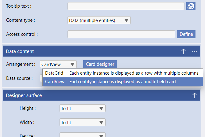
This will bring up a new button, a "card designer", that allows you to design and manage the UI and actions of the cards.
Please see below for a full explanation of configuring cards for a CardView.
General Settings
-
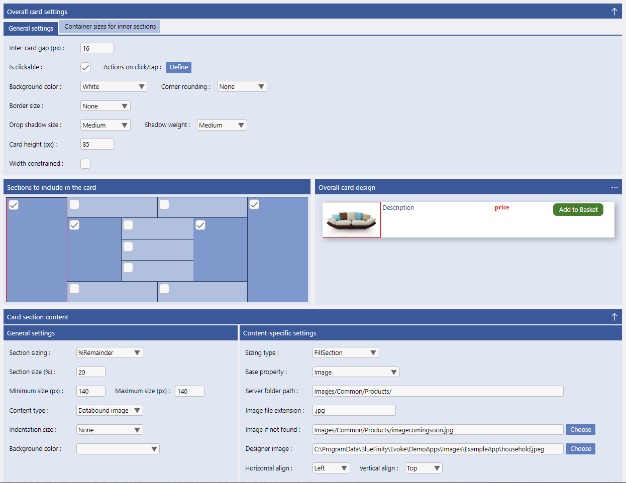
Inter-card gap - the space between the different segments of the card
-
Is clickable - indicate if the user can click the card to invoke specific Evoke "Click Actions"
-
Background Color - select the color to use for each cards background (default is white)
-
Corner Rounding - select the degree of corner rounding for each cards border (default is none)
-
Border size - select the size/width of each card's border (default is none)
-
Drop Shadow Size - Select, from the dropdown list, the size (if any is desired) of each card's outer drop shadow
-
Shadow Weight - Select, from the drodown list, the weight (light, medium, dark) of the drop shadow to be displayed
-
Card height (px) - set the fixed height of the card's height
-
Width constrained - a check boxe to indicate if the cards width is to be constrained (if not ticked it will expand to fit 100% of the width of the container/segment it is in
-
Max width - if the width checkbox is constrained then set the maximum width of the card in pixels
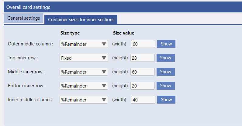
Container sizes for inner sections
-
Outer Middle Column - set, in pixels, the width of the large middle area (that contains 9 card blocks).
-
Top Inner Column - set, in pixels, the height of the top row of large middle area (the two card blocks at the top of the middle area).
-
Middle Inner Column - set, in pixels, the height of the large middle area of cards in the middle area (the five card blocks in the middle of the middle area).
-
Bottom Inner Column - set, in pixels, the height of the bottom row of large middle area (the two card blocks at the botton of the middle area).
-
Inner Middle Column - set, in pixels, the width of the small middle area (that contains 3 card blocks).
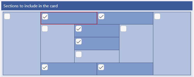
Sections to include in the card
Card Section Content
-
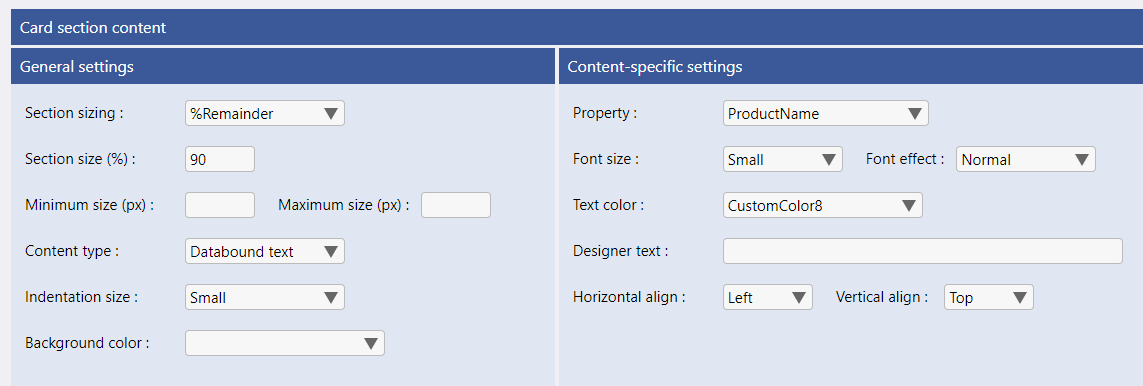
Section Sizing - Selection from the dropdown list to define if the section is to be 'Remainder' (%) or 'fixed' sizing. Fixed sizng is used more reguarly with cards than with Evoke segments and is often used where you would have previously used 'auto' in a page segment. Remainder sizing requires the remainder percentage to be set in the option below.
-
Section size (%) or (px) - set the actual or percentage size of the section depending on if you are using fixed or remainder sizing. If you are having two card sections side by size then this will be the remainder % amount of the area to take up for this card section. If you are using fixed sizing then it is the pixel value of the size.
-
Minimum and Maximum size (px) - the minimum and maximum sizes for the segment. Only used with remainder sections (fixed size sections are fixed to a specific number of pixels). These sizes control the variable size of a section in relation to another card section in the same row.
-
Content Type - select from the dropdown list the type of content for this specific section of the card. The options are:
-
Databound text - this card section contains a single textual value from a property value of the associated entity. for example a price, description, name, etc
-
Databound text x2 - this card section contains two textual values from two properties of the associated entity.
-
Static text - A manually entered static textual value e.g. a heading, legend, etc.
-
Databound image - An image whose name is derived (retrieved) from a property in the associated entity.
-
Static image - An image whose name is manually entered (fixed) in the designer during the app design e.g. a fixed image from your image library on your computer.
-
Static image - An image whose name is manually entered (fixed) in the designer during the app design e.g. a fixed image from your image library on your computer.
-
Button - An Evoke button widget.
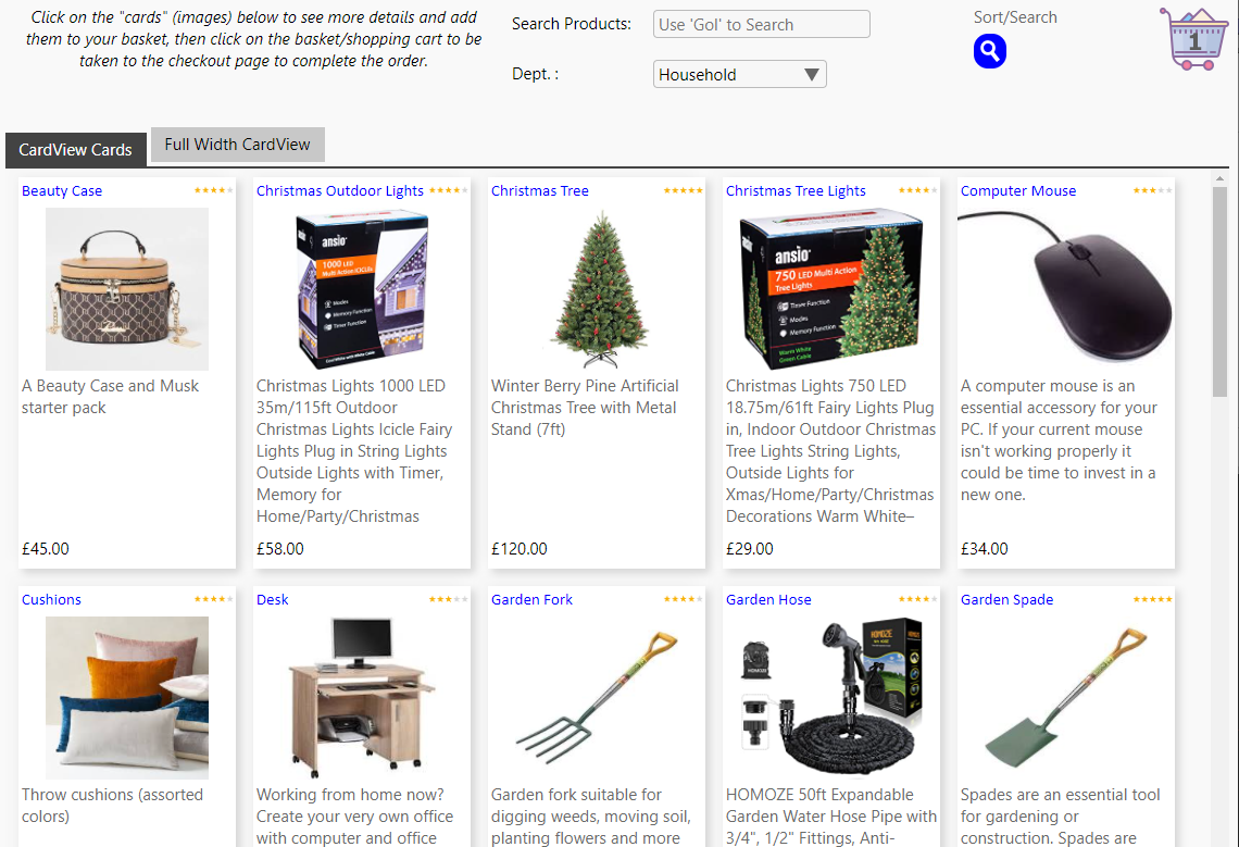
Each different content type will slightly alter the remaining options that need to be configuired in the rest of this section. The image opposite shows an example card and the definition of the middle 'image' section of the card. This example is taken from the Shopping area of the Example app and the app design for this can be fiound in your Evoke desginer account as an example.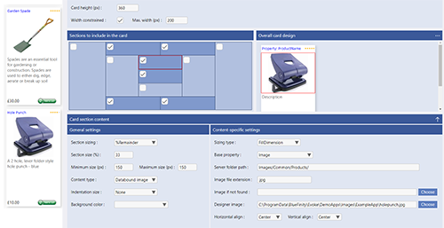
-
-
Indentation Type - Select from the drop down list the indentation size of the section (default is none). If you have text, a button or an image you can select a small, mediumsmall, medium, mediumlarge or large indentation from the sides of the section.
-
Background color - Select from the options available in your app design color pallettes the background color of the card section.
Content-specific settings
-
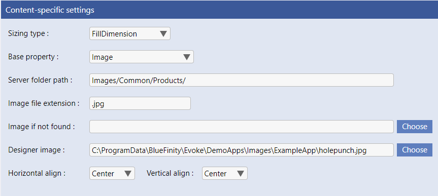
Image
-
Sizing Type - Select on of the 3 dropdown options:
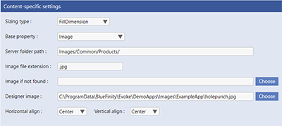
- FillSection - the image will be resized to ensure that all of the section surface is covered without altering the images natural proportions
- FillDimension - the image will be resized to ensure that the smallest dimension of the section is filled without altering the images natural proportions
- FillDimensionCircle - same as FillDimension but the image will also be clipped to display a circular/rounded image
-
Base Property - Which property (from the Entity (Datasource) associated with this CardView) holds the name of the image
-
Server Folder Path - The folder path (relative to the root 'web' folder) of where the image is stored e.g. Images/Common/Products/
-
Image File Extension - The file extension of the image e.g. .jpg or .png
-
Image not found - The folder path (relative to the root 'web' folder) and name of the image is to be displayed if the data-bound image (detailed above) does not exist e.g. Images/Common/Products/Imagedoesnotexist.png
-
Designer image - the location and name (in the local file system of the computer you are using to work on your app design) of the image to be displayed within the Evoke designer. It is important to have a visual reference of the "card" you are creating and so Evoke will represent the card in the Evoke designer but needs images, text etc defined to do this.
-
Horizontal and Vertical align - select how the image is positioned in the card section (left, center, right for horizontal and top, middle, bottom for vertical)
-
-
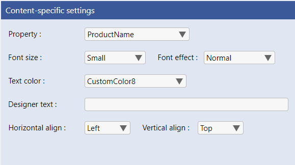
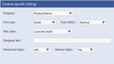
Databound Text
-
Property - Which property (from the Entity (Datasource) associated with this CardView) holds the text to display in this section
-
Font Size - Select the font size for the text you are displaying in this section from the dropdown options of: VerySmall, Small, Normal, Large, Very Large, ExtremelyLarge
-
Font Effect - if you would like a font effect, Select the font effect for the text you are displaying in this section from the dropdown options of: Normal, Bold, Italic, BoldItalic, StrikeThrough
-
Text color - Select the color of the text to be displayed in this section from the options available in your app design color pallettes.
-
Designer Text - dummy text to be displayed within the Evoke designer. It is important to have a visual reference of the "card" you are creating and so Evoke will represent the card in the Evoke designer but needs images, text etc defined to do this.
-
Horizontal and Vertical align - select how the text is positioned in the card section (left, center, right for horizontal and top, middle, bottom for vertical)
-
-
Button
-
Button Style -
select from the drop down list style of Button you would like. The options for this are:-
Text - the button contains a text only caption (default option if not filled in).
-
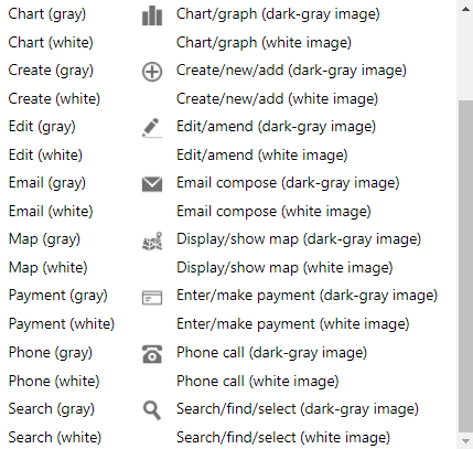
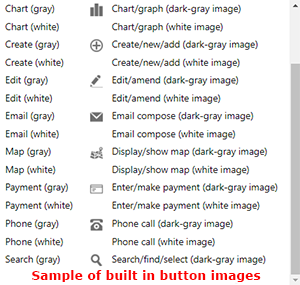
Image (library) - Button contains an image from a set of standard built-in images. Please see a sample of the built in button images below.
-
Image (custom) - Button contains a developer-supplied image (24px by 24px ideally)
-
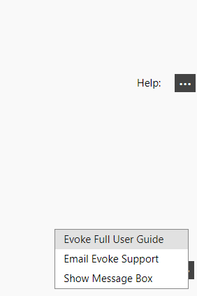
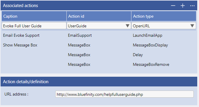
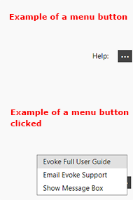
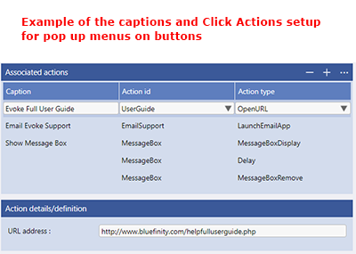
Pop-up menu - Button contains an ellipsis and when clicked displays a pop-up menu. Requires the menu to be set up in click actions (please see image below)
-
-
Caption Text - the Caption text to include within the button, if you have selected a text button.
-
Library image type - if you have selected an "image (library)" button select the Evoke button image to use.
-
Background Color - Select the color of the background of the button from the options available in your app design color pallettes.
-
Caption Color - Select the color of the caption text of the button from the options available in your app design color pallettes. If you are using a text button.
-
Border Style - Select the border style of the button from none, rectangular or rounded (rounded corner borders)
-
Border Color - Select the color of the border of the button from the options available in your app design color pallettes.
-
Border Rounding - select the border rounding size for your button i.e. how rounded do you want it
-
Actions on click/tap - define the actions (from the Evoke click action library) that you want to be actioned when the button is clicked.
-
Horizontal and Vertical align - select how the button is positioned in the card section (left, center, right for horizontal and top, middle, bottom for vertical)
-