Pages - Spacing
-
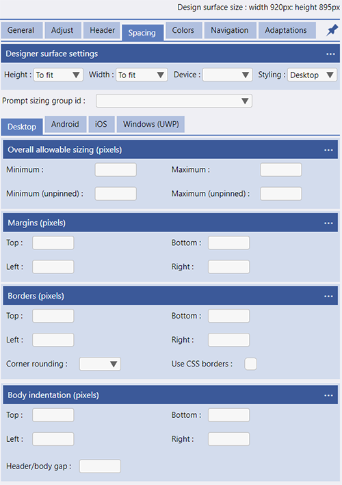
Designer Surface Settings
The designer surface settings allow you reset the WYSIWYG display area so that it displays based on a specific device (iphone, smartwatch, android tablet, desktop device, etc). Alternatively you can specifically set a screen size (using the Height and Width options) or change the styling to see how the difference device (operating system) cultures change the look and feel of your screen design.
These are the same settings that can be found in the General Tab at the top of this section. -
Data Segment Sizing SettingsIf the Cultural Styling Override checkboxes in the Apps section have nen checked then the app will be using the "desktop" settings for all devices and only the "Desktop" options will be available here. Otherwise, tabs are provided for desktop, Android, iOS and Windows (UWP) data segment areas that can be used to override, on the selected segment, any default theme sizing settings that may have been set App wide.The areas that can be defined/re-defined are:
-
Overall allowable sizing - opportunity to set the minimum and maximum size that a segment can occupy on the screen in pixels
-
Margins - set the Top, Bottom, Left and Right margins that are applied to the Segment (in pixels)
-
Borders - set the Top, Bottom, Left and Right border sizings that are applied to the Segment (in pixels)
-
Body indentation - set the Top, Bottom, Left and Right indentation of the Segment body that is applied to the Segment (in pixels)
-
Header/Body gap - set the gap between the header and the body of a segment
If you would like to put a border around a "transparent" segment then you will need to check the "Use CSS borders" checkbox. Borders generally work by setting a border color and setting a background color, however, if you would like the background transparent (e.g. to see an image, etc), then "Use CSS borders" allows for this. The background/border colour is still used but only for the CSS border.The "Corner rounding" drop down, see image left, allows you to set the amount of rounding to be set for the corners of a page segment on any device/operating system or each operating system.On the iOS, Android and Windows (UWP) tabs there is also an option to "Use Desktop sizing for iOS/Android/Windows (UWP)" which will automatically apply any sizing you have set in your Desktop sizing settings to iOS, Android and/or Windows (UWP) sizing settings. -
-
Prompt Sizing Group IDThe prompt sizing group ID provides for the standardisation of prompt lengths across multiple segments so that data areas in multiple segments appear on the same indentation throughout a page.
When a segment is selected you can either type a new Prompt Sizing Group name (any name you choose) into the Prompt sizing group ID field or if you have already typed a name in against another segment you can use the drop down list to pick from the IDs already set up on this page.
All segments with the same prompt sizing group ID, on the page, will have their prompt sizes set to the longest of the prompt sizes in the group.
Please see the example shown on the right which has all the segments displayed with a red border. Click the image for a larger version.


