Pages - UI Design Menu
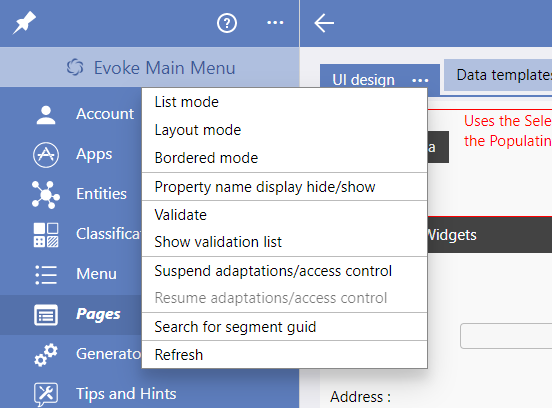
The drop down menu on the
UI design tab in the page designer provides multiple useful options when designing and editing
Pages/Screens. The menu contains the following options, click on the option for an explanation and examples of the menu option use:
Display options
The different display options within Evoke, namely List Mode, Layout Mode, Bordered Mode and WYSIWYG mode, change the "design" display mode of the Page/Screen that is being worked on in the Evoke designer section.
Each display mode will use as much screen space as is available to display a representation of the actual app screen that a user will see in edit/design mode.
-
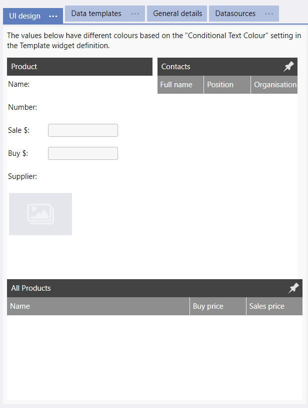
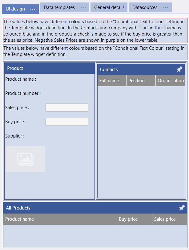
WYSIWYG Mode - What You See Is What You Get mode displays the Page just as the App user will see it. All adpatations run based on the displayable area on the screen and individual segments can be selected.
-
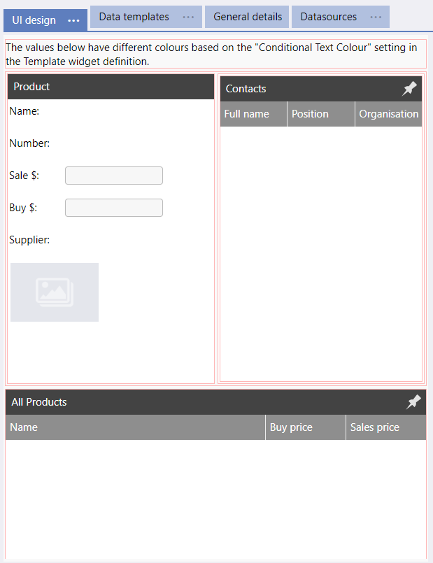
Bordered Mode - Displays the Page just as the App user will see it except all segments are bordered red (with the selected segment bordered bold red). All adpatations run based on the displaible area on the screen and individual segments can be selected.
-
Layout Mode - Each segment is displayed individually on the screen.
-
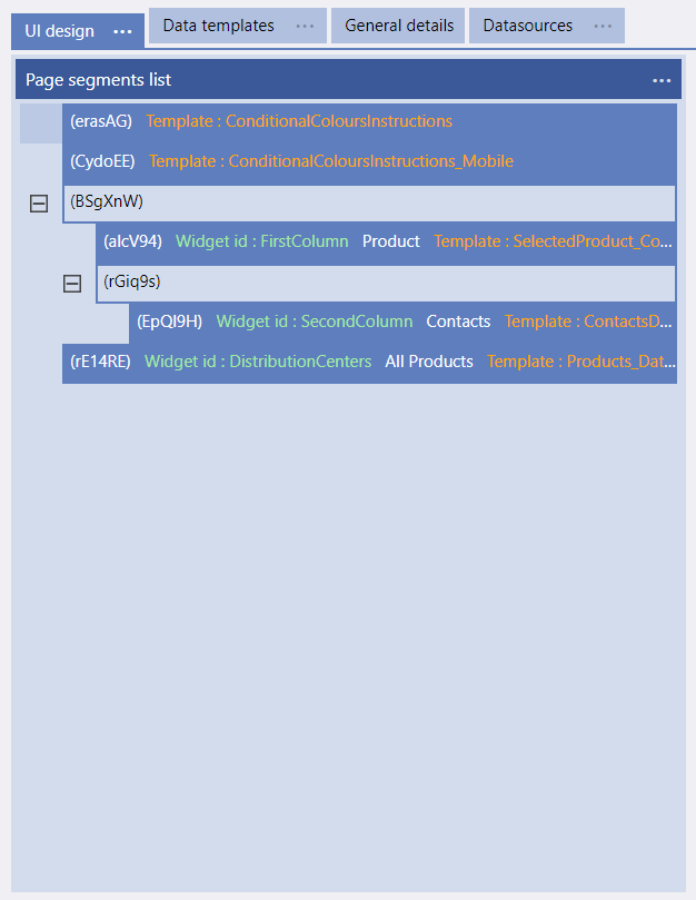
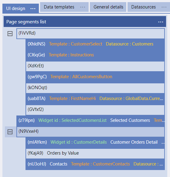
List Mode - Displays each segment, in its parent/child hierarchy, showing the Segment GUID (the unique identifier for a Segment), the Widget ID (Segment ID as entered), if it has a Template and Datasource associated with it those are also shown.
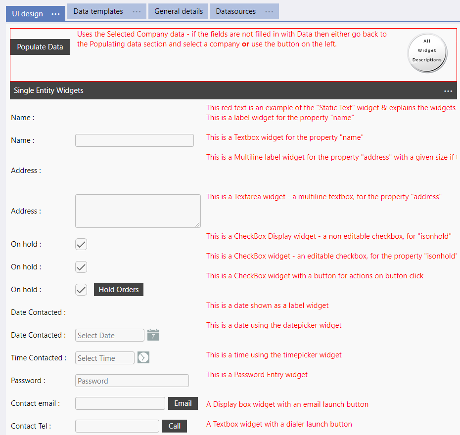
Examples of a Page/Screen displayed in each of the different display modes appear below.
Property Name Display hide/show
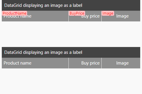
The UI Design menu option "Property Name Display hide/show" toggles the displaying/hiding of the actual "Entity" property name that is used in a Template against the Prompt of the Widget used in the screen design.
This can be very useful, particularly on complicated pages, to see the name of the actual Property in the Entitity as well as the "Prompt" name that you have given a field.
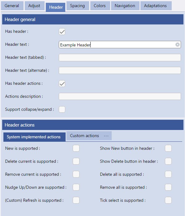
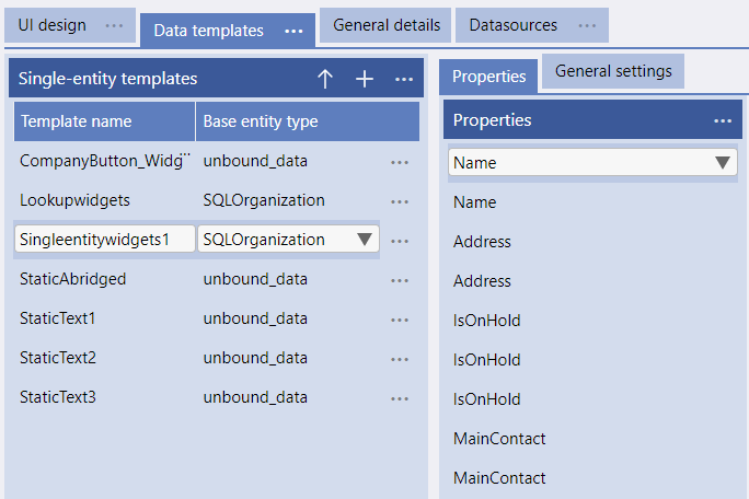
The example screen on the left shows the template used for the image on the right. The Property names, from the Entity definition, are used in the template and these are often different from the "prompts" given in the Template. It is these "property" names that can be toggled on and off.
The "Property Name Display hide/show" toggles the displaying/hiding of the actual "Entity" property name on multi Entity templates as well as single entity ones.
This means that you can see the Entity property name on tables and grids etc as well as data input and display templates for single records.
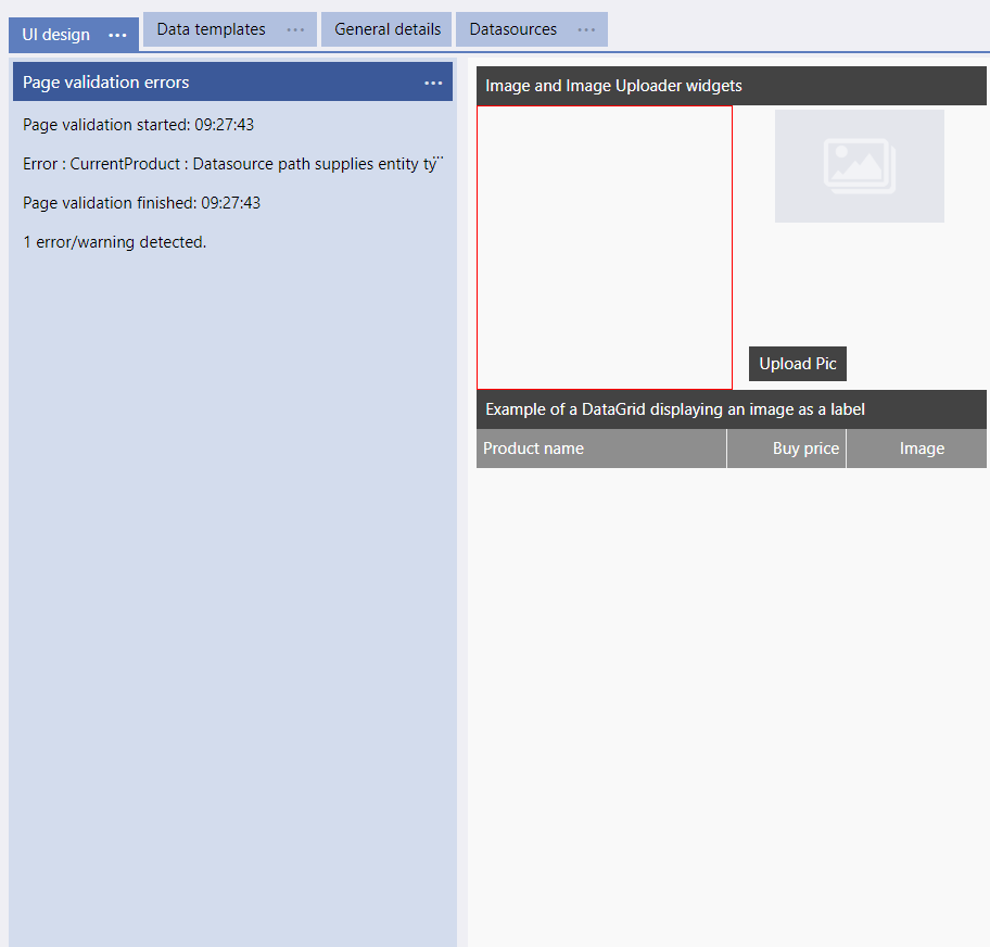
The menu option "Validate" runs an Evoke validation on the currently displayed page (screen).
It will advise of any errors that it finds on the Page, in the Templates, Datasources, etc. This avoids needing to wait until the app is generated to find the warnings/errors associated with this Page.
A panel, to the left of the page design is temporarily displayed showing any warnings or errors found.
The Menu option Show Validation list will re-display the panel and leave it visible. The Show Validation list menu option will change to Hide Validation list and the list will remain visible until this "hide" option is selected.
Validating a Page can be useful to app developers when unexpected errors occur or multiple errors are being triaged and resolved simultaneously.
Suspend/Resume Adaptations/access control
Adaptations are incredibly useful in creating apps that dynamically adapt based on the screen size
real estate available when the app is running.
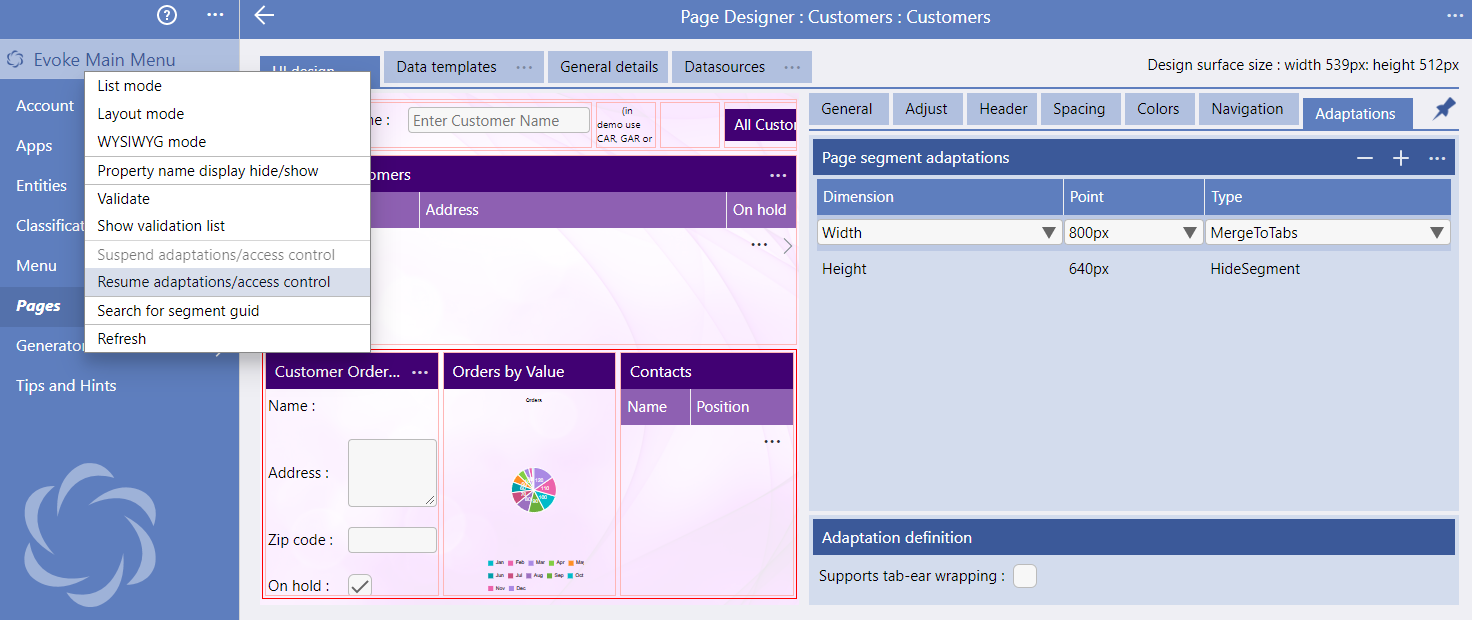
When working on a app design in WYSIWYG or Bordered display modes any adaptations that have been set up against segments on the page will be actioned based on the "display area" size of the page being displayed. Whilst this allows the developer to see, in real time, what the screen would look like to a user, it is sometimes useful to "suspend" (turn off) adaptations temporarily.
Suspend Adaptations/access control suspends any adaptations running on the page design and Resume Adaptations/access control restarts adaptations running on the page design.
Search for Segment GUID
When correcting warnings or errors on a Page (screen design) sometimes you need to identify (find) a specific Segment.
The image on the left shows the Page displayed in list mode, on this you can see that it displays each segment, in its parent/child hierarchy, showing the Segment GUID (the unique identifier for a Segment) and the Widget ID (Segment ID as entered)
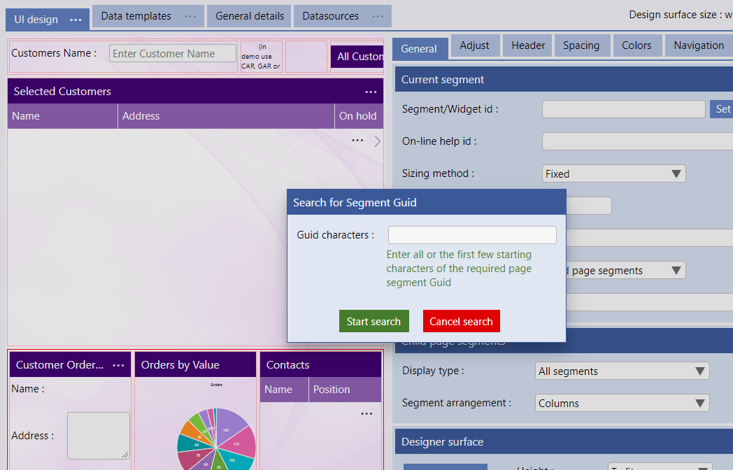
Search for Segment GUID allows you to enter all or the first few starting characters of a page Segment GUID that you are searching for on the Page (as identified in generation errors or warnings) and jump directly to that Segment, selecting it.
When you select "Search for Segment GUID" a small "pop up" will appear for you to enter the GUID or the first few characters. Search and cancel buttons will then allow you to either find and jump to the segment or cancel the search.
Refresh
The Refresh menu option simply refreshes the page (screen) design portion of the UI design display.
Occasionally this is required if multiple commands are performed and the design does not have time to "catch up"