Using Evoke Adaptations - Adapting to Different Screen Sizes
Adaptations automatically change the look, feel, actions and navigation route in an app based on the screen size of the device on which the app is running.
When an app is running on a device (a phone, a desktop, a tablet, etc.) the app knows how much physical screen space is available to it. In devices like phones this will be the entire screen size but on desktops and some tablets it could be a portion of the screen size.
The available screen size is measured in terms of width and height. Equally, each Adaptation is based on the width or the height of the available screen space being at or below a certain size. There are standard screen sizes and also standard screen resize points and Evoke offers these as dropdown options for each width or height option.
A full list and examples of use of each of the Adaptations available within Evoke is provided at the
full list of Evoke Adaptations link.
The following sections describe, in detail, the process of using different Evoke Adaptations. Where possible the following sections will use the Sales_Order_Processing and Example App designs, included in all Evoke accounts, as the examples. Please click on the link to see detailed explanations of using the specific adaptations and click on any image to see a larger version of the image:
General Adaptations for Data Grids and Tables
Adaptations are often used on datagrids or tables so that information can be displayed, on a desktop computer monitor, where there is lots of space and also on a phone or tablet, in a readable form, where there is limited space. The following Adaptation descriptions include many adaptations that you can use when displaying a multiple record data grid on a phone, tablet or simply a smaller laptop monitor. Some of those commonly used are:
-
Hiding Columns from the data grid when the screen width is below a certain size
-
Adding or removing additional Navigation to other Pages to see the data that is hidden on a small screen. This is done by displaying or hiding navigation menus on each data line or in the header menu.
-
Using alternate column headers that are shorter to fit the available space
It is also common for single data fields or records to be adapted on smaller screens. Significant use is made of merging multiple segments to tabbed headings only, using alternate prompts or captions, displaying prompts above data fields or converting fields that are displayed horizontally to be displayed vertically.
There are many Adaptations that can be used in Evoke to help screens of all designs work well on all devices. The Example demonstration app, available as a deployed app and an app design to all Evoke customers, provides a specific section demonstrating adaptations.
The MergeToTabs Adaptation is used to allow multiple horizontally aligned data segments to be accessible on a smaller width screen. Please see the example in the Simple Adaptations page from the Adaptations menu item shown in the Example app design, in the image on the right
You can have multiple data segments (or other segments e.g. image, button, etc.) and based on the screen size reduce the segments down to tabbed headers with the selected data segment being displayed (whichever tab header is clicked on).
It can be particularly useful to use this adaptation when the app screen is displayed for the first time (Page Load) meaning that the screen will be loaded with the data segments "tabbed" together regardless of the screen size.
As can be seen in the Adaptation configuration, below right, the segments that you wish to add an adaptation to
need to be selected and the "
Adaptations" tab selected in the Evoke Page designer.
There are three basic settings for each adaptation:
Dimension - select either width or height to identify if this adaptation is associated with the width or height of the screen being at or below a selected size boundary.
Point - select the size (in pixels) of the the width or height of the screen size (at or below) that you want the adaptation to run on. PageLoad means the adaptation is run regardless of screen size.
Type - select the name of the adaptation you wish to run, this is MergeToTabs, at or below a selected size boundary.
MergeToTabs does not have any additional information required to be added for the adaptation to run.
Each segment can have as many Adaptations set, on as many different point sizes as you wish.
Jump back to
top of page to access the list of adaptation examples again.
The ArrangeAsRows Adaptation is used to easily switch multiple horizontally aligned data segments from columns (within a parent segment) to rows, so that the segments can be seen vertically on a smaller width screen.
Please see the example in the Additional Adaptations page from the Adaptations menu item of the Example app design shown in the image on the right. This shows a first name and a surname separately side by side and then on a smaller screen shown one above the other.
As can be seen in the Adaptation configuration, below right, the segments that you wish to add an adaptation to need to be selected and the "Adaptations" tab selected in the Evoke Page designer.
There are three basic settings for each adaptation:
Dimension - select either width or height to identify if this adaptation is associated with the width or height of the screen being at or below a selected size boundary.
Point - select the size (in pixels) of the the width or height of the screen size (at or below) that you want the adaptation to run on. PageLoad means the adaptation is run regardless of screen size.
Type - select the name of the adaptation you wish to run, this is ArrangeAsRows, at or below a selected size boundary.
ArrangeAsRows does not have any additional information required to be added for the adaptation to run.
Each segment can have as many Adaptations set, on as many different point sizes as you wish.
As the columns are now in rows you may want to use the Adaptation
SetPromptSizingGroup to ensure that the Prompts spacing for these rows match.
The
Prompt Sizing Group provides standardization of Prompt lengths across multiple Segments (please see the image on the right) and SetPromptSizingGroup can "group" the rows to standardise the Prompt sizing of a group.
Jump back to
top of page to access the list of adaptation examples again.
Segment Hide and Segment Show
The HideSegment and ShowSegment Adaptations work together and are used to either hide or show a segment (containing a data grid/table, single data elements, images, buttons, etc) at different screen sizes.
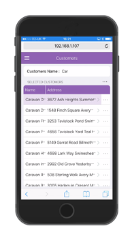
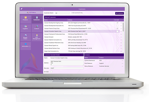
You may wish to hide a segment(s) on a smaller screen, please see the example of the Customer Extended Details and Contacts Segments on the Customers page of the Sales_Order_Processing demonstration app shown above. The parent segment of the two data segments has a HideSegment adaptation set on a height of 640px (see Adaptation configuration, below right). This hides the two segments on screens with a height less than 640px. The data grid segment above uses the EnableGridNavigation adaptation (at the same height) to add a menu that allows the user to navigate to two new screens to see data from these two segments on a small device.
You do not need to use the ShowSegment Adaptation to re-show the segments as HideSegment (and ShowSegment) works as a toggle, hiding at 640px or below and showing again above this screen size.
If you use HideSegment when a screen is first displayed (PageLoad) then the ShowSegment adaptation is useful to show the segment (or individual segments) when you wish.
As can be seen in the Adaptation configuration, below right, the segments that you wish to add an adaptation to need to be selected and the "Adaptations" tab selected in the Evoke Page designer.
There are three basic settings for each adaptation:
Dimension - select either width or height to identify if this adaptation is associated with the width or height of the screen being at or below a selected size boundary.
Point - select the size (in pixels) of the the width or height of the screen size (at or below) that you want the adaptation to run on. PageLoad means the adaptation is run regardless of screen size.
Type - select the name of the adaptation you wish to run, this is HideSegment, at or below a selected size boundary.
HideSegment and ShowSegment do not have any additional information required to be added for the adaptation to run.
Each segment can have as many Adaptations set, on as many different point sizes as you wish.
Jump back to
top of page to access the list of adaptation examples again.
Hide Header Actions Button
The HideHeaderActionButton Adaptation is used when you have set up a Header Actions Menu. Header Actions menus are set up in the header tab in the Evoke Page designer (please see image below right). The adaptation will hide the menu from the header bar when the screen size is at or below a selected pixel size threshold. Please see the example in the Additional Adaptations page from the Adaptations menu item of the Example app design shown in the image on the right.
The HideHeaderActionsButton adaptation is often used when screens have to be split in to multiple screens on smaller devices. Menus that are logical on a larger screen may no longer be relevant on a smaller screen.
As can be seen in the Adaptation configuration, below right, the segments that you wish to add an adaptation to need to be selected and the "
Adaptations" tab selected in the Evoke Page designer.
There are three basic settings for each adaptation:
Dimension - select either width or height to identify if this adaptation is associated with the width or height of the screen being at or below a selected size boundary.
Point - select the size (in pixels) of the the width or height of the screen size (at or below) that you want the adaptation to run on. PageLoad means the adaptation is run regardless of screen size.
Type - select the name of the adaptation you wish to run, this is HideHeaderActionsButton, at or below a selected size boundary.
HideHeaderActionsButton does not have any additional information required to be added for the adaptation to run.
Each segment can have as many Adaptations set, on as many different point sizes as you wish.
Jump back to
top of page to access the list of adaptation examples again.
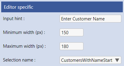
The HidePrompts Adaptation is used to simply hide any prompts that you have added in a data segment. This allows important data to be seen on a smaller screen. Please see the example in the Simple Adaptations page from the Adaptations menu item of the Example app design shown in the image on the right and the Customer screen in the Sales_Order_Processing demonstration app (see image below left)
When you remove prompts from a data entry screen it is recommended that you use the
input hint option in the Editor specific section of the template to display a description of what the user is the enter when there is no data present.
Hide Prompts is often used when an app screen is displayed on a watch or a phone screen when screen real estate is at a minimum.
As can be seen in the Adaptation configuration, below right, the segments that you wish to add an adaptation to
need to be selected and the "
Adaptations" tab selected in the Evoke Page designer.
There are three basic settings for each adaptation:
Dimension - select either width or height to identify if this adaptation is associated with the width or height of the screen being at or below a selected size boundary.
Point - select the size (in pixels) of the the width or height of the screen size (at or below) that you want the adaptation to run on. PageLoad means the adaptation is run regardless of screen size.
Type - select the name of the adaptation you wish to run, this is HidePrompts, at or below a selected size boundary.
HidePrompts does not have any additional information required to be added for the adaptation to run.
Each segment can have as many Adaptations set, on as many different point sizes as you wish.
Jump back to
top of page to access the list of adaptation examples again.
Display Prompts Above and Display Prompts Left
The DisplayPromptsAbove and DisplayPromptsLeft Adaptations work together and are used to either adjust the position of data field prompts to either display above or to the left (default) of the data field.
Please see the example of the Current Company Segment on the Simple Adaptations page of the Example demonstration app shown right. The segment has a DisplayPromptsAbove adaptation set on a width of 800px (see Adaptation configuration, below left). This adjusts the two prompts (Name and Type) to move from left of the input fields to above them when the screen size is less that 800px wide. The DisplayPromptsLeft adaptation adjusts the prompts to move to the left of the data field.
The default (starting position) of the prompts is set in the Template of the data segment in the General Settings tab of the template (please see image below right).
As can be seen in the Adaptation configuration, image left, the segments that you wish to add an adaptation to need to be selected and the "Adaptations" tab selected in the Evoke Page designer.
There are three basic settings for each adaptation:
Dimension - select either width or height to identify if this adaptation is associated with the width or height of the screen being at or below a selected size boundary.
Point - select the size (in pixels) of the the width or height of the screen size (at or below) that you want the adaptation to run on. PageLoad means the adaptation is run regardless of screen size.
Type - select the name of the adaptation you wish to run, this is DisplayPromptsAbove, at or below a selected size boundary.
DisplayPromptsAbove and DisplayPromptsLeft do not have any additional information required to be added for the adaptation to run.
Each segment can have as many Adaptations set, on as many different point sizes as you wish.
Jump back to
top of page to access the list of adaptation examples again.
Column Disable and Column Enable
The DisableColumn and EnableColumn Adaptations are used to disable or enable (when previously disabled) the editing capability of a column in a data grid/table at different screen sizes.
You may wish to disable a column(s) on a smaller screen, or enable a column that was previously disabled please see the example of the Product Name column in the datagrid/table on the Adaptations page of the Example demonstration app shown right. The datagrid/table segment in the Example app design has:
-
A DisableColumn adaptation set on PageLoad. This disables the Product Name column (the first column) when the screen is first displayed (PageLoad).
-
A DisableColumn adaptation set on a width of 800px (see Adaptation configuration, below right). This disables the Product Name column (the first column) on screens with a width of less than 800px.
You do not need to re-enable the column(s) after a DisableColumn at a certain screen size as DisableColumn adaptations work as a toggles, disabling at, in this case, 800px or below and enabling again above this screen size. However, you may want to enable a column at a certain screen size if DisableColumn is used at PageLoad.
It is recommended that you use the SuspendAdaptations option in the UI Design Tab header ellipsys menu to see all the columns while setting up or managing these adaptations.
As can be seen in the Adaptation configuration, below right, the segments that you wish to add an adaptation to need to be selected and the "Adaptations" tab selected in the Evoke Page designer.
There are three basic settings for each adaptation:
Dimension - select either width or height to identify if this adaptation is associated with the width or height of the screen being at or below a selected size boundary.
Point - select the size (in pixels) of the the width or height of the screen size (at or below) that you want the adaptation to run on. PageLoad means the adaptation is run regardless of screen size.
Type - select the name of the adaptation you wish to run, this is either DisableColumn or EnableColumn, at or below a selected size boundary.
DisableColumn and EnableColumn do have additional information required to be added for the adaptation to run. The Column numbers that you want to enable or disable must be included. Columns are numbered left to right and start with column number 1. A list of columns can be included by space separating the list of column numbers.
Each segment can have as many Adaptations set, on as many different point sizes as you wish.
Jump back to
top of page to access the list of adaptation examples again.
Column Hide and Column Show
The HideColumn and ShowColumn Adaptations work together and are used to either hide or show a column in a data grid/table at different screen sizes.
You may wish to hide a column(s) on a smaller screen, please see the example of the on hold columns in the Selected Customers datagrid/table on the Customers page of the Sales_Order_Processing demonstration app shown right and the product number and buy price columns in the Example demonstration app (image below left). The datagrid/table segment in the Example app design has:
-
A HideColumn number 3 adaptation set on PageLoad (see Adaptation configuration, below right). This hides the Buy Price Column (the third column) when the screen is first displayed (PageLoad).
-
A HideColumn number 2 adaptation set on a width of 800px (see Adaptation configuration, below right). This hides the Product Number column (the second column) on screens with a width of less than 800px.
-
A ShowColumn number 3 adaptation set on a width of 800px (see Adaptation configuration, below right). This shows the Buy Price column (the third column) that was previously hidden on screen/Page load on screens with a width less than 800px.
You do not need to use the ShowColumn Adaptation to re-show the columns as
HideColumn and
ShowColumn adaptations work as a toggles, hiding at, in this case, 800px or below and showing again above this screen size.
It is recommended that you use the SuspendAdaptations option in the UI Design Tab header ellipsys menu to see all the columns while setting up or managing these adaptations.
As can be seen in the Adaptation configuration, below right, the segments that you wish to add an adaptation to need to be selected and the "Adaptations" tab selected in the Evoke Page designer.
There are three basic settings for each adaptation:
Dimension - select either width or height to identify if this adaptation is associated with the width or height of the screen being at or below a selected size boundary.
Point - select the size (in pixels) of the the width or height of the screen size (at or below) that you want the adaptation to run on. PageLoad means the adaptation is run regardless of screen size.
Type - select the name of the adaptation you wish to run, this is HideColumn, at or below a selected size boundary.
Hidecolumn and ShowColumn do have additional information required to be added for the adaptation to run. The Column numbers that you want to show or hide must be included. Columns are numbered left to right and start with column number 1. A list of columns can be included by space separating the list of column numbers.
Each segment can have as many Adaptations set, on as many different point sizes as you wish.
Jump back to
top of page to access the list of adaptation examples again.
The SetMaxWidth Adaptation is used to limit the width of a Segment regardless of how much screen real estate there is and regardless of its other sizing settings. This allows important other data to be seen on a smaller screen. Please see the example in the Additional Adaptations page from the Adaptations menu item of the Example app design shown in the image on the right
As can be seen in the Adaptation configuration, below left, the segments that you wish to add an adaptation to
need to be selected and the "Adaptations" tab selected in the Evoke Page designer.
There are three basic settings for each adaptation:
Dimension - select either width or height to identify if this adaptation is associated with the width or height of the screen being at or below a selected size boundary.
Point - select the size (in pixels) of the the width or height of the screen size (at or below) that you want the adaptation to run on. PageLoad means the adaptation is run regardless of screen size.
Type - select the name of the adaptation you wish to run, this is SetMaxWidth, at or below a selected size boundary.
SetMaxWidth does have additional information required to be added for the adaptation to run. The Maximum Width of the Segment must be included. This Segment size is entered in pixels.
Each segment can have as many Adaptations set, on as many different point sizes as you wish.
Jump back to
top of page to access the list of adaptation examples again.
The SetMaxHeight Adaptation is used to limit the height of a Segment regardless of how much screen real estate there is and regardless of its other sizing settings. This Adaptation is used to allow control, on certain screen sizes, of how much height is allocated to a Segment so that other important data may be seen on a smaller screen. Please see the example in the DataGrid Adaptations page from the Adaptations menu item of the Example app design shown in the image on the right
As can be seen in the Adaptation configuration, below left, the segments that you wish to add an adaptation to
need to be selected and the "Adaptations" tab selected in the Evoke Page designer.
There are three basic settings for each adaptation:
Dimension - select either width or height to identify if this adaptation is associated with the width or height of the screen being at or below a selected size boundary.
Point - select the size (in pixels) of the the width or height of the screen size (at or below) that you want the adaptation to run on. PageLoad means the adaptation is run regardless of screen size.
Type - select the name of the adaptation you wish to run, this is SetMaxHeight, at or below a selected size boundary.
SetMaxHeight does have additional information required to be added for the adaptation to run. The Maximum Height of the Segment must be included. This Segment size is entered in pixels.
Each segment can have as many Adaptations set, on as many different point sizes as you wish.
Jump back to
top of page to access the list of adaptation examples again.
Disable Click Navigation and Enable Click Navigation
The DisableClickNavigation and EnableClickNavigation Adaptations work together and are used to either hide or show a click navigation menu on a Datagrid/Table at different screen sizes.
As screen sizes reduce it is possible that no matter what other adaptations you apply (merge to tabs, hide columns, alternate prompts, etc) there may simply be not enough screen real estate to display the information that you need to make available to a user.
A good example of this is the Customers page of the Sales_Order_Processing demonstration app shown on the right. The Customers Extended Details and Contacts Segments at the bottom of the screen are adapted to Tabs (using MergetoTabs) when the width of the screen gets smaller but there simply is not room for these segments when the screen height is below 640px. Therefore at that height the parent segment of the Customers Extended Details and Contacts data segments has a HideSegment adaptation set at a height of 640px.
The Datagrid/Table segment above uses the DisableGridNavigation (on PageLoad) and EnableGridNavigation adaptations (at the same height that the bottom Segments are hidden - 640px) to add a menu that allows the user to navigate to two new screens to see data from these two segments on a small device.
You do not need to use the DisableGridNavigation Adaptation to re-hide the segments as the adaptations work as a toggle, showing the Click Navigation menu at 640px or below and hiding it again above this screen size.
As can be seen in the Adaptation configuration, image left, the segments that you wish to add an adaptation to need to be selected and the "Adaptations" tab selected in the Evoke Page designer.
There are three basic settings for each adaptation:
Dimension - select either width or height to identify if this adaptation is associated with the width or height of the screen being at or below a selected size boundary.
Point - select the size (in pixels) of the the width or height of the screen size (at or below) that you want the adaptation to run on. PageLoad means the adaptation is run regardless of screen size.
Type - select the name of the adaptation you wish to run, this is
DisableClickNavigation, at or below a selected size boundary.
DisableClickNavigation and EnableClickNavigation do not need any additional information in the adaptation definition, however, they do need the Grid row drill-down (child) page navigation set in the Navigation tab (please see image showing this on the right).
This defines the menu captions and which destination page to navigate to (as a child page) when the menu item is clicked or tapped/touched.
The new menu will be displayed as a ">" at the end of each grid row or just before the "..." grid row action ellipsis menu.
Each segment can have as many Adaptations set, on as many different point sizes as you wish.
Jump back to
top of page to access the list of adaptation examples again.
Captions are the words in buttons that you include within your app design. The ShowAlternateCaptions Adaptation is used to change these words to alternate ones, that you define, at different screen sizes.
You may wish to use alternate captions in buttons to abbreviate the words in a button on a smaller screen when screen space is tight. Please see the example of the button on the Customers page of the Sales_Order_Processing demonstration app and another button on the Additional Adaptations page of the Example demonstration app shown right.
The segment containing the button, in the Example app design, has a ShowAlternateCaptions adaptation set to run at a width of 800px (see Adaptation configuration, below left). The segment containing the button in the Sales_Order_Processing app design also has a ShowAlternateCaptions adaptation set to run at a width of 800px
This switches the button words (captions) "All Customers" to "All" and "Adaptations Descriptions" to "Adaptations List" at or below a screen size of 800px and back again above this screen size.
As can be seen in the Adaptation configuration, image left, the segments that you wish to add an adaptation to need to be selected and the "Adaptations" tab selected in the Evoke Page designer.
There are three basic settings for each adaptation:
Dimension - select either width or height to identify if this adaptation is associated with the width or height of the screen being at or below a selected size boundary.
Point - select the size (in pixels) of the the width or height of the screen size (at or below) that you want the adaptation to run on. PageLoad means the adaptation is run regardless of screen size.
Type - select the name of the adaptation you wish to run, this is ShowAlternateCaptions, at or below a selected size boundary.
ShowAlternateCaptions does not need any additional information in the adaptation definition, however, does need the Alternate Caption Text set in the Editor Specific section of the Template definition (please see image showing this on the right).
Please note that the Alternate Caption Text is separate and different to the Alternate Prompt Text, which can be seen above it in the image on the right. In the case of the button used in this example no "prompt" is required and therefore the prompt text has been changed to "_", although it is ok to just blank this field out, the "_" indicates that no space at all is allocated to a prompt, which can be useful in some app designs.
Each segment can have as many Adaptations set, on as many different point sizes as you wish.
Jump back to
top of page to access the list of adaptation examples again.
Headers are the area above each Segment and are usually used to provide information about a data segment and/or control actions to assist with navigation or management of a data grid. The ShowAlternateHeader Adaptation is used to change these words to alternate ones, that you define, at different screen sizes.
You may wish to use an alternate header to abbreviate the words in a header on a smaller screen. Please see the example of the header on the Datagrid Adaptations page of the Example demonstration app shown right.
The segment with the header has a ShowAlternateHeader adaptation set to run at a width of 800px (see Adaptation configuration, below left).
This switches the Header words to "And at below 800px this Alternate header shown !"
from the longer header "Adaptations - below 800px - product Number column hidden, Buy Price shown and navigation menu enabled" at or below a screen size of 800px and back again above this screen size.
As can be seen in the Adaptation configuration, image left, the segments that you wish to add an adaptation to need to be selected and the "Adaptations" tab selected in the Evoke Page designer.
There are three basic settings for each adaptation:
Dimension - select either width or height to identify if this adaptation is associated with the width or height of the screen being at or below a selected size boundary.
Point - select the size (in pixels) of the the width or height of the screen size (at or below) that you want the adaptation to run on. PageLoad means the adaptation is run regardless of screen size.
Type - select the name of the adaptation you wish to run, this is ShowAlternateHeader, at or below a selected size boundary.
ShowAlternateHeader does not need any additional information in the adaptation definition, however, does need the Header text (Alternate) set in the header tab (please see image showing this on the right).
Each segment can have as many Adaptations set, on as many different point sizes as you wish.
Jump back to
top of page to access the list of adaptation examples again.
Prompts are the words, that you include within your app design, that appear before any data entry field, data display field or other UI component that describe the information to be entered or the data that is displayed.
You may wish to use alternate prompts to abbreviate these words on a smaller screen when screen space is tight. Please see the example of the prompts on the Selected Product Page, reached from the Datagrid Adaptations page of the Example demonstration app shown right.
The segment containing the 5 data fields, in the Example app design, has a ShowAlternatePrompts adaptation set to run at a width of 480px (see Adaptation configuration, below left).
This switches the prompts (words before the data) to alternate prompts that you set up. For example "Product name" changes to "Name" and "Sales price" to "Sale $" at or below a screen size of 480px and back again above this screen size.
As can be seen in the Adaptation configuration, image left, the segments that you wish to add an adaptation to need to be selected and
the "
Adaptations" tab selected in the Evoke Page designer.
There are three basic settings for each adaptation:
Dimension - select either width or height to identify if this adaptation is associated with the width or height of the screen being at or below a selected size boundary.
Point - select the size (in pixels) of the the width or height of the screen size (at or below) that you want the adaptation to run on. PageLoad means the adaptation is run regardless of screen size.
Type - select the name of the adaptation you wish to run, this is ShowAlternatePrompts, at or below a selected size boundary.
ShowAlternatePrompts does not need any additional information in the adaptation definition, however, does need the
Alternate Prompt Text set in the Editor Specific section of the Template definition (please see image showing this on
the right).
It is possible that you may wish for the ShowAlternatePrompt adaptation to suppress the Prompt text completely on a smaller screen. In this case set the alternate prompt text to "_" (just the _ not the quotes), this indicates that no space at all is allocated to a prompt, which can be useful in some app designs.
Each segment can have as many Adaptations set, on as many different point sizes as you wish.
Jump back to
top of page to access the list of adaptation examples again.
Show Alternate Column Headers
Column Headers are the titles, that you include within your app design, that appear at the top of the columns in a datagrid/table.
You may wish to use alternate column headers to abbreviate these titles on a smaller screen when screen space is tight. Please see the example of the Column Headers on the Contacts Page of the Sales_Order_Processing demonstration app shown right.
The Datagrid/Table, in the Sales_Order_Processing app design, has a ShowAlternateColumnHeaders adaptation set to run at a width of 800px (see Adaptation configuration, below left).
This switches the Column Headers (titles) to alternate Column Headers that you have set up. For example "Contact name" changes to "Name" and "Telephone Number" to "Tel." at or below a screen size of 800px and back again above this screen size.
As can be seen in the Adaptation configuration, image left, the segments that you wish to add an adaptation to need to be selected and
the "
Adaptations" tab selected in the Evoke Page designer.
There are three basic settings for each adaptation:
Dimension - select either width or height to identify if this adaptation is associated with the width or height of the screen being at or below a selected size boundary.
Point - select the size (in pixels) of the the width or height of the screen size (at or below) that you want the adaptation to run on. PageLoad means the adaptation is run regardless of screen size.
Type - select the name of the adaptation you wish to run, this is
ShowAlternateColumnHeaders, at or below a selected size boundary.
ShowAlternateColumnHeaders does not need any additional information in the adaptation definition, however, does need the Alternate Header Text set in the Editor Specific section of the Template definition (please see image showing this on the right).
Each segment can have as many Adaptations set, on as many different point sizes as you wish.
Jump back to
top of page to access the list of adaptation examples again.
Clear Margin, Set Prompt Sizing Group, Move Segment as First Child, Set Remainder Size
The four adaptations, Clear Margin, Set Prompt Sizing Group, Move Segment as First Child, Set Remainder Size, are being explained here as a group as they are often used together. Although each can be used individually, describing them as a group will allow us to explain how they interact with each other.
For this example we will be using the the Additional Adaptations page of the Example demonstration app shown right. The bottom segment shows 6 data entry boxes side by size on a desktop monitor, 3 groups of two data entry boxes on a laptop computer monitor, 2 groups of 3 data entry boxes on a tablet (i.e. an ipad) and 1 column of 6 data entry boxes on a mobile phone.
This is a common scenario for apps designed to run on all devices. The data entry boxes in the example can be any Evoke Widget from data entry or data display through signature entry to image etc.
The Evoke app design screen for this page shows 6 segments nested (at different segment levels) within a parent segment (please see image below left). To help with viewing this screen in the design we suspended adaptations running
automatically in the design based on the available space for the design.
This allows us to work on all the segments individually without the adaptations running. We did this using the UI Design menu (please see image below right).
The exact structure of the segments in our example app design is:
There is an overall parent segment that has a header. Inside the parent segment there are two child segments (we will call these Child1 and Child2).
Child1 contains two further child segments (subchild1 and subchild2) and Child2 contains two individual child segments that contain "Date created" and "Account" respectively.
SubChild1 contains two individual segments that contain "FirstName" and "Surname" respectively and SubChild2 contains two individual child segments that contain "Email" and "Login name".
Without any adaptations this structure will always try to show the segments side by side horizontally across the screen. This is considered a traditional data entry screen scenario for a desktop monitor application but obviously not for a mobile app.
Arrange As Rows
The first adaptation that will be run on this group is on the 3 segments within the parent segment (i.e. on Child2, Subchild1 and SubChild2). The ArrangeAsRows adaptation is run when the screen size is at or below 1600px (below large desktop monitor = laptop monitor or smaller).
The ArrangeAsRows Adaptation will pivot the segments nested within these 3 segments so that they display as rows instead of columns. Please see the screenshot of the configuration of this adaptation on the left.
This will give us the "laptop" view of 3 columns of two rows. Further information on using the ArrangeAsRows adaptation is available in its own section on this help page and may be found
here.
Set Prompt Sizing Group
The second adaptation will also be run at 1600px. Now that the segments are in 3 columns of 2 rows it is important that the data entry/display boxes line up.
The SetPromptSizingGroup adaptation is run on the Last Name, Login Name and Account segments.
The
Prompt Sizing Group, which provides standardization of Prompt lengths across multiple Segments, has been set on the First Name, Email and Date Created Segments to be, respectively, FirstGroup, SecondGroup and ThirdGroup. Please see the image on the right.
The SetPromptSizingGroup Adaptation will "Group" rows and can set/reset their Prompt Sizing Group so that the Prompts in that group (column) all line up.
Please see the example screen on the right which shows the prompts aligned in the same
Prompt Sizing Group (bottom helf of the screen) and not using Prompt Sizing Groups (top half of the screen).
In addition to Dimension, Point and Type configurations (described in more detail below), the SetPromptSizingGroup Adaptation has two additional settings:
-
Group id (Shrinking)
-
Group id (Growing)
An Evoke app knows if the last screen size (if you are working on a desktop computer monitor and resizing the screen size) was bigger or smaller than it is now and will use either the "shrinking" or "growing" setting accordingly.
The Group id should contain the name of the Prompt Sizing Group you would like this segment to move into.
MoveSegmentAsFirstChild
The third set of adaptations will be run at 1280px accommodating small laptops and tablets. First, the ArrangeAsRows adaptation is applied to "Child1" (which contains the two subchild segments). This will put First Name, Last Name, Email and Login Name into a column of 4 rows.
However, we do not want a column of 4 rows and a column of 2 rows and so we will use the MoveSegmentAsFirstChild adaptation on the "Login Name" Segment (please see image left) to move that child segment out of the Segment that it shared with "Email" and into (as the first child) the segment that contains "Date Created" and "Account".
As the rows have once again been converted to columns we will also use the SetPromptSizingGroup adaptation (described above) to reset the Prompt sizing/spacing on the Login Name and Email to match the new groups that they are in.
In addition to Dimension, Point and Type configurations (described in more detail below), the MoveSegmentAsFirstChild Adaptation requires an additional setting of
Target Segment. This is the Segment/Widget ID (from the General tab of the Segment - see image right) of the Parent Segment you wish to move this segment into.
Please remember to review the Example demonstration app design, available in all Evoke accounts, and the deployed live at
Evoke Example App to see how the example used in this section was implemented in the design and when running with these adaptations.
SetRemainderSize
Still with the third set of adaptations at 1280px accommodating small laptops and tablets, we have now created two columns for 3 rows. However, the original segment sizing will no longer be appropriate for these segments. Originally, in the general tab of the Evoke App design (see image below right), the Segment sizes were set as follow:
-
Child1 (contains subchild1 and subchild2) - %Remainder - 66% (see image right)
-
subchild1 - %Remainder - 50% (50% of child1)
-
subchild2 - %Remainder - 50% (50% of child1)
-
Child2 - %Remainder - 33%
Now that we have only have two columns, we do not want the first column ("Child1") (that now only contains one column now not two) to take up 66% of the screen width and the second column to take up 33% ! So we will use the
SetRemainderSize adaptation to reset the Segment size of the first segment ("Child1") to be the same as Child2 i.e. 33%.
Evoke will work out that two segments of the same remainder size will equate to 50% each (it will
not leave the final 33% of the screen blank!).
The image on the left shows the SetRemainderSize adaptation being used to reset the size of the Child1 segment to 33%.
In addition to Dimension, Point and Type configurations (described in more detail below), the SetRemainderSize Adaptation requires an additional setting of %Remainder size. This should be set to whatever %remainder segment size you want.
Please also see the Example demonstration app design, available in all Evoke accounts, and the deployed live at
Evoke Example App to see how the example used in this section was implemented in the design and when running with these adaptations.
Clear Margin
The next set of adaptations will not be run until the screen size is at or below 640px in width. It is worth reminding at this point that ALL of the adaptations detailed above will also have run at this point as the screen size is below all their Point size definitions.
At this point the Parent segment will run the ArrangeAsRows adaptation (see above) and will pivot the segments nested within it. This will give us the "mobile phone" view of 1 column of six rows. Further information on using the ArrangeAsRows adaptation may be found
here.
Now we have 6 rows in a single column the margins that were included after the segments in SubChild1 and SubChild2, in order to seperate the segment contents when they were displayed in multiple side by side columns, will now just be blank areas at the end of each of these segments as they are arranged in rows.
On a mobile phone, where screen real estate is a precious commodity, it would not be appropriate to leave this blank and so we will use the adaptation ClearMargin to remove these margins.
Margins for a Segment are set in Spacing tab in the Evoke Page designer. The image below on the left shows where this segment has a "Right" margin of 20px.
However, you can clear any of the Top, Bottom, Right, Left margins using the
ClearMargin adaptation.
In addition to Dimension, Point and Type configurations (described in more detail below), the ClearMargin Adaptation requires an additional setting of Margin to Clear.
As segments can have margins to the right, left, top or bottom each of these settings is appropriate to indicate which margin you wish to clear.
The final set of adaptations, in this example, run at 480px and are the
ShowAlternatePrompts adaptation that reset the Prompts to their alternate (abbreviated) text for optimization of the screen real estate on a mobile phone.
Common Adaptation Settings
As can be seen in the Adaptation configuration, below right, the segments that you wish to add an adaptation to need to be selected and the "Adaptations" tab selected in the Evoke Page designer.
There are three basic settings for each adaptation:
Dimension - select either width or height to identify if this adaptation is associated with the width or height of the screen being at or below a selected size boundary.
Point - select the size (in pixels) of the the width or height of the screen size (at or below) that you want the adaptation to run on. PageLoad means the adaptation is run regardless of screen size.
Type - select the name of the adaptation you wish to run at or below a selected size boundary.
Jump back to
top of page to access the list of adaptation examples again.
Widget Hide and Widget Show
The WidgetHide and WidgetShow Adaptations work together and are used to either hide or show a Widget within a segment (i.e. single data field, images, etc) at different screen sizes.
You may wish to hide a Widget(s) on a smaller screen, please see the example of the Additional Adaptations page of the Example demonstration app shown right. The segment has a HideWidget adaptation set for the 'Date Created' field display Widget on Page Load, a ShowWidget adaptation set on the same field Widget at a width of 800px and a HideWidget adaptation set for the 'Culture' field display Widget at a screen width of 800px. (see Adaptation configuration, below left).
This switches out the 'Culture' data field display for the 'Date Created' data field display at 800px.
You do not need to use the WidgetShow Adaptation to re-show the segments hidden with WidgetHide as WidgetHide (and WidgetShow) works as a toggle, hiding at 800px or below (in this example) and showing again above this screen size.
If you use WidgetHide when a screen is first displayed (PageLoad) then the WidgetShow adaptation is useful to show the Widget when you wish.
As can be seen in the Adaptation configuration, below right, the segments that you wish to add an adaptation to need to be selected and the "Adaptations" tab selected in the Evoke Page designer.
There are three basic settings for each adaptation:
Dimension - select either width or height to identify if this adaptation is associated with the width or height of the screen being at or below a selected size boundary.
Point - select the size (in pixels) of the the width or height of the screen size (at or below) that you want the adaptation to run on. PageLoad means the adaptation is run regardless of screen size.
Type - select the name of the adaptation you wish to run, this is WidgetHide, at or below a selected size boundary.
WidgetHide and WidgetShow both need the identify the Widget that is to be shown or hidden by you entering the Widget ID in the adaptation definition. The Widget ID is in the Template, in the Widget Definition for each Property (please see image showing this on the right).
Each segment can have as many Adaptations set, on as many different point sizes as you wish.
Jump back to
top of page to access the list of adaptation examples again.
The WidgettoNewLine Adaptation works on specific widgets and forces a Widget that is being "flowed/stacked" horizontally to be displayed on a new line.
This Adaptation is for an individual Widget in a Template definition associated with the segment that the adaptation is configured on. If the Template is reused in the same Page Series you will need to use the "Template Widget ID Prefix" option in the Segment definition (General Details) in the Evoke app design (see Evoke app design of Example App for example) to give each Widget ID a unique prefix in each segment. This allows you to apply adaptations on a specific widget in a specific template in a specific segment.
As can be seen in the Adaptation configuration, on the left, the segments that you wish to add an adaptation to need to be selected and the "Adaptations" tab selected in the Evoke Page designer.
There are three basic settings for each adaptation:
Dimension - select either width or height to identify if this adaptation is associated with the width or height of the screen being at or below a selected size boundary.
Point - select the size (in pixels) of the the width or height of the screen size (at or below) that you want the adaptation to run on. PageLoad means the adaptation is run regardless of screen size.
Type - select the name of the adaptation you wish to run, this is WidgetToNewLine, at or below a selected size boundary.
WidgettoNewLine needs the identify the Widget that is to be shown or hidden by you entering the Widget ID in the adaptation definition. The Widget ID is in the Template, in the Widget Definition for each Property (please see image showing this on the right).
Each segment can have as many Adaptations set, on as many different point sizes as you wish.
Jump back to
top of page to access the list of adaptation examples again.
The WidgetPrompt Adaptation works on specific widgets and hides the 'prompt' of an individual Widget in a Template definition associated with the segment that the adaptation is configured on.
This Adaptation is for an individual Widget in a Template definition associated with the segment that the adaptation is configured on. If the Template is reused in the same Page Series you will need to use the "Template Widget ID Prefix" option in the Segment definition (General Details) in the Evoke app design (see Evoke app design of Example App for example) to give each Widget ID a unique prefix in each segment. This allows you to apply adaptations on a specific widget in a specific template in a specific segment.
As can be seen in the Adaptation configuration, on the left, the segments that you wish to add an adaptation to need to be selected and the "Adaptations" tab selected in the Evoke Page designer.
There are three basic settings for each adaptation:
Dimension - select either width or height to identify if this adaptation is associated with the width or height of the screen being at or below a selected size boundary.
Point - select the size (in pixels) of the the width or height of the screen size (at or below) that you want the adaptation to run on. PageLoad means the adaptation is run regardless of screen size.
Type - select the name of the adaptation you wish to run, this is WidgetPromptHide, at or below a selected size boundary.
WidgetpromptHide needs the identify the Widget that is to be shown or hidden by you entering the Widget ID in the adaptation definition. The Widget ID is in the Template, in the Widget Definition for each Property (please see image showing this on the right).
Each segment can have as many Adaptations set, on as many different point sizes as you wish.
Jump back to
top of page to access the list of adaptation examples again.
The UnpinSegment Adaptation is used to unpin a segment (i.e. table/datagrid, single data field, images, etc) at different screen sizes.
You may wish to "unpin" a Segment(s) on a smaller screen, please see the example of the Miscellaneous - Pinned/Unpinned page of the Example demonstration app shown right. The segment has a UnpinSegment adaptation set for the 'All Products' and 'Contact' segments at a width of 800px (see Adaptation configuration, below left).
A demonstration of the use of pinning and unpinning is available in the
Example App and also shown in the image on the right.
You do not need to use a Pin Segment Adaptation to re-pin the segments unpinned as UnpinSegment works as a toggle, hiding at 800px or below (in this example) and showing again above this screen size.
As can be seen in the Adaptation configuration, below right, the segments that you wish to add an adaptation to need to be selected and the "Adaptations" tab selected in the Evoke Page designer.
There are three basic settings for each adaptation:
Dimension - select either width or height to identify if this adaptation is associated with the width or height of the screen being at or below a selected size boundary.
Point - select the size (in pixels) of the the width or height of the screen size (at or below) that you want the adaptation to run on. PageLoad means the adaptation is run regardless of screen size.
Type - select the name of the adaptation you wish to run, this is UnpinSegment, at or below a selected size boundary.
UnpinSegment does not need any additional information in the adaptation definition
Each segment can have as many Adaptations set, on as many different point sizes as you wish.
Jump back to
top of page to access the list of adaptation examples again.
Accordion (Segment header adaptation)
The Accordion Adaptation may be found in the segment header tab in the Evoke page designer (please see image below left). An arrow is placed in the segment header of each segment the Evoke Accordion is set on. The Accordion function simply collapses the segment down to just its header or expands the segment (from the collapsed view) to be the full segment again.
This feature is useful for the user of your app to dynamically change screen real estate for each data segment to see what is important to them.
There are Evoke Click Actions (Expand Page Segment and Collapse Page Segment) that allow you to determine which segments should be collapsed when a screen is displayed for the first time or dependant on an action (e.g. button click) within the app.
As can be seen in the Header tab (in the Evoke Page designer) configuration, below left, the segments that you wish to add the Accordion function to
need to be selected and the "
Header" tab selected in the Evoke Page designer. The options are:
Support collapse/expand - adds the accordion function to the header and displays the expand/collapse arrow.
Whole Header Clickable - identifies if expand/collapse of the segment should take place only when the arrow is clicked (default) or if clicking any part of the segment header triggers the expand/collapse of the segment.
The Segment must have a segment id for the Accordion to run and a warning prompting you to add a segment id (in the General tab in page designer) will be displayed if one does not exist.
As standard, the Evoke Accordion gives full control to the user allowing each segment expand/collapse to be controlled individually.
However,
Traditional Accordion functions work by collapsing all other segments when one segment is expanded. This can be achieved using Evoke by:
-
Ensuring that all segments that you will "Accordion" are child segments within a single parent segment
-
Setting the "Display Type" of the parent segment to "Single Expanded" (see image right)
-
Using the "Actions on Page load", for the Page Series, to "Collapse" Segments that you do not want open when the page loads.
Jump back to
top of page to access the list of adaptation examples again.
Column Width Dynamic Adjustment (automatic)
Column Width Adjustments can be made by users on any datagrids/tables included in your app that do not have a fixed width set. App users frequently wish to make a specific column, in a datagrid/table, wider or narrower when using an app to view certain information specific to them.
Evoke includes dynamic adjustment of column widths (in tables/datagrids), by app users, as standard on all datagrids/tables included in your app.
The image on the right, taken from our Pipeline demonstration app, shows a lot of columns and a lot of information that does not all fit into the columns.
Clicking on (or touching on a mobile device or touch screen) the column header displays the control panel (shown left and on the image on the right) under the column header.
The options/functions in this control panel are:
-
X Close the column width control panel (control panel also closes automatically when you move over it and away.
-
<< Decrease the size of this column.
-
 Revert back to the original column size
-
>> Increase the size of this column.
The width of the columns in the second app screen shown on the right have been adjusted using this control panel.
You do not need to do anything, except ensure your table columns are not of a "fixed" size, for this functionality to be enabled in your app.
Jump back to
top of page to access the list of adaptation examples again.
This Adaptation Example is still to be completed
Examples of using this Adaptation will be in this location shortly
Jump back to
top of page to access the list of adaptation examples again.


