
Evoke Widgets
Widgets are the UI input/display/image control options that can be included within the App being built with Evoke. Used together with Templates, inside Segments, they are fundamental to the App functions. The following is a summary of the Widgets available within Evoke. Please also see the "Example" App design provided as part of Evoke accounts that provides examples of these Widgets.
click for Demo of use
Widget Description
Editor Types
Example edit type
click image
click image
A clickable button element. For a full example of the use of this widget in an app design please see here.
Button Style - the style of the button (text, Image (either library or custom) or pop-up menu
Button Caption text - text in the button
Alternate Caption Text - Button text used by adaptations
Minimum width (px) - minimum size of button regardless of screen size
Maximum width (px) - maximum size of button regardless of screen size
Actions on click/tap: when the button is clicked automatically action one of more of the Evoke Click Actions in order to excute Evoke library routines.

A checkbox widget for true/false values. For a full example of the use of this widget in an app design please see here.
No Editor Specific options
A checkbox and button compound widget. For a full example of the use of this widget in an app design please see here
Button Style - the style of the button (text, Image (either library or custom) or pop-up menu
Button Caption text - text in the button
Alternate Caption Text - Button text used by adaptations
Minimum width (px) - minimum size of button regardless of screen size
Maximum width (px) - maximum size of button regardless of screen size
Actions on click/tap: when the button is clicked automatically action one of more of the Evoke Click Actions in order to excute Evoke library routines.
Button Caption text - text in the button
Alternate Caption Text - Button text used by adaptations
Minimum width (px) - minimum size of button regardless of screen size
Maximum width (px) - maximum size of button regardless of screen size
Actions on click/tap: when the button is clicked automatically action one of more of the Evoke Click Actions in order to excute Evoke library routines.

A display only checkbox widget. For a full example of the use of this widget in an app design please see here
Compressed Height - removes spacing between labels to compress the height of several labels.

Custom
A custom implemented widget (creates all the Visual Studio hooks to hang the custom code on). Please see the Custom Code description help page.
No Editor Specific options.
A dropdown widget for capturing date values or on mobile devices a trigger to use the native datepicker e.g. a date scroll wheel on ios/Android or the calender style on Windows. For a full example of the use of this widget in an app design please see here.
Input Hint - text that appears in the textbox (greyed out) as a hint as to what should be input
Minimum width (px) - minimum size of the input field for the date regardless of screen size
Maximum width (px) - maximum size of the input field for the date regardless of screen size
Minimum width (px) - minimum size of the input field for the date regardless of screen size
Maximum width (px) - maximum size of the input field for the date regardless of screen size

A non-editable textbox and button compound widget. For a full example of the use of this widget in an app design please see here
Input Hint - text that appears in the textbox (greyed out) as a hint as to what should be input
Editor Size min (px) - minimum size of the Non-editable display text box
Editor Size max (px) - maximum size of the Non-editable display text box
Button Style - the style of the button (text, Image (either library or custom) or pop-up menu
Button Caption text - text in the button
Alternate Caption Text - Button text used by adaptations
Button tooltip text - the tooltip that is displayed when the button is hovered over
Actions on click/tap: when the button is clicked automatically action one of more of the Evoke Click Actions in order to excute Evoke library routines.

A non-editable textbox for displaying information. For a full example of the use of this widget in an app design please see here
Minimum width (px) - minimum size of display box field regardless of screen size that app is running on
Maximum width (px) - maximum size of display box field regardless of screen size that app is running on
Maximum width (px) - maximum size of display box field regardless of screen size that app is running on
A general file downloader that allows you to download a single from the server to your computer/device.
Button Caption text - text in the button
Alternate Caption Text - Button text used by adaptations
File Path Type - if the file has a databound path (a path which incorporates the associated property value that contains the file name) or a Static Path (a non varying static filename)
File Path prefix - the path to the folder where the file is stored (must be within the app folders)
File Path Suffix Data - the name of the file is populated from a datafield in the database (Entity) identifed using the Build button
Path Suffix - anything (static or databound text) you would like on the end of the filename and any file extension different to the files existing extension.
Download Style - i.e. PreviewOnly (display), DownloadOnly (download and store on device), DownloadWithPreview.

A general file uploader that allows you to pick one or more files on your computer/device and upload them to the server or a cloud location.
Button Caption text - text in the button
Alternate Caption Text - Button text used by adaptations
File Path Type - if the file has a databound path (a path which incorporates the associated property value) or a Static Path (a non varying static path)
File Names Display Rows - how many rows to display for the input of filenames
File Path prefix - the path to the folder where the file is stored
File Path Suffix Data - the name of the file is populated from a datafield in the database (Entity) identifed using the Build button
Path Suffix - anything (static or databound text) you would like on the end of the filename and any file extension different to the files existing extension.

Displays an image - this widget request additional information regarding the size, path etc for the image. For a full example of the use of this widget in an app design please see here
Widget row height - specifies the height of the image e.g. single 936 px), singlex2 (76 px), singlex3 (116px), singlex4 (156px), etc
Metered connection check - Indicates whether the image should only be downloaded if the app is NOT running over a metered data connection
Image Path Type - is the image at a databound path (a path which incorporates the associated property value) or a Static Path (a non varying static path)
Image Path Prefix - the initial path to the folder where the image is stored
Image Path suffix data - use the build button to select any additional (datasource) value to be added to the image path
Image Path suffix (with .ext) - the final (static) part of the image path (including file extension)
On image not found - select the action to be performed when the specified image is not found
Image alternative path - the path of the alternative image to use if the primary one is not fount (full path to static image file)
Disable browser cache - indicates whether the browser's image caching should be disabled for this widgets image
is clickable - can you click on the image to invoke the actions on click/tap
Actions on click/tap: when the button is clicked automatically action one of more of the Evoke Click Actions in order to excute Evoke library routines.

A button widget that allows an image file to be picked from a computer (file manager) or created via a camera on the mobile device and uploaded. For a full example of the use of this widget in an app design please see here
Caption text - text in the button
Alternate Caption Text - Button text used by adaptations
Image Path Type - is the image at a databound path (a path which incorporates the associated property value) or a Static Path (a non varying static path)
Image Path Prefix - the initial path to the folder where the image is stored
Image Path suffix data - use the build button to select any additional (datasource) value to be added to the image path
Image Path suffix (with .ext) - the final (static) part of the image path (including file extension)
image widgets to reload - the widget id'd of any image widgets that you want to be automatically refreshed when this image uploader uploads a new image
Disable browser cache - indicates whether the browser's image caching should be disabled for this widgets image
is clickable - can you click on the image to invoke the actions on click/tap
Actions on click/tap: when the button is clicked automatically action one of more of the Evoke Click Actions in order to excute Evoke library routines.

A non-editable display of text (alphanumeric) data. For a full example of the use of this widget in an app design please see here
Minimum width (px) - minimum size of display field regardless of screen size
Maximum width (px) - maximum size of display field regardless of screen size - note: if too short for the data will truncate the data displayed
Text Alignment - used to indicate if the contents of the field should be Left justified (default), Centered or Right justified
Compressed Height - removes spacing between labels to compress the height of several labels.

A non-editable display of a fixed area for multiple lines of text data. For a full example of the use of this widget in an app design please see here.
Minimum width (px) - minimum size of display field regardless of screen size
Maximum width (px) - maximum size of display field regardless of screen size
Widget Row Height - specifies the height of the multiline label e.g. single 936 px), singlex2 (76 px), singlex3 (116px), singlex4 (156px), etc
Top align prompt - indicates whether the prompt should appear at the top of the overall widget area (as opposed to the default of center-aligned)
Text alignment - the alignment of the text within the label. Options are left, center or right.

A dropdown list of options for data values that have to be selected from a range of allowable values. The values may be provided via a Classification. For a full example of the use of this widget in an app design please see here
Input Hint - text that appears in the textbox (greyed out) as a hint as to what should be input
Minimum width (px) - minimum size of the input field regardless of screen size
Maximum width (px) - maximum size of the input field regardless of screen size
Data Source - use the build button to select the data source to use for the dropdown list (populated as a Classification or Selection)
Drop Down Columns - use the Add button to select which field (property) to use from the selected data source for the drop down list, for multiple fields separate properties with a space
Drop down size - the number of rows to appear in the drop down list before scrolling starts i.e. how big is the drop down list window
Actions on option select: when the option is selected automatically action one of more of the Evoke Click Actions in order to excute Evoke library routines.

A Lookup and Button Compound widget. A dropdown list of options for data values that have to be selected from a range of allowable values via a button click. The values may be provided via a Classification. For a full example of the use of this widget in an app design please see here
Input Hint - text that appears in the textbox (greyed out) as a hint as to what should be input
Minimum width (px) - minimum size of the input field regardless of screen size
Maximum width (px) - maximum size of the input field regardless of screen size
Button Style - the style of the button (text, Image (either library or custom) or pop-up menu
Button Caption text - text in the button
Alternate Caption Text - Button text used by adaptations
Button tooltip text - the tooltip that is displayed when the button is hovered over
Actions on button click: when the button is clicked automatically action one of more of the Evoke Click Actions in order to excute Evoke library routines.
Data Source - use the build button to select the data source to use for the dropdown list (populated as a Classification or Selection)
Drop Down Columns - use the Add button to select which field (property) to use from the selected data source for the drop down list, for multiple fields separate properties with a space
Drop down size - the number of rows to appear in the drop down list before scrolling starts i.e. how big is the drop down list window
Actions on option select: when an option is selected from the lookup list automatically action one of more of the Evoke Click Actions in order to excute Evoke library routines.

An editable text input for password entry - the input is obscured with * as the user types. For a example of this widgets use please see here.
Input Hint - text that appears in the textbox (greyed out) as a hint as to what should be input
Minimum width (px) - minimum size of the input field regardless of screen size
Maximum width (px) - maximum size of the input field regardless of screen size
Is read only - is the field read only or not
Hide borders/background - if the field is read only hide the borders and background usually associated with input fields
Compressed Height - if read only removes spacing between labels to compress the height of several labels.

A list of radio buttons allowing selection of a single option. For a example of this widgets use please see here
Options DataSource - the full path of the multiple entity data source used to populate the radio button list.
Options Value Property - select from a dropdown list the property from the options data source entity to provide the value if selected.
Options Caption Property - select from a dropdown list the property from the options data source entity the caption text for each radio button within the options list.
Top align prompt - indicates whether the prompt should appear at the top of the overall widget area (as opposed to the default of center-aligned)
Actions on option select: when an option is selected from the lookup list automatically action one of more of the Evoke Click Actions in order to excute Evoke library routines.

A textbox and button combination to allow entry and reading of a specified record key
Editor Size min (px) - minimum size of the editable text box
Editor Size max (px) - maximum size of the editable text box
Button Style - the style of the button (text, Image (either library or custom) or pop-up menu
Button Caption text - text in the button
Alternate Caption Text - Button text used by adaptations
Button tooltip text - the tooltip that is displayed when the button is hovered over
Entity Properties to load - A space separated list of entity properties (of the selected entity) to be retrieved when a row from the drop down list is selected

Triggers a selection activity, against a specified DataSource, as the user types into the Widget. For a example of this widgets use please see here.
Input Hint - text that appears in the textbox (greyed out) as a hint as to what should be input
Minimum width (px) - minimum size of button regardless of screen size
Maximum width (px) - maximum size of button regardless of screen size
Selection name - choose from the drop down list of available selections the selection you would like to run when the button is clicked
Additional filter Value(s) - a space separated list of literal values and/or datasource property paths (enclose in curly brackets) representing the additional filter argument value(s) to be used in the above selection
Min Select Chars - the minimum number of characters that must be entered for a valid selection to be performed
Entity Properties to load - A space separated list of entity properties (of the selected entity) to be retrieved when a row from the drop down list is selected

Displays selection results (from the specified DataSource) in dropdown window as the user types into the Widget. For a example of this widgets use please see here.
Input Hint - text that appears in the textbox (greyed out) as a hint as to what should be input
Minimum width (px) - minimum size of button regardless of screen size
Maximum width (px) - maximum size of button regardless of screen size
Drop-down source - The source (datasource) of data for the drop-down list
Selection name - choose from the drop down list of available selections the selection you would like to run when the button is clicked
Additional filter Value(s) - a space separated list of literal values and/or datasource property paths (enclose in curly brackets) representing the additional filter argument value(s) to be used in the above selection
Drop-down columns - which field (property) to use from the selected data source for the drop down list, for multiple fields separate properties with a space
Min Select Chars - the minimum number of characters that must be entered for a valid selection to be performed
Entity Properties to load - A space separated list of entity properties (of the selected entity) to be retrieved when a row from the drop down list is selected
Actions on option select: when an option is selected from the drop-down list automatically action one of more of the Evoke Click Actions in order to excute Evoke library routines.

A textbox and button combination with selection activity being triggered when the button is clicked. For a full example of the use of this widget in an app design please see here.
Input Hint - text that appears in the textbox (greyed out) as a hint as to what should be input
Minimum width (px) - minimum size of button regardless of screen size
Maximum width (px) - maximum size of button regardless of screen size
Selection name - choose from the drop down list of available selections the selection you would like to run when the button is clicked
Additional filter Value(s) - a space separated list of literal values and/or datasource property paths (enclose in curly brackets) representing the additional filter argument value(s) to be used in the above selection
Min Select Chars - the minimum number of characters that must be entered for a valid selection to be performed
Button Caption text - text in the button
Alternate Caption Text - Button text used by adaptations
Entity Properties to load - A space separated list of entity properties (of the selected entity) to be retrieved when a row from the drop down list is selected
Actions on button click: when the button is clicked automatically action one of more of the Evoke Click Actions in order to excute Evoke library routines.

A textbox and button combination with a dropdown window displayed (showing the results of the selection for the user to select from) that is displayed when the button is clicked. For a full example of the use of this widget in an app design please see here.
Input Hint - text that appears in the textbox (greyed out) as a hint as to what should be input
Minimum width (px) - minimum size of button regardless of screen size
Maximum width (px) - maximum size of button regardless of screen size
Drop-down source - The source (datasource) of data for the drop-down list
Selection name - choose from the drop down list of available selections the selection you would like to run when the button is clicked
Additional filter Value(s) - a space separated list of literal values and/or datasource property paths (enclose in curly brackets) representing the additional filter argument value(s) to be used in the above selection
Drop-down - which field (property) to use from the selected data source for the drop down list, for multiple fields separate properties with a space
Min Select Chars - the minimum number of characters that must be entered for a valid selection to be performed
Caption text - text in the button
Alternate Caption Text - Button text used by adaptations
Entity Properties to load - A space separated list of entity properties (of the selected entity) to be retrieved when a row from the drop down list is selected
Actions on option select: when an option is selected from the drop-down list automatically action one of more of the Evoke Click Actions in order to excute Evoke library routines.

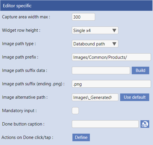
A signature display and capture box. For a full example of the use of this widget in an app design please see here.
Capture Area Max width (px) - The maximum size of the signature capture panel
Widget Row Height - the height (in rows) of the signature capture panel
Image Path Type - is the image at a databound path (a path which incorporates the associated property value) or a Static Path (a non varying static path)
Image Path prefix - the path to the folder where the image is stored
Only display if equal to - the image will only be displayed if the value of the bound property is equal to this value
Image Path Suffix Data - the name of the image photo is provided by the uniquely initialied GUID value (which can be blank or nothing), this suffix data field allows for the name of the image to be populated from a datafield in the database (Entity).
Image Path Suffix (with .ext) - the name of the image photo is provided by the uniquely initialied GUID value, this suffix field defines the filetype extension to be added. In this example we have used .JPG which opens all images uploaded from mobile devices and those scanned/stored on a desktop computer.
Image Alternative Path - The alternative image to display as a background in the signature capture panel.
Mandatory input - indicates whether a signature has to be entered before data can be saved
Done button caption - the override caption for the Done button (leave blank for "Done")
Actions on Button click: when the "Done" button is clicked automatically action one of more of the Evoke Click Actions in order to excute Evoke library routines.
A block of read-only static text. This input for this widget can be just straight text OR HTML which can be used to format the static text. For a full example of the use of this widget in an app design please see here
Text - A block of text to be displayed. Text can be formatted with standard HTML tags eas shown in the example
Match prompt padding - indicates if the static text should be left indented to align with prompt padding
Center text - text will be centered in the segment
Top adjustment (px) - the position of the top of the text - negative number of pixels (move up) or positive (move down)
left indentation (px) - the left edge indentation to be applied to this text
right indentation (px) - the right edge indentation to be applied to this text
top indentation (px) - the top edge indentation to be applied to this text
bottom indentation (px) - the bottom edge indentation to be applied to this text
Text color - pick from the app color pallet the color to be used for this text
Bold text - indicates if this text should be "bold"
Italic text - indicates if this text should be "italic"

An editable single line text input widget for alpha-numeric or numeric values. For a full example of the use of this widget in an app design please see here.
Input Hint - text that appears in the textbox (greyed out) as a hint as to what should be input
Minimum width (px) - minimum size of the input field regardless of screen size
Maximum width (px) - maximum size of the input field regardless of screen size
Max input length - maximum number of characters the text box will let the user input e.g. 4
Assign on keystroke - indicates if the property value, used with this template widget, should be updated as soon as the user enters keystrokes
Use specialized input - the type of specialized input required (controls soft keybard on mobile devices)

A textbox and button combination compound widget. For a full example of the use of this widget in an app design please see here.
Input Hint - text that appears in the textbox (greyed out) as a hint as to what should be input
Editor Size min (px) - minimum size of the editable text box
Editor Size max (px) - maximum size of the editable text box
Button Style - the style of the button (text, Image (either library or custom) or pop-up menu
Button Caption text - text in the button
Alternate Caption Text - Button text used by adaptations
Button tooltip Text - the tooltip if you hover over the button
Actions on Button click: when the button is clicked automatically action one of more of the Evoke Click Actions in order to excute Evoke library routines.
Assign on keystroke - indicates if the property value, used with this template widget, should be updated as soon as the user enters keystroke

An editable lookup widget. For a full example of the use of this widget in an app design please see here.
Input Hint - text that appears in the textbox (greyed out) as a hint as to what should be input
Minimum width (px) - minimum size of the input field regardless of screen size
Maximum width (px) - maximum size of the input field regardless of screen size
Data Source - use the build button to select the data source to use for the dropdown list
Drop Down Columns - use the Add button to select which field (property) to use from the selected data source for the drop down list, for multiple fields separate properties with a space
Drop down size - the number of rows to appear in the drop down list before scrolling starts i.e. how big is the drop down list window
Actions on option select: when an option is selected from the drop-down list automatically action one of more of the Evoke Click Actions in order to excute Evoke library routines.
Assign on keystroke - indicates if the property value, used with this template widget, should be updated as soon as the user enters keystrokes

An editable lookup widget that also has a Button allowing Evoke Click Actions to be invoked. For a full example of the use of this widget in an app design please see here.
Input Hint - text that appears in the textbox (greyed out) as a hint as to what should be input
Minimum width (px) - minimum size of the input field regardless of screen size
Maximum width (px) - maximum size of the input field regardless of screen size
Button Style - the style of the button - text, Image (either library or custom) or pop-up menu
Button Caption text - text in the button
Alternate Caption Text - Button text used by adaptations
Button tooltip Text - the tooltip if you hover over the button
Actions on Button click: when the button is clicked automatically action one of more of the Evoke Click Actions in order to excute Evoke library routines.
Data Source - use the build button to select the data source to use for the dropdown list
Drop Down Columns - use the Add button to select which field (property) to use from the selected data source for the drop down list, for multiple fields separate properties with a space
Drop down size - the number of rows to appear in the drop down list before scrolling starts i.e. how big is the drop down list window
Actions on Button click: when the button is clicked automatically action one of more of the Evoke Click Actions in order to excute Evoke library routines.
Assign on keystroke - indicates if the property value, used with this template widget, should be updated as soon as the user enters keystroke

If you need a formatted entry field, where the format is stored in the database i.e. a SSN "123-4567-890", this is An editable, formatted textbox. For a full example of the use of this widget in an app design please see here.
Section separator - what should seperate the sections? a '-' or a '*' etc.
Input sections - add a new line to the grid for each section of the input box. Once a line is added use the section definition below to add configure the section and the grid will show the options selected.
Section Definition. Valid Chars Type - pick from dropdown options of alphanumeric, Alphabetic, Numeric, Minimum width (px) - minimum size of the input field regardless of screen size
Maximum width (px) - maximum size of the input field regardless of screen size
Button Style - the style of the button - text, Image (either library or custom) or pop-up menu
Button Caption text - text in the button
Alternate Caption Text - Button text used by adaptations
Button tooltip Text - the tooltip if you hover over the button
Actions on Button click: when the button is clicked automatically action one of more of the Evoke Click Actions in order to excute Evoke library routines.
Data Source - use the build button to select the data source to use for the dropdown list
Drop Down Columns - use the Add button to select which field (property) to use from the selected data source for the drop down list, for multiple fields separate properties with a space
Drop down size - the number of rows to appear in the drop down list before scrolling starts i.e. how big is the drop down list window
Actions on Button click: when the button is clicked automatically action one of more of the Evoke Click Actions in order to excute Evoke library routines.
Assign on keystroke - indicates if the property value, used with this template widget, should be updated as soon as the user enters keystroke

An editable multi-line text input Widget. For a full example of the use of this widget in an app design please see here.
Input Hint - text that appears in the textbox (greyed out) as a hint as to what should be input
Minimum width (px) - minimum size of the input field regardless of screen size
Maximum width (px) - maximum size of the input field regardless of screen size
Rows - the number of rows in the Textarea
Is read only - a checkbox that indicates if the textarea is editable or just read only.
Top align prompt - indicates whether the prompt should appear at the top of the overall widget area (as opposed to the default of center-aligned)

An display only block of data that will take up as much screen space as required, unless the min and max attributes are used, to display the text on multiple lines. For a full example of the use of this widget in an app design please see here.
Text alignment - the alignment of the text relative to the textbblock area e.g. left, center or right
Compressed height - removes spacing between the lines to compress the height of the text.
Compressed height - removes spacing between the lines to compress the height of the text.

A dropdown widget for capturing time values or on mobile devices a trigger to use the native timepicker e.g. a time scroll wheel. For a full example of the use of this widget in an app design please see here.
Input Hint - text that appears in the textbox (greyed out) as a hint as to what should be input
Minimum width (px) - minimum size of the input field regardless of screen size
Maximum width (px) - maximum size of the input field regardless of screen size
Minimum width (px) - minimum size of the input field regardless of screen size
Maximum width (px) - maximum size of the input field regardless of screen size
