

-
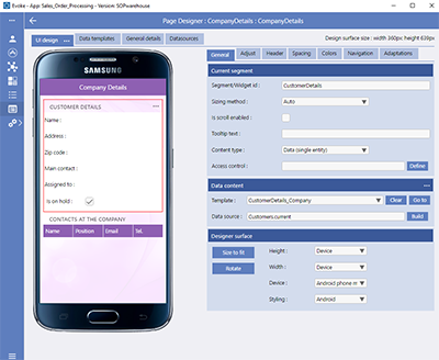
Current Segment
The Current Segment section provides configuration settings for the currently selected segment on the Page design.-
Segment/Widget id (Chosen name of the segment that is used in the Visual Studio project to identify it)
-
On-line help id (Chosen name of the help tag {segment} that can be used in the URL of a help page. See Menu Styling.
-
Template Widget id prefix (Chosen name to be included before the widget ids within the Template (associated with this Segment) to ensure these are unique in the Visual Studio project and you are able, therefore, to reference these as unique ids within custom JavaScript)
-
Is scroll enabled - used to enable scrolling on a segment - see Sizing Method
-
Suppress Content Resizing - suppress content based dynamic resizing, typically for datagrids where you do not want the size of the segment dynamically adjusted by the browser based on how many rows there are.
-
Size Value (%) - The size of the segment in the context of the "sizing method"
-
Tooltip text - a tooltip for the segment that will be displayed when, on a device with a mouse, the segment header is hovered over.
-
Content Type (Table/datagrid, single entity data, chart/graph, image, components, custom, etc)
-
Access Control - define and add access control, via data or user groups, to this Segment.
-
-
Data Content
The Data Content section provides configuration settings for the content of the currently selected segment on the Page design.-
Arrangement - When a multi-entity segment is selected then a new option appears "arrangement". This defaults to "datagrid" to display a table but can be changed to CardView in order to allow access to the Card designer. When the arrangement option is CardView then the option to select a Template is hidden.
-
Template - Selects the single or multi-entity template that you want to provide the data format of the Template
-
Data Source - Selects the DataSource (Evoke data area) that this segment is bound onto (remember that Data Sources need to be Populated. Use the DataSource Build button to populate the name of a DataSource and the path to any Related Data.
-
Act as a list picker - indicates whether this multi entity grid is to act as a picker (multiple selector) for another entity list.
-
Horizontal grid scroll - enables horizontal scrolling on a displayed datagrid on any device.

If you want to enable horizontal scrolling on a displayed datagrid/table then the "arrangement" must be set to "datagrid". Simply leaving it blank so the arrangement defaults to datagrid is not enough it must be specifically set to datagrid.
Check the "horizontal grid scroll" checkbox and a new option will be displayed "Scroll Segment width (px)". Horizontal scrolling works on FIXED width datagrids/tables, set the fixed width you require in "Scroll Segment width (px)".
-
-
Designer SurfaceThe designer surface settings allow you reset the WYSIWYG display area so that it displays based on a specific device (iphone, smartwatch, android tablet, desktop device, etc - as shown below) by selecting from the dropdown list in the "device" list. Alternatively you can specifically set a screen size for the designer WYSIWYG area (using the Height and width options) or change the styling to see how the difference device cultures change the look and feel of your screen design (using the "Styling" drop down list.The Size to Fit Button instantly returns the WYSIWYG Designer area back to fill all the available space in the design area.The Rotate Button is used, when viewing the WYSIWYG as if the page was on a Device, to rotate the screen in the WYSIWYG as if a mobile phone or tablet had been rotated in someone hands.


Content Type (data grids, single entity data, components, custom, etc)
-
Child Page Segments
 Selecting Child Page Segments defines the currently selected segment as a segment that has one or multiple child segments. When "Child Page Segments" is selected the "Data Content" (Template and datasource) configuration is hidden and a new segment showing the Display Type and Segment Arrangement as either rows or columns is shown. Each of the child segments can be further defined using the "Content Type" selection when that segment is selected as the current segment.
 -
Data (Single Entity)
-
Data (Multiple Entities)
The segment contains single widget that are populated with data from multiple entity instances - by default this is a Table/Data Grid. DataGrid Columns have an automatic "tooltip" of the column header text that will be displayed, in full, when the Column header is 'hovered over' on devices that provide this capability, such as desktop computer screens. This segment content type requires a multi entity template. Multi Entity Templates are typically used for tables of record data, datagrids, etc. See example image right. You are also able to use Multi Entity grid content types as List Pickers.
There is also an option to display a Multi Entity segment in a CardView format where each of the records has its own card.

-
Chart/Graph
-
Component
The segment contains a special Evoke Component that allows you to add:-
Online Payment - Inclusion of online payments using a range of providers including PayPal and Stripe.
-
Map Display - Inclusion of Google Maps Web Service (requires Google Maps API)
-
Calculator - Inclusion of a slide in calculator on the screen.
-
ChatBot Window - A conversational chat window (human-to-chatbot)
-
Agent Chat Window - A conversational chat window (human-to-human).
-
-
Image (static) or Image (databound)
When Selected a further option of "Image Content" is offered (see example image right).-
Image (static) - The segment contains only an image that has a static datapath (see Segment images for more information and instructions on the configuring of the various fields and options relevant to this "Content Type".
-
Image (databound) - The segment contains only an image that has a datapath that is determined by a datasource property value (see Segment images for more information and instructions on the configuring of the various fields and options relevant to this "Content Type".
-
-
360° Image with a path that is static
When Selected a further option of "360° Image Details" is offered (see example image right).Evoke provides content types to support Panoramic/360° images, virtual tours and hotspotting, these are 360° image with a static path.
Please see the comprehensive help section on 360° images and virtual tours
-
Video Player (static or databound)
When selected a further option of "Video Player Details" is offered (see example image right).Evoke provides content types to support embedded videos within the app. These can be static images or databound images and option exist for controling the actions of the videos.
Please see the comprehensive help section on Embedded videos
-
Custom
When "Custom" is selected as the "Content Type" (see example image right), the segment contains custom developed content. This will create a place holder or "Evoke code hook" inside the Visual Studio project that will allow the custom content to be added at that point.There are a couple of options that allow you to center the custom content and to optionally make the content clickable (and then define the actions to take when it is clicked).
-
Blank
The segment contains no content. Select this content type if the segment is to just represent and area of blank space on the User Interface.


-
Chart Type - Choose a chart type of Area, Bar, Donut, Line, Percent Area, Percent Bar, Pie, Stacked Area, Stacked Bar, Setp-up Bar, Waterfall.
-
Caption - insert the caption to appear above the chart/graph
-
Sub-caption - insert the sub-caption to appear below the caption
-
Show Legends - Checkbox, if checked show the data legends below the chart/graph.
-
Suppress Group Totals - Checkbox, if checked then the group total figures (numbers above each bar on a bar chart, on each segment of pie on a pie chart, etc) are hidden.
-
Orientation - The plotting orientation of the chart/graph (only available on certain graphs).
-
Horizontal label - The label to be displayed along the horizontal axis (if one is present) of the chart/graph (only available on certain graphs).
-
Vertical label - The label to be displayed along the vertical axis (if one is present) of the chart/graph. (only available on certain graphs).
-
Axis ticks - The graduation points (values) to be used along the value axis of the chart/graph (only available on certain graphs).
-
Dataset count - The number of discrete datasets to be displayed within the chart/graph. This setting is only used for chart/graph types capable of displaying multiple datasets (Area, Bar, Line, Percent Area, Percent Bar, Stacked Area, Stacked Bar and Step-Up Bar).
-
Dataset name -The display name of the dataset.
-
Dataset datasource path - The datasource for the dataset. This must be either the name of a collective datasource or a property within a datasource that represents a collection (list) of entities.
-
Property for names - This property (for all datasets) is to be used to obtain the values that will form the graduation points (and labels) along the opposite axis to the value axis. Each discrete value for this property will be represented by a dedicated labelled graduation point.
-
Property for values - This property (for all datasets) is to be used to obtain the plotting value for each record within the dataset.
-
Group by - This setting allows you to define (if required) how records within the underlying datasource are to be grouped together to form compound/computed values for chart/graph plotting purposes.
-
Group by property - This property (for all datasets) is to be used to obtain the grouping value for each underlying datasource record.
-
Restrict records by - This setting allows you to define (if required) whether only the first x number of records or the last x number of records within the underlying datasource are to be used for plotting purposes.
-
Restriction size - The maximum number of records to be used in the graph (if the above setting is not "None").