


-
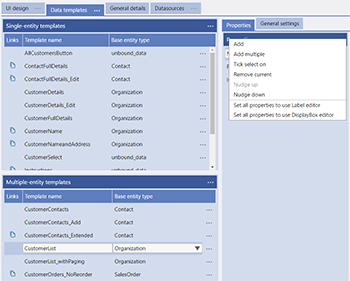
Add - Add a single Property from the Entity to the selected Template
-
Add Multiple - Add multiple Properties from the Entity to the selected Template. This options uses a "tick select" method to add Properties and the order that you tick the Properties in will be the initial order of the Properties in your Template
-
Tick Select On - Turns on the "Tick Select" option on the Property list so that you can select multiple properties to delete, remove, etc.
-
Remove Current - Remove the currently selected Property from the list.
-
Nudge up - Allows for re-ordering the Property lists - Nudge up moves a selected item up 1 place in a list and the menu remains active so that you can click the same item in the menu multiple times to move the Property multiple places.
-
Nudge down - Allows for re-ordering the Property lists - Nudge down moves a selected item down 1 place in a list and the menu remains active so that you can click the same item in the menu multiple times to move the Property multiple places.

-
Set all properties to use Label editor - Sets all the Properties in this Template to have the Editor Type of label
-
Set all properties to use DisplayBox editor - Sets all the Properties in this Template to have the Editor Type of DisplayBox
Widget definitions for Property
-
Widget id - Chosen name of the widget (this data/functional element of the user interface) that is used in the Visual Studio project to identify it
-
Tooltip - a simple help expression that the user sees when hovering over the widget
-
Editor Type - the definition of the display Widget that will define the display function. The "Editor Help" button will take you to a full example of using that selected widget.
-
Prompt text - (single entity only) the prompt for what is to be input, e.g. "Name", "address", etc. If you do not have or want a prompt BUT want the sizing of the label (other widget) to appear the same as the others then add an underscore "_" into the prompt box.
-
Alt Prompt text - (single entity only) the alternate prompt used by Adaptations for what is to be input, e.g. "Nm.", Add." etc
-
Suppress Prompt Padding - (single entity only) used to suppress the data fields lining up in line with the largest prompt
-
Tab Index - (single entity only) used to identify the next input or display box to jump to when the user presses the tab key on the keyboard
-
Column header Text - (multi entity data grids only) the column header for this specific column, e.g. "Name", "address", etc. DataGrid Columns have an automatic "tooltip" of the column header text that will be displayed, in full, when the Column header is 'hovered over' on devices that provide this capability, such as desktop computer screens.
-
Alternate header Text - (multi entity data grids only) the alternate column header used by Adaptations for this specific column, e.g. "Nm.", Add." etc
-
Numeric Coercion - (multi entity data grids only) only for alphanumeric fields. Forces Evoke to see an alphanumeric number as a numeric number when sorting is used on the datagrid.
-
Column size (%) - (multi entity data grids only) used to define the size of this specific column as a percentage of the data grid width
-
Column size max (px) - (multi entity data grids only) used to define the maximum size, in pixels, this specific column can grow to in the User Interface
-
Column alignment - (multi entity data grids only) used to define the alignment of the column, the options are:
-
Left - values will be aligned along the left edge of the column
-
Center - values will be aligned centrally within the column
-
Right - values will be aligned along the right edge of the column
-
-
Access Control - by data or user group for each property
-
Column Background Colour - (multi entity data grids only) used to set the background colour of a specific column in a datagrid.
-
Functionality Actions - use of Evoke's Click Actions
-
Single Entity Templates
-
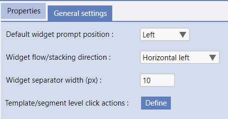
Default Prompt Position - where the "Prompt" is displayed, options are above or left
-
Widget flow/stacking direction. Options are Vertical (all widgets one above the other) or Horizontal left or right (all widgets one after the other horizontally from the left or right).
-
Widget separator width (px). If the widget flow (above) is not vertical then a seperator size can be specified.
-
Template Level Click Actions - the Evoke Click Actions associated and used by this template. These are used in conjunction with header actions.
-
-
Multi Entity Templates (shown right)
-
Show Column Headers (checkbox) - if a row showing the headers for columns is shown at the top of the grid (under a heading bar - if present)
-
Show Column Footers (checkbox) - if a row showing the footers (totals boxes) for columns is shown at the bottom of the grid
-
Column Sort Enabled (checkbox) - if Evoke automatic sort options are to be available to the App user. Used in conjunction with Refined Data Sources
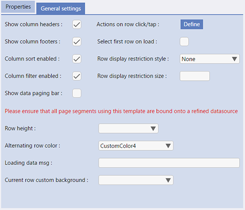
Column Filter Enabled (checkbox) - if Evoke automatic Search/Filter options are to be available to the App user. Used in conjunction with Refined Data Sources
-
-
Show data paging bar (checkbox) - displays the data paging bar on the grid for the user to use Data Paging functions, if they are set on the Data Source
-
Actions on row click/tap - the Evoke Click Actions associated and used by this template
-
Select first row on load (checkbox) - Determines, when data is loaded into the data grid, if the first row should become the selected row or not. This checkbox is regularly used when the page contains other data segments showing related data as "selecting" the first row can also be used to trigger the click actions associated with a row i.e. RetrieveRelatedData.
-
Row display restriction style - used to identify which rows are shown in the data grid. Options are:
-
None (all selected rows are displayed)
-
First Rows (Only the first n selected rows are displayed - used in conjunction with the row display restriction option below)
-
Last Rows (Only the last n selected rows are displayed - used in conjunction with the row display restriction option below)
-
-
Row display restriction size - used to limit the number of rows shown in the Table/Datagrid.
-
Row height - defines the row height of the rows in the data grid. The default is a single line row height of 36px. Alternative options include 8 additional heights from 76 pixels through 356 pixels.
-
Alternating Row Color - if selected then the alternate rows in this datagrid will be highlighted in the color selected from the available app color pallets.
Any colour can be selected for the highlight colour. -
Loading data msg - any text entered here will be displayed in the first line of the datagrid while a selection against the database (to populate the datagrid) is being performed - so that users know data is being retrieved. The message is controlled by the 'State' of the DataSource, therefore is the DataSource is "Initialised" or has data in it the message will not be displayed but is the DataSource is an empty instance (as an uninitialised datasource is initially set to or as a datasource is set to when a selection is run) the message will be displayed.
-
Current Row custom background - if selected with a colour then the currently selected row will have a background of the colour chosen.
Any colour can be selected for the background colour.

