Building a Page
The
Pages section of Evoke provides the capability of building your App Pages, refining them and adding navigation to them,
But where do you start...
When you create a
new app in Evoke a couple of new Page Series and Pages are setup for you to modify. These new Pages are the same as the Pages created when you use the 'create a new page' option in
Page Series. A couple of blank segments are included and, in the case of the Pages created with a new app and example of a data segment displaying a message is included (see image right).
Pages define each of the screens displayed in your App. Each Page is made up of Segments. Segments can be any size and can have any number of Child segments within them. Each Segment can contain data, text, images, grids, etc. Individual segments can be arranged in Rows or Columns and in this way you can have the configuration (look and feel) of a Page that you want. There are detailed examples
below on this page.
Build the Page up with Segments
To add, remove or structure segments you will need to use the
Adjust tab in the configuration area to the right of the WYSIWYG display. Here you can add sibling or child Segments, change the order of segments, add or remove segments and adjust the Segments on your Page to the structure you require.
Structure a segment
To structure a Segment, First, use the
General Tab in the configuration area to the right. Once you have considered the Content Type (data, blank, child, etc) and decided on any
Access Control you are ready to add content and form to the Segment. There are detailed explainations, with examples, of many of the different types of data structures and page design elements
below on this page.
Add Content and Form
The content and form of a Data Segment are controlled by
Templates,
Widgets and
Data Sources. Don't forget that you need to
populate the data Source.
Refine the Segment
You can now refine your Segment using the Header, Spacing, Color, Navigation and Adjustment tabs that are explained in the
UI Design and use
Adaptations so the app runs perfectly on all devices and screen sizes.
Add more Segments
Repeat the process until you have a Page set up the way you want your App users to see.
The following sections describe, in detail, the process of creating datagrids, data record update and display, selections, buttons and the use of many other Evoke Widgets and Components. The examples below also cover many other aspects of page design and creation in much more detail. Please click on any image to see a larger version of the image.
Where possible the following sections will use the Sales_Order_Processing and Example App designs, included in all Evoke accounts, as the examples. The following sections are below:
Creating and Configuring a DataGrid/Display Table
We will use the "Selected Customer" Datagrid, from the Customers menu item of the Sales_Order_Processing app design and shown on the image on the right, as our example for creating and configuring a Datagrid (table display).
In the app design, in the PageSeries Customers and on the Page Customers, a Segment has been
added to the screen. Click on the Segment to select it and a red border will appear around the Segment. In the
General Tab we have selected a
Content Type of "Data (Multiple Entities)", which will indicate that we will be displaying multiple records in a datagrid. Please see image below on the left.
Next we need to identify where the data that will be displayed is. Still in the General Tab we used the "
Build" button next to
DataSource, in the Data Content section, to select the
DataSource to be used. If there is not a suitable DataSource then use the "DataSources" Tab to create one. At this stage there is nothing in the DataSource, it is not populated, the only thing that is important is that a) it is a Collection (can hold multiple records or a list of data) and b) it has an Entity Type of the Records/list of data that we want to display.
Now we need to give our Datagrid some structure and for this we will use a
Template. Use the "Data Templates" Tab or the "Go to" button in the Data Content area to enter the
Templates area. There are two choices of Template: Single-Entity (for individual data elements) and Multiple-Entity (for multiple records) - DataGrids
always use Multiple-Entity templates as they are displaying multiple records/data. we created a new Multiple-Entity Template, named it and selected the "Base Entity type" (The Entity type of the records you want to display).
Select which fields, from each record (Entity Type) you want to display. These are the
Properties of the Template and can be selected from a drop down list after you add one or more Properties. Each property is now configured in the
Widget definition for property section with an
Evoke Widget. The General Details tab of each Property (see image left) allows you to select the
Editor Type of the Widget, the example shows a simple "Label" Editor/Widget Type, which is just a non editable display of a single line of text data, but there are many
Widgets to choose from. You can also set things like the header text, alternative column header text (for use with
Adaptations), column size (remainder i.e. what is left after other columns are sized) or fixed (using the max column size), column alignment ( for this column - left, right, center),
Access Control and Custom Background colour which allows you to set the background of the column for this property to a specific colour.
In the
General Settings area of Templates (image right) you can set or modify things like if Columns headers are displayed, turn on
footers (totals boxes) for columns, enable automatic
searching, sort and filtering options for your users, Select first row on load (sets the first displayed row as the selected or ".current" row without it being clicked on) and much more.
Now your Template is set up, you need to go back to where you started, the UI Design Tab and
General Tab tab, and pick, from the drop down list, the Template that you have just created, in the Data Content Template area.
The app design now has a DataGrid that will display data records/a list of data and in this example it will display whatever data records/list of data is included/populated in the
Customers DataSource.
Therefore, we must now ensure that the information we want to display is in that DataSource. To do this we need to
Populate the DataSource and in this example we will include a Selection (as
explained below) on this screen/Page for the user of the app to select data that will be populated into the Datasource.
The additional tabs, as part of the "UI Design" screen have been used in this example to a) add a
Header to the DataGrid b) adjust the
Spacing and
Colors of this Segment from the default
Theme settings c) create a
Navigation menu against each data row in the Datagrid and d) make the Datagrid
Adapt to different display sizes.
Jump back to
top of page to access list of widget examples again.
Creating and Configuring Data Update and Single Record Display
We will use the "Customer Extended Details" Segment, from the Customers menu item of the Sales_Order_Processing app design and shown on the image on the right, as our example for creating and configuring Data Update and Single Record Display.
In the app design, in the PageSeries Customers and on the Page Customers, a Segment (Customer Extended Details - bottom left on the screen) has been
added to the screen. Click on the Segment to select it and a red border will appear around the Segment. In the
General Tab we have selected a
Content Type of "Data (Single Entity)", which will indicate that we will be displaying a single piece of data, a single data element or a single data record. Please see image below on the right.
Next we need to identify where the data that will be displayed is located. Still in the General Tab we used the "
Build" button next to
DataSource, in the Data Content section, to select the
DataSource to be used. The DataSource
must be a single data record therefore select either a) a dataSource that is
not a collection or b) use the builder to select the ".current" property level (the currently selected data record in a collection) of a collective Datasource. In the example below the "Customers.current" Datasource has been selected. If there is not a suitable DataSource then use the "DataSources" Tab to create one. At this stage there is nothing in the DataSource, it is not populated, the only thing that is important is that it has an Entity Type of the Records/list of data that we want to display.
Now we need to give our Segment some structure and for this we will use a
Template. Use the "Data Templates" Tab or the "Go to" button in the Data Content area to enter the
Templates area. There are two choices of Template: Single-Entity (for individual data elements) and Multiple-Entity (for multiple records) - Segments with a Content Type of "Data (Single Entity)"
always use Single-Entity templates as they are a single record/data element. We created a new Single-Entity Template, named it and selected the "Base Entity type" (The Entity type of the record you want to display).
Select which fields, from the Entity Type you want to display. These are the
Properties of the Template and can be selected from a drop down list after you add one or more Properties. Each property is now configured in the
Widget definition for property section with an
Evoke Widget. The General Details tab of each Property (see image left) allows you to select the
Editor Type of the Widget, the example shows a simple "Textbox" Editor/Widget Type, which is an editable single line text input for alpha-numeric or numeric values, but there are many
Widgets to choose from. You can also set things like the prompt text, alternative prompt text (for use with
Adaptations), Tab Index (to control the order fields are tabbed to),
Access Control, etc.
The Editor specific section of the Widget definition for property allows you to set multiple settings that relate specifically to the Editor/Widget Type. In this example, an input hint (text to appear in a text entry box before anything is entered), the minimum and maximum width of the text entry box (so that you can make the box bigger and smaller to look better), Max input length (limit the amount of character you allow the user to type in the input box), etc.
Now your Template is set up, you need to go back to where you started, the UI Design Tab and
General Tab tab, and pick, from the drop down list, the Template that you have just created, in the Data Content Template area.
The app design now has a Segment that will display data from a single data record, in this example it will display whatever data is included/populated in the
Customers.current DataSource. Which will be the currently selected record in the Customers Datasource i.e. the row clicked on or selected in the Datagrid above.
In this example the Datasource is already populated, however, in other cases you may need to
Populate the DataSource using a click action or selection.
The additional tabs, as part of the "UI Design" screen have been used in this example (please review in the Sales_Order_processing app design in your Evoke account) to a) add a
Header to the Segment b) adjust the
Spacing and
Colors of this Segment from the default
Theme settings c) create a
Navigation menu in the Segment header and d) make the Segment
Adapt to different display sizes.
Jump back to
top of page to access list of widget examples again.
Creating and Configuring a Selection
To explain using
Selections we will, once again, use the Customers page from the
Customers menu item of the Sales_Order_Processing app design, as used in the Datagrids and Single record examples above and shown in the image on the right, as our example for creating and configuring a Selection.
We will use as the example the "Customers Name" input area at the very top of the screen. In the app design, in the PageSeries Customers and on the Page Customers, a Segment (Customer Name - a prompt and an input box) has been
added to the Page. Click on this Segment, in the app design included in all Evoke accounts, to select it and a red border will appear around the Segment, note that this is a
Segment inside another Segment and so only a small Segment, around the prompt and the input box should appear.
In the
General Tab we have selected a
Content Type of "Data (Single Entity)", which will indicate that we will be allowing the user to input a single piece of text to be used as an input parameter in the Selection. Please see image below on the right.
Next we need to identify where the data that will be retrieved by the Selection will be placed i.e. which Datasource will be populated. Still in the General Tab we used the "
Build" button next to
DataSource, in the Data Content section, to select the
DataSource to be used.
The DataSource
must be a Collection (holds a list/multiple records) for Widgets such as SelectAuto and SelectButton that select multiple records (as will be used in this example) but a single entity datasource (i.e. not a collection) for Widgets such as SelectAutoDrop and SelectButtonDrop that allow the user to select a single record/piece of data as the result. The
list of Widgets identifies if a specific Widget is expecting a Multi-Entity or Single-Entity Datasource.
In the case of this example (please also refer to the descriptions of displaying a datagrid and single record above) we will be populating the "Customers" Datasource and therefore this is selected. If there is not a suitable DataSource then use the "DataSources" Tab to create one.
Now we need to give our Segment some structure and identify which Selection we will use, for this we will use a
Template. Use the "Data Templates" Tab or the "Go to" button in the Data Content area to enter the
Templates area. There are two choices of Template: Single-Entity (for individual data elements) and Multiple-Entity (for multiple records) - Segments with a Content Type of "Data (Single Entity)"
always use Single-Entity templates as they are a single record/data element (in this case a single input value). In this example (and in the image on the left) you will see a Single-Entity Template named "CustomerSelect". This template is going to allow the
input of a piece of text that will be used in the Selection, therefore we have to give it a "base entity type" of a
variable. In Evoke variables/temporary data areas are called
unbound_data.
You will still need to add a
Property, to hold the text input by the user
and to be passed to the Selection as a parameter. Evoke will offer multiple "unbounddata" temporary data areas and you can select anyone of these, even reuse them on the same page. The Property must now be configured in the
Widget definition for property section with an
Evoke Widget. The General Details tab of the Property (see image left) allows you to select the
Editor Type of the Widget, the example shows a "SelectAuto" Editor/Widget Type. There are Multiple
Selection Widgets to choose from. You can also set things like the prompt text, alternative prompt text (for use with
Adaptations), Tab Index (to control the order fields are tabbed to),
Access Control, etc.
The Editor specific section of the Widget definition for property allows you to set multiple settings that relate specifically to the Editor/Widget Type. In this example, a Selection, first you can add an input hint (text to appear in a text entry box before anything is entered), then the minimum and maximum width of the text entry box (so that you can make the box bigger and smaller to look better).
The next settings relate specifically to the Selection. The first thing to identify is the
Selection Name, this picked from the dropdown list of Selections available for the Entity type of the Datasource that is to be populated by the Selection (in this case "Organization" which is the Entity type of the "Customers" datasource, see description above and image right). As detailed in the
Selections section of this user guide, Selections are setup/defined (named and any parameters to be passed into them are identified) against each
Entity, which is linked to a Table/File/Object in the
Data Mappings area.
In Data Mappings, Selections are further defined with Filter and Sort clauses. The Selection used in the example is shown in the image (left) and the
filter clause will include the SQL or MultiValue selection to be performed against the database including the parameter (input by the user) that is being passed to the Selection.
The next settings, in the Editor Specific section of the Template definition are: Min Select Chars - which is the number of characters that the user must enter before the Selection is run against the database Table or Object. If this is 3 then then the selection will be run after 3 characters are entered and then again when 4 are entered, etc. Finally, the "Entity properties to load"
add button can be used to select any
Related Data that you wish to also populate in your Datasource.
Now your Template is set up, you need to go back to where you started, the UI Design Tab and
General Tab tab, and pick, from the drop down list, the Template that you have just created, in the Data Content Template area.
The app design now has a Segment that will allow the user to input 3 or more alphanumeric characters, will run the "CustomersWithNameStarting" Selection after 3 or more characters are entered, and populate the "Customers" Datasource (used in the other Segments on this Page) with the results of the Selection.
The additional tabs, as part of the "UI Design" screen have been used in this example (please review in the Sales_Order_processing app design in your Evoke account) to a) adjust the
Spacing and
Colors of this Segment from the default
Theme settings b) make the Segment
Adapt to different display sizes.
Jump back to
top of page to access list of widget examples again.
Creating and Configuring Textboxes/Displayboxes
Textboxes allow the display and entry of an alphanumeric data field. They are one of the most commonly used forms of UI data entry. We will use the "Simple Widgets" page (in the image on the right) from the Example app design (that is included in all Evoke Accounts) as our example as we describe creating and configuring Textboxes in this section. Displayboxes are simply non-editable textboxes and therefore the following instructions may also be followed for Displayboxes.
First, on the "SimpleWidgets" Page in the Example app design, a Segment (on the left of the screen shown opposite that contains the "Name" Textbox) has been
added to the screen. Click on the Segment to select it and a red border will appear around the Segment. In the
General Tab we have selected a
Content Type of "Data (Single Entity)", however, Textboxes relate to alphanumeric properties in
Entities and therefore are able to be used to display or enter alphanumeric values in "Data (Multi-Entity)" Datasources (collections) as well. Please see image below on the right.
Next we need to identify where the Textbox, that will be displayed/entered/updated, is located and where the alphanumeric value is to be saved. Still in the General Tab we used the "
Build" button next to
DataSource, in the Data Content section, to select the
DataSource to be used. In the example below a GlobalData Datasource "SelectedCompany" has been selected. A
Global Datasource is a Data Source that is available throughout the App/app design not just in the Page Series that it is defined in. Global Data Sources are defined and described in the
App Settings General DataSource section, please see image left.
If there is not a suitable DataSource then use the "DataSources" Tab to create one. The "GlobalData.SelectedCompany" datasource is populated, in the Example app, with a SQLOrganization record in the PageSeries: PopulatingData and the Page: PopulatingData.
But we do need to give our Segment some structure and for this we will use a
Template. Use the "Data Templates" Tab or the "Go to" button in the Data Content area to enter the
Templates area. Depending on your Segment Content Type (either "Data (Single Entity) or Data (Multi Entity)" use either a Single-Entity or Multi-Entity template. In this example (and in the image on the left) you will see a Single-Entity Template named "SQLentitywidgets1" has been used.
Select which fields, from the Entity Type you want to display. These are the
Properties of the Template and can be selected from a drop down list after you add one or more Properties. Each property is now configured in the
Widget definition for property section with an
Evoke Widget. The General Details tab of each Property (see image left) allows you to select the
Editor Type of the Widget, the example shows a simple "Textbox" Editor/Widget Type, which is an editable single line text input for alpha-numeric or numeric values, but there are many
Widgets to choose from. You can also set things like the prompt text, alternative prompt text (for use with
Adaptations), Tab Index (to control the order fields are tabbed to),
Access Control, etc.
The Editor specific section of the Widget definition for property allows you to set multiple settings that relate specifically to the Editor/Widget Type. In this example, an
input hint (text to appear in a text entry box before anything is entered), the
minimum and maximum width of the text entry box (so that you can make the box bigger and smaller to look better),
Max input length (limit the amount of character you allow the user to type in the input box), etc.
The TextboxButton and Displayboxbutton widgets also has the settings that you can find in the "
creating and using a Button" section above.
The Displaybox widget does not have the Editor Specific settings of input hint, Max input length or assign on keystroke as information cannot be entered into a Displaybox.
Now your Template is set up, you need to go back to where you started, the UI Design Tab and
General Tab tab, and pick, from the drop down list, the Template that you have just created, in the Data Content Template area.
The app design now has a Segment that will display a textbox, including any existing contents of that alphanumeric field, and allow your users to update the value by typing new alphanumeric characters into the textbox.
In this example the Datasource is already populated, however, in other cases you may need to
Populate the DataSource using a click action or selection.
The additional tabs, as part of the "UI Design" screen have been used in this example (please review in the Example app design in your Evoke account) to a) adjust the
Spacing and
Colors of this Segment from the default
Theme settings b) make the Segment
Adapt to different display sizes. Although now used here, we could have added a
Header to the DataGrid or created a
Navigation menu.
Jump back to
top of page to access list of widget examples again.
Creating and Configuring TextboxSectioned
A TextBoxSectioned widget is a formatted/sectioned text/Alphanumeric (TextBox) input fields. You define the number of sections, the type of input and any separators. The value stored in the database will include the seperators.
This type of input is useful for inputting formatted data such as a Social Security Number, Driving License number, etc.
Textboxes allow the display and entry of an alphanumeric data field. They are one of the most commonly used forms of UI data entry.
We will use the "Exanple All Widgets" page (in the image on the right) from the Example app design (that is included in all Evoke Accounts) as our example as we describe creating and configuring TextboxSectioned widgets in this section.
First, on the "Example All Widget" Page in the Example app design, a Segment (showing the SSN, Driving license and ID) has been
added to the screen. Click on the Segment to select it and a red border will appear around the Segment. In the
General Tab we have selected a
Content Type of "Data (Single Entity)", however, Textboxes relate to alphanumeric properties in
Entities and therefore are able to be used to display or enter alphanumeric values in "Data (Multi-Entity)" Datasources (collections) as well.
Next we need to identify where the TextboxSectioned, that will be displayed/entered/updated, is located and where the alphanumeric value is to be saved. Still in the General Tab we used the "
Build" button next to
DataSource, in the Data Content section, to select the
DataSource to be used. In the example below a Datasource "WidgetCompanyrecord" has been selected.
If there is not a suitable DataSource then use the "DataSources" Tab to create one. The "WidgetCompanyrecord" datasource is populated, in the Example app, with a SQLOrganization record in the PageSeries: PopulatingData and the Page: PopulatingData.
But we do need to give our Segment some structure and for this we will use a
Template. Use the "Data Templates" Tab or the "Go to" button in the Data Content area to enter the
Templates area. Depending on your Segment Content Type (either "Data (Single Entity) or Data (Multi Entity)" use either a Single-Entity or Multi-Entity template. In this example (and in the image on the left) you will see a Single-Entity Template named "T_TextBoxSectionedTemplate" has been used.
Select which fields, from the Entity Type you want to display. These are the
Properties of the Template and can be selected from a drop down list after you add one or more Properties. Each property is now configured in the
Widget definition for property section with an
Evoke Widget. The General Details tab of each Property (see image left) allows you to select the
Editor Type of the Widget, the example shows a "TextboxSectioned" Editor/Widget Type but there are many
Widgets to choose from. You can also set things like the prompt text, alternative prompt text (for use with
Adaptations), Tab Index (to control the order fields are tabbed to),
Access Control, etc.
The Editor specific section of the Widget definition for property allows you to set multiple settings that relate specifically to the Editor/Widget Type.
-
Section separator - the separator of each section of the textbox e.g. a hyphon '-', in the examples in the Example app - 'ABC1' and 'Full'.
-
Input Sections - create as many input sections as you want (separated by the separator) using the '+' and then configure each input section using the following Section definition parameters.
-
Valid chars type - the type of valid input characters
-
Additional Valid chars - additional valid input characters
-
Inputbox width (px) - the width of the input box in pixels
-
Minimum input length - the minimum allowed number of input characters
-
Maxiumum input length - the maximum allowed number of input characters
-
Use specialized input - the platformd on which specialised text input is to be used for this section
-
Text alignment - the alignment of text within this section
-
Forced Casing - the type of casing manipulation used within this section
-
Text color - the override text color to be used for this section
-
background color - the override background color for this section
Now your Template is set up, you need to go back to where you started, the UI Design Tab and
General Tab tab, and pick, from the drop down list, the Template that you have just created, in the Data Content Template area.
The app design now has a Segment that will display a textboxsectioned widget, including any existing contents of that alphanumeric field, and allow your users to update the value by typing new alphanumeric characters into the textboxs of the different sections.
In this example the Datasource is already populated, however, in other cases you may need to
Populate the DataSource using a click action or selection.
The additional tabs, as part of the "UI Design" screen have been used in this example (please review in the Example app design in your Evoke account) to a) adjust the
Spacing and
Colors of this Segment from the default
Theme settings b) make the Segment
Adapt to different display sizes. Although now used here, we could have added a
Header to the DataGrid or created a
Navigation menu.
Jump back to
top of page to access list of widget examples again.
Creating and Configuring Navigation
Navigation around an app is much more than the standard
Menu, Evoke apps can have:
-
Page menus for navigation
-
Segment Header menus for navigation and actions
-
Grid row menus for navigation
-
Grid row menus for navigation and actions
-
Navigation Click Actions on Buttons, Selections, etc
We will use the "Navigation" Page (in the image on the right) from the Example app design (that is included in all Evoke Accounts) as our example as we describe the different types of
Navigation available to app designers, in this section.
Page NavigationThe image opposite shows page navigation included by the ellipsis at the top right of the screen (in the Page header).
Page Navigation is configured in the "
General Details" tab in Pages (see image left). The Sibling page Navigation option allows you to add new page level navigation, include a caption and select, from a dropdown list, a Page to navigate to from the list of Pages in this PageSeries.
When the first
Sibling Page Navigation is added the Ellipsys at the top of the screen is added.
Sibling Page Navigation allows the user of the app to move around, between various Pages at the same logical level within the app, without having to navigate back through multiple parent/child pages or main menu navigation. This form of Navigation is sometimes referred to as a "sideways" jump within the app.
Segment Header NavigationThe image above right shows Segment Header Navigation included via an ellipsis in the segment header of the bottom/lower data grid segment.
Segment Header Navigation is configured in the "
Header" tab in Pages (see image left). When the checkbox "Has header actions" is checked the "
Header Actions" area below is available.
There are two tabs: "
System implemented actions" and "
Header actions", both are shown on the image (left) but they are seperate tabs in Evoke app design.
System implemented actions The System implemented actions, their use and configuiration, are described in detail in the
Headers section of this user guide.
Custom actions
The custom actions options allow you to create/manage multiple header menu options, each with their own Caption, that will appear in the menu.
Each menu item can also have an
Action Type of: a) Custom - A Custom Implemented Action b) Remove - A system implemented action that removes (without deleting) the currently selected row from the grid displayed within the page segment c) Delete - A system implemented action that deletes the currently selected row from the grid displayed within the page segment or d) ClickActiontrigger - An action that invokes the Evoke Click Action Component library using the associated
ActionID.
The Custom, Remove and Delete options, their use and configuiration, are described in detail in the
Headers section of this user guide.
The ClickActionTrigger creates a navigation menu option that allows you to define multiple Evoke
Click Actions to perform multiple actions when the menu item is clicked. The Click Actions actioned will be those associated with the
ActionID that is associated with the menu item.
If you simply want to include a segment header navigation that simply navigates to another page without any other actions then there are two options:
-
Use the method described above and define the Evoke Click Actions of NavigatetoChild, NavigatetoInput, NavigatetoGrandParent, NavigatetoParent, NavigatetoSibling or NavigatetoRoot, all of which are described in further detail in the List of Click Actions.
-
Use the "Header actions page Navigation" in the Navigation tab (please see image below right), which provides for simple NavigatetoChild functionality with a caption in the menu.
Grid row menus for navigation The "
Grid row drill-down (child) page navigation" section in the
Navigation tab (please see image right) provides for simple NavigatetoChild functionality with a caption in the menu.
The menu captions are defined (e.g. Account Details in the example on the right) and appear in a separate menu to the grid row actions menu (see below). This can be very useful when used in conjunction with
Adaptations. The "
DisableClickNavigation" and "
EnableClickNavigation"
Click Actions work on the entries defined in the "Grid row drill-down (child) page navigation" section.
The grid row navigation menu options allow you to navigate to another page, within the current PageSeries, each with their own
Caption, that will appear in the menu.
Their use and configuiration, are described in detail in the
Navigation section of this user guide under the heading "Grid row drill-down (child) page navigation".
Grid row menus for navigation and actions The "
Grid row actions menu" section in the
Navigation tab (please see image right) allows the configuration of menu items that have an
Action Type of: a) Custom - A Custom Implemented Action b) Remove - A system implemented action that removes (without deleting) the currently selected row from the grid displayed within the page segment c) Delete - A system implemented action that deletes the currently selected row from the grid displayed within the page segment or d) ClickActiontrigger - An action that invokes the Evoke Click Action Component library using the associated
ActionID.
The Custom, Remove and Delete options are the same as the options included in the Segment header menu and their use and configuiration, are described in detail in the
Headers section of this user guide.
The ClickActionTrigger creates a navigation menu option that allows you to define multiple Evoke
Click Actions to perform multiple actions when the menu item is clicked. The Click Actions actioned will be those associated with the
ActionID that is linked with the menu item.
Navigation Click Actions on Buttons, Selections, etc Navigation, using the Evoke
Click Actions of NavigatetoChild, NavigatetoInput, NavigatetoGrandParent, NavigatetoParent, NavigatetoSibling or NavigatetoRoot, all of which are described in further detail in the
List of Click Actions, can be performed in many other paces throughout your app design (Pages).
Widgets, including
Buttons,
Selections,
Images, etc (please images below) all have the ability to add either direct navigation or navigation via Click Actions.
Jump back to
top of page to access list of widget examples again.
Creating and Configuring Buttons
Buttons are useful as standalone buttons (Button Widget), together with Selections (SelectAutoButton, SelectButtonDrop, ReadKeyButton), Dropdown Lists (LookupButton, TextBoxButton, TextBoxLookupButton) and to add actions to another widget (CheckboxButton, DisplayBoxButton). Buttons can be simple rectangles (see green button in image opposite) or any button image you would like (see round button, top right on ipad image opposite). We will use the two pages from the Example app design (that is included in all Evoke Accounts) that are shown ("Simple Widgets" and "Selection Widgets" as our examples as we describe creating and configuring Buttons in this section.
First, on the "Selection Widgets" Page in the Example app design, a Segment ("Show Grid" green button) has been
added to the screen. Click on the Segment to select it and a red border will appear around the Segment. In the
General Tab we have selected a
Content Type of "Data (Single Entity)", Buttons are always "Data (Single Entity)" segments. Please see image below on the left.
The button widget does not need a DataSource, it is independent, so you do not need to select a Datasource.
But we do need to give our Segment some structure and for this we will use a
Template. Use the "Data Templates" Tab or the "Go to" button in the Data Content area to enter the
Templates area. Segments with a Content Type of "Data (Single Entity)"
always use Single-Entity templates. In this example (and in the image on the left) you will see a Single-Entity Template named "ButtonShowMulti". This template is going to display the Button.
This template is to simply display the Button, therefore we have to give it a "base entity type" of a temporary data area. In Evoke variables/temporary data areas are called unbound_data.
You will still need to add a
Property, to hold Button configuration details. Evoke will offer multiple "unbounddata" temporary data areas and you can select anyone of these, even reuse them on the same page. The Property must now be configured in the
Widget definition for property section with an
Evoke Widget. The General Details tab of the Property (see image left) allows you to select the
Editor Type of the Widget, the example shows a "Button" Editor/Widget Type but there are many
Widgets to choose from.
You can also set things like the prompt text, alternative prompt text (for use with
Adaptations), Tab Index (to control the order fields are tabbed to),
Access Control, etc.
The Editor specific section of the "Widget definition for Property" allows you to set multiple settings that relate specifically to the Editor/Widget Type. The first setting is a drop down list that allows you to set the Button Style. The options for this are:
-
Text - the button contains a text only caption (default option if not filled in).
-
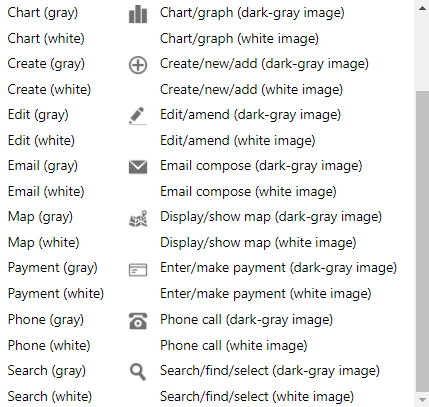
Image (library) - Button contains an image from a set of standard built-in images. Please see a sample of the built in button images below.
-
Image (custom) - Button contains a developer-supplied image (24px by 24px ideally)
-
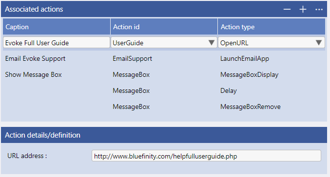
Pop-up menu - Button contains an ellipsis and when clicked displays a pop-up menu. requires the menu to be set up in click actions (please see image below)
In this example, a standard "text" Button Widget, first you need to set the "Button Capture Text" - the text that will appear within the button. Next the "Alternative Caption Text" holds alternative text that can be shown using
Adaptations when the screen real estate (size) is smaller. Minimum Width and Maximum Width set the boundaries for how wide the button can shrink to or grow to depending on the available screen real estate.
The
Actions on click/tap are the
functions of the Button. Click the Define button and you will be taken to a Click Action set up page (see image left). The Evoke
Click Actions are a comprehensive, powerful library of functions that you can call in relation to buttons, navigation, menus, etc. This example use uses a couple of simple Evoke Click Actions ("ShowPageSegment" and "HidePageSegment") but there are many additional Click Actions that you can use and we encourage you to review the
full list of Click Actions.
Now your Template is set up, you need to go back to where you started, the UI Design Tab and
General Tab tab, and pick, from the drop down list, the Template that you have just created, in the Data Content Template area.
The app design now has a Segment that will display a button and allow your users to click the button to invoke some action/function.
The additional tabs, as part of the "UI Design" screen have been used in this example (please review in the Example app design in your Evoke account) to a) adjust the
Spacing and
Colors of this Segment from the default
Theme settings and make the Button "green" b) make the Segment
Adapt to display the alternative button caption when the screen is smaller.
Jump back to
top of page to access list of widget examples again.
Creating and Configuring Signature Capture
We will use the "Signature Panel" Segment, from the Signature Confirm menu item of the Example app design and shown on the image on the right, as our example for creating and configuring Signature Capture to allow people sign with a finger, stylos or even a computer mouse.
In the app design, in the PageSeries ComponentsSignature and on the Page SignatureConfirm, a Segment (the Signature panel - bottom left on the screen) has been
added to the screen. Click on the Segment to select it and a red border will appear around the Segment. In the
General Tab we have selected a
Content Type of "Data (Single Entity)", which will indicate that we will be displaying a single piece of data, a single data element or a single data record. Please see image below on the right.
Next we need to identify where the Signature, that will be displayed, is located and where details of a new Signature are to be saved. Still in the General Tab we used the "
Build" button next to
DataSource, in the Data Content section, to select the
DataSource to be used. The DataSource
must be a single data record therefore select either a) a dataSource that is
not a collection or b) use the builder to select the ".current" property level (the currently selected data record in a collection) of a collective Datasource. In the example below the "DS_Order" Datasource has been selected (this is a single instance/non collection datasource). If there is not a suitable DataSource then use the "DataSources" Tab to create one. DS_Order is populated, in the example, with the selected SQLOrders record, using the "Order Number" selection at the top of the Page.
Now we need to give our Segment some structure and for this we will use a
Template. Use the "Data Templates" Tab or the "Go to" button in the Data Content area to enter the
Templates area. There are two choices of Template: Single-Entity (for individual data elements) and Multiple-Entity (for multiple records) - Segments with a Content Type of "Data (Single Entity)"
always use Single-Entity templates as they are a single record/data element. In this example (and in the image on the left) you will see a Single-Entity Template named "T_Signature". This template is going to display any existing Signature image in the record and allow the
input of a new Signature.
Select the "Base Entity type" (The Entity type of the record you want to display), in this case SQLOrders and then select which fields, from the Entity Type you want to display. These are the
Properties of the Template and can be selected from a drop down list after you add one or more Properties. In this case the Signature Property has been selected. The Entity Properties for "SQLOrders" are shown in the image below. The Signature property is simply an alphanumeric field however it value
must be unique and so it has an initial value (the value of the property whenever a new record is created) of the special Evoke value {guid} which will result in a unique number being created each time.
Each property is now configured in the
Widget definition for property section with an
Evoke Widget. The General Details tab of each Property (see image left) allows you to select the
Editor Type of the Widget, the example shows we have selected the "Signature Capture" Editor/Widget Type, which is a widget allowing a person's signature to be captured, but there are many
Widgets to choose from. You can also set things like the prompt text, alternative prompt text (for use with
Adaptations), Tab Index (to control the order fields are tabbed to),
Access Control, etc.
The Editor specific section of the "Widget definition for Property" allows you to set multiple settings that relate specifically to the Editor/Widget Type. In this example, a Signature Capture Widget, first you need to set the "Capture area width max", this will limit the maximum width of the signature capture box. Next the "widget row height" will specify the height of the signature capture box. Signatures are held as images (pictures), there are two ways to save/store these images: the first is a "static image", these are images that do not change, usually a company logo or photograph that can be uploaded from a computer at the time the app is designed and generated. The second are "databound images", these are images that a user will create/upload/change/etc and the path to the image is stored in your database with the image, usually, being stored in an images folder on your web server. The
Image Path Type allows you to specify which type your image is and for signature capture, in this example, the path will be a databound path so the image can be created and stored each time.
Now you need to specify where the images that are uploaded are stored. The
Image Path Prefix allows you to specify where to store the signature images. If the images are not physically stored in the database then they can be stored anywhere on the server (usually the web server) as long as this is accessible to the app. In this case, we have specified a path of "Images/Common/Products/" this will store the images within the Visual Studio project for this App (that is a known set of folders on the web server and is accessible to your app. It is usually that people use a folder in the Visual Studio Solution for storing images). If the final folder does not exist (e.g., in this example, Products) then please remember to create this.
The
Image Path Suffix Data is an option field - the name of the image photo is usually provided by the uniquely initialised GUID value however it is not mandatory to use a GUID and maybe you would want to use the Product Number or Customer number or other unique value, this suffix data field allows for the name of the image to be preceded (suffix) populated from a datafield in the database (Entity).
The
Image Path Suffix (ending .png) defines the final (static) part of the signature image path. This must end with .png and .png is included (see example) if you are not using any other identifier.
The
Image Alternate Path is used when you read and display a record that will have a signature but maybe does not have it just yet e.g. a delivery note that the customer must sign, etc. If the image is not found for the record (it does not exist yet) this is where the alternate image to display is stored. A default image, showing a pen, is provided by Evoke and can be reverted to using the "use default" button.
Now your Template is set up, you need to go back to where you started, the UI Design Tab and
General Tab tab, and pick from the drop down list, the Template that you have just created in the Data Content Template area.
The app design now has a Segment that will display the signature capture widget and allow your users to input a signature that will be captured, stored and identified, uniquely, from a specific data record. If a Signature image already exists and is identified by this record then it will be displayed in the Signature Capture box and maybe overwritten. In this example the record containing the signature image or fields awaiting the entry of a signature are populated in the DS_Order DataSource which is selected using the "Order Number" entry/selection widget at the top of this screen. The image is automatically retrieved and does not need to be retrieved separately (e.g. using a retreieverelateddata or any other method). Please note that the signature image is stored when you either a) perform a save using the tick/cross on an autosaved datasource or b) you add a "SavePageSeriesChanges" click action as a page button action or on the "capture" or "done" button on the actual signature panel (see Example app).
The additional tabs, as part of the "UI Design" screen have been used in this example (please review in the Sales_Order_processing app design in your Evoke account) to adjust the
Spacing and
Colors of this Segment from the default
Theme settings. No additional Headers, Navigation or Adaptations have been used in this example.
Jump back to
top of page to access list of widget examples again.
Creating and Configuring Charts and Graphs
Charts and Graphs help your users to visualize data. Evoke allows you to quickly and easily incorporate multiple graph types that you populate into a Datasource.
We will use the ComponentsGraphs page from the Example app design (that is included in all Evoke Accounts) as our example as we describe creating and configuring Charts/Graphs in this section.
Chart/graph types available to include in app designs include:
-
Pie
-
Stacked Area
-
Stacked Bar
-
Waterfall
-
Percent Area
-
Percent Bar
-
Step-Up Bar
In the Example app design, in the PageSeries ComponentsGraphs and on the Page Graphs, a Segment (the Line graph - top right on the screen) has been
added to the screen. Click on the Segment to select it and a red border will appear around the Segment.
In the
General Tab we have selected a
Content Type of "Chart/Graph", which opens up a new configuration area called
Chart/Graph definition. Please see image on the left.
First you will need to select, from the drop down list the Chart Type, choose a chart type of Area, Bar, Donut, Line, Percent Area, Percent Bar, Pie, Stacked Area, Stacked Bar, Setp-up Bar, Waterfall. In this example we have chosen Line. Next type into Caption the Caption/Heading to appear above the chart/graph and into the Sub-caption what you would like to appear below the caption. In our example we have used "Annual Sales Achieved" and "Evoke".
On some chart types, i.e. a pie chart, it is optional to show a legend (sometimes referred to as a key) and so a check box allowing you to show these or not is included. This option is not seen in our example as we are using a Line graph.
However, there is an option to Supress group totals which hides the totals of each line of segment from being displayed.
The next few configuration options should be self-explanatory; Orientation is which way round the graph is - vertical or horizontal. Horizontal label and Vertical label are simply the text that appears under each axis of the graph.
The Axis ticks are the graduation points (values) to be used along the value axis of the chart/graph.
Now you must define the data that will be used by the chart/graph. First, how many sets of data will be represented in the graph? Select, from the drop down options available, the
dataset Count. Give your first set of data a name in the
dataset#1 name box and now use the "
Build" button next to
dataset#1 datasource path to select the
DataSource that holds the data to be used in the chart/graph. This Datasource must be either the name of a collective datasource or a property within a datasource that represents a collection (list) of entities so the data can be grouped. Repeat the process of selecting a name and datasource path for
Dataset#2 name and
dataset#2 datasource path and any subsequent datasets. The image below left shows the datasources selected for this example.
Next you must identify the specific Property in the Datasource for the
Names (The property to be
used to obtain the values that will form the graduation points along the opposite axis to the value axis. Each discrete value for this property will be represented by a dedicated labelled graduation point.) and the
Values that will be used on the graph/chart. Use the "
Build" button next to
Property for names to select the
Entity Property that holds the names and again to select the
Property for values which is used to obtain the plotting value for each record within the dataset.
In this example we have used a very simple data structure to help illustrate the point. However, far more complex data structures may be used and Evoke
UI only Calculated Properties may be used to hold the values or names. The data used in the example is shown in the image on the right. The data has been refined simply by using a
Refined datasource with
Filtering. The actual datasources used in the example are shown on the left.
The final things to configure are the
group by - this setting allows you to define (if required) how records within the underlying datasource are to be grouped together to form compound/computed values for chart/graph plotting purposes. the options are:
-
None - No value grouping to be applied
-
Average - values in the same group are to be used to compute an average group value
-
Count - the value for the group will be the number of individual values occurring for the group
-
Sum - Values in the same group are to be added together to provide an overall group value
and the
Restrict records by setting that allows you to define (if required) whether only the first x number of records or the last x number of records within the underlying datasource are to be used for plotting purposes.
Jump back to
top of page to access list of widget examples again.
Creating and Configuring Labels
Labels allow the display only (no update/edit/entry/etc.) of an alphanumeric data field. They are one of the most commonly used forms of UI display. We will use the "Simple Widgets" page (in the image on the right) from the Example app design (that is included in all Evoke Accounts) as our example as we describe creating and configuring Labels in this section.
First, on the "SimpleWidgets" Page in the Example app design, a Segment (on the left of the screen shown opposite that contains the "Name" Label - the first field displayed) has been
added to the screen. Click on the Segment to select it and a red border will appear around the Segment. In the
General Tab we have selected a
Content Type of "Data (Single Entity)", however, Labels relate to any alphanumeric properties in
Entities and therefore are able to be used to display or enter alphanumeric values in "Data (Multi-Entity)" Datasources (collections) as well. Please see image below on the right.
Next we need to identify where the field/data, that will be displayed as a Label, is located. Still in the General Tab we used the "
Build" button next to
DataSource, in the Data Content section, to select the
DataSource to be used. In the example below the GlobalData Datasource "SelectedCompany" has been selected. A
Global Datasource is a DataSource that is available throughout the App/app design not just in the Page Series that it is defined in. Global Data Sources are defined and described in the
App Settings Global DataSource section, please see image left.
If there is not a suitable DataSource then use the "DataSources" Tab to create one. The "GlobalData.SelectedCompany" datasource is populated, in the Example app, with a SQLOrganization record in the PageSeries: PopulatingData and the Page: PopulatingData.
But we do need to give our Segment some structure and for this we will use a
Template. Use the "Data Templates" Tab or the "Go to" button in the Data Content area to enter the
Templates area. Depending on your Segment Content Type (either "Data (Single Entity) or Data (Multi Entity)") use either a Single-Entity or Multi-Entity template. In this example (and in the image on the left) you will see a Single-Entity Template named "SQLentitywidgets1" has been used.
Select which fields, from the Entity Type you want to display. These are the
Properties of the Template and can be selected from a drop down list after you add one or more Properties. Each property is now configured in the
Widget definition for property section with an
Evoke Widget. The General Details tab of each Property (see image left) allows you to select the
Editor Type of the Widget, the example shows a simple "Label" Editor/Widget Type, which is a non-editable single line display of text, alpha-numeric or numeric, data, but there are many
Widgets to choose from. You can also set things like the prompt text, alternative prompt text (for use with
Adaptations), Tab Index (to control the order fields are tabbed to),
Access Control, etc.
The Editor specific section of the Widget definition for property allows you to set multiple settings that relate specifically to the Editor/Widget Type. In this example the
minimum and maximum width of the text entry box (so that you can make the box bigger and smaller to look better), a
Text Alignment drop down list so you can choose the contents to be Left justified (default), Centered or Right justified (useful for numbers or currency) and a
Compressed height option that, when checked, will make the "display only" fields display closer together.
Now your Template is set up, you need to go back to where you started, the UI Design Tab and
General Tab tab, and pick, from the drop down list, the Template that you have just created, in the Data Content Template area.
The app design now has a Segment that will display a non editable alphanumeric field (Label).
In this example the Datasource is already populated, however, in other cases you may need to
Populate the DataSource using a click action or selection.
The additional tabs, as part of the "UI Design" screen have been used in this example (please review in the Example app design in your Evoke account) to a) adjust the
Spacing and
Colors of this Segment from the default
Theme settings b) make the Segment
Adapt to different display sizes. Although now used here, we could have added a
Header to the DataGrid or created a
Navigation menu.
Jump back to
top of page to access list of widget examples again.
Creating and Configuring Static Text
Static Text is useful in apps for longer descriptions/instructions/explanations to be added for the user. We will use the "Instructions" page (in the image on the right) from the Example app design (that is included in all Evoke Accounts) as our example as we describe creating and configuring Static Text in this section.
First, on the "Instructions" Page in the Example app design, a Segment (at the top of the page that contains the instructions) has been
added to the screen. Click on the Segment to select it and a red border will appear around the Segment. In the
General Tab we have selected a
Content Type of "Data (Single Entity)", Static Text is always "Data (Single Entity)" segments. Please see image below on the right.
The Static Text widget does not need a DataSource, it is independent, so you do not need to select a Datasource.
But we do need to give our Segment some structure and for this we will use a
Template. Use the "Data Templates" Tab or the "Go to" button in the Data Content area to enter the
Templates area. Segments with a Content Type of "Data (Single Entity)"
always use Single-Entity templates. In this example (and in the image on the left) you will see a Single-Entity Template named "Instructions". This template is going to display the
Static Text of the instructions.
This template is to simply display Static Text, therefore we have to give it a "base entity type" of a temporary data area. In Evoke variables/temporary data areas are called unbound_data.
You will still need to add a
Property, to hold Button configuration details. Evoke will offer multiple "unbounddata" temporary data areas and you can select anyone of these, even reuse them on the same page. The Property must now be configured in the
Widget definition for property section with an
Evoke Widget. The General Details tab of the Property (see image left) allows you to select the
Editor Type of the Widget, the example shows a "Static Text" Editor/Widget Type, which is just one of the many
Widgets available. You can also set things like the
Access Control so that you can decide which users will see this static text.
The Editor specific section of the "Widget definition for Property" allows you to add the
text that you want displayed into the Text box. The text is free format, however, all the standard HTML tags will work with the text. In the example shown we have used the "
< strong>" tag to make text bold and the "
< br>" tag to input a line break in to the text. While these are simple examples of the use of HTML they show the principle that HTML tags can be used in this static Text if you choose to use them (HTML tags are optional). There are a number of additional Editor Specific setting that will allow you to change the look and feel of your static text without using HTML; you can
Match prompt Padding so that the text lines up with the end of prompts, a
Center text checkbox that will center the text within the segment, Options to
indent the text from the left, right, top of bottom. A dropdown box to allow you to select the
text colour and check boxes for both
bold text and
italic text.
Now your Template is set up, you need to go back to where you started, the UI Design Tab and
General Tab tab, and pick from the drop down list, the Template that you have just created, in the Data Content Template area.
The app design now has a Segment that will display a button and allow your users to click the button to invoke some action/function.
The additional tabs, as part of the "UI Design" screen have been used in this example (please review in the Example app design in your Evoke account) to adjust the
Spacing and
Colors of this Segment from the default
Theme settings. It is also common to apply
Adaptations to the Segment, however, this example does not use these.
Jump back to
top of page to access list of widget examples again.
Creating and Configuring CheckBoxes
Checkboxes allow the display and entry of "Boolean" (on or off, true or false, etc) values. We will use the "Simple Widgets" page (in the image on the right) from the Example app design (that is included in all Evoke Accounts) as our example as we describe creating and configuring Checkboxes in this section.
First, on the "SimpleWidgets" Page in the Example app design, a Segment (on the left of the screen shown opposite that contains checkboxes) has been
added to the screen. Click on the Segment to select it and a red border will appear around the Segment. In the
General Tab we have selected a
Content Type of "Data (Single Entity)", however, Checkboxes relate to
Entities and therefore are able to be used to display or enter Boolean values in "Data (Multi-Entity)" Datasources (collections) as well. Please see image below on the right.
Next we need to identify where the Checkbox, that will be displayed/entered/updated, is located and where details of the Boolean value is to be saved. Still in the General Tab we used the "
Build" button next to
DataSource, in the Data Content section, to select the
DataSource to be used. In the example below the a GlobalData Datasource "SelectedCompany" has been selected. A
Global Datasource is a Data Sources that are available throughout the App/app design not just in the Page Series that it is defined in. Global Data Sources are defined and described in the
App Settings General DataSource section, please see image left.
If there is not a suitable DataSource then use the "DataSources" Tab to create one. The "GlobalData.SelectedCompany" datasource is populated, in the Example app, with a SQLOrganization record in the PageSeries: PopulatingData and the Page: PopulatingData.
But we do need to give our Segment some structure and for this we will use a
Template. Use the "Data Templates" Tab or the "Go to" button in the Data Content area to enter the
Templates area. Depending on you Segment Content Type (either "Data (Single Entity) or Data (Multi Entity)") use either a Single-Entity or Multi-Entity template. In this example (and in the image on the left) you will see a Single-Entity Template named "SQLentitywidgets1" has been used.
This Template is to simply display or allow entry of a
Checkbox, therefore we have created a new Single-Entity Template, named it and selected the "Base Entity type" (The Entity type of the record you want to display) of SQLOrganization. Select which fields, from the Entity Type you want to display/enter. These are the
Properties of the Template and can be selected from a drop down list after you add one or more Properties. Each property is now configured in the
Widget definition for property section with an
Evoke Widget. The General Details tab of the Property (see image left) allows you to select the
Editor Type of the Widget, the example shows a "Checkbox" Editor/Widget Type, which is just one of the several
Widgets available for checkboxes such as "CheckboxDisplay" and "Checkbox Button". You can also set things like the prompt text, alternative prompt text (for use with
Adaptations), Tab Index (to control the order fields are tabbed to),
Access Control so that you can decide which users will see this checkbox, etc.
The Editor specific section of the Widget definition for property allows you to set multiple settings that relate specifically to the Editor/Widget Type. In this example, there are no editor specific settings for a checkbox that allows entry of a checkmark to indicate true or false. However, the CheckboxDisplay widget offers a
Compressed height option that, when checked, will make the "display only" fields display closer together. The CheckboxButton widget also has the settings that you can find in the "
creating and using a Button" section above.
Now your Template is set up, you need to go back to where you started, the UI Design Tab and
General Tab tab, and pick from the drop down list, the Template that you have just created in the Data Content Template area.
The app design now has a Segment that will display a checkbox and allow your users to click the checkbox to set the boolean value to true or false.
The additional tabs, as part of the "UI Design" screen have been used in this example (please review in the Example app design in your Evoke account) to adjust the
Spacing and
Colors of this Segment from the default
Theme settings. It is also common to apply
Adaptations to the Segment, however, this example does not use these.
Jump back to
top of page to access list of widget examples again.
Creating and Configuring Images
There are multiple ways to include images (pictures, photographs, drawings, etc) in your app, these include Segment Images and Widget Images. The following section uses examples from the Example app design to describe how to display, update and use images into your app.
Segment Images
A
Segment can simply hold an image if you wish. This makes use of the Evoke images
Content Types. The login screen (see image right) of the Example app is a good demonstration of the use of a Segment Image.
There are two types of Segment Images - Static Images and Databound Images. We will review these two types of images separately.
Static Images
The example of the login page is an example of a Static Image. A Static Image is an image that is included in the app prior to the app being generated. Typical examples of Static Images would be a company logo, custom Buttons, etc. A path to the image, held on the computer environment of the Evoke app designer (i.e. on the network or their computer - somewhere accessible at the time of app generation) is included in the app design and the image is then included in the app when the app is generated.
The image on the left shows the configuration of a "Content Type" of
Image (static). First set the
Content Center Style to select the style of centering for your image a) none b) center vertically only c) center horizontally only d) center both vertically and horizontally.
Next identify the image in the
Image Name, this is the location of the image in your computer file system (on your computer/network selected via the choose button).
The
Image size summary is completed automatically by Evoke and contains the actual size and width of the image selected. The
Image Opacity is used to set the opacity (transparency) of the image. Pick from the dropdown list of % transparent to make the image.
Image Stretching issued to set the maximum amount of image stretching to be performed e.g. only up to 200% original image size etc.
Image fixed size is used to identify a fixed size of an image (width, height) i.e. the selected image will be displayed as this size and the
Show Image Zoom Slider is used to force a "zoom slider" to be displayed when the image is displayed on a desktop computer so that the image can be zoomed without touch screen controls.
Is Clickable allows you to specify if the image is clickable by the app user, allowing a click on the image to open a new page or perform other actions, if checked this is used in conjunction with the next field
Click Action which will open the Evoke
Click Actions configurator allowing navigation to another page or any of the other powerful Evoke click actions.
We will use the Example app Page WidgetsImage-ImageFullPage as our example of a Databound Image (see image right). A Databound Image is an image that is included in and retrieved from your Database. Typical examples of databound Images would be a photo of a product (different for and specific to each product), staff photos/images, etc.
The image on the left shows the configuration of a "Content Type" of
Image (databound). First set the
Content Center Style to select the style of centering for your image a) none b) center vertically only c) center horizontally only d) center both vertically and horizontally.
Next you need to identify the
Image Path Prefix, this is where to store the images that uploaded and where to find images that are identified by an identifier in a data record. If they are not physically stored in the database (as is the case in this example) then they can be stored anywhere on the server as long as this is accessible to the app. In this case, we have specified a path of "Images/Common/Products" this will store the images within the Visual Studio project for this App that was deployed to a web server. In this case .../Web/Images/Common/Products. If the final folder does not exist (e.g. Products) then please remember to create this AND set the permissions of the folder so that images can be written to it. You can now specify the
Image databind Path, this is the datasource and property to be used to identify the image (provide the identifier of the image name as indicated above).
The
Image Path Suffix (data) allows you to pick out all or part of the name of the image file from the current data record, possibly the unique product number, while the
Image Path Suffix (static) - the name of the image/photo is provided by the uniquely initialied GUID value, this suffix field defines the filetype extension that you specified to be added. In this example we have used .JPG which opens all images uploaded from mobile devices and those scanned/stored on a desktop computer.
You have a lot of flexibility in creating your image path name, it is possible that you might have an Image path prefix of Images/Common/Products, an Image databind path Product.Image (that contains a GUID - a unique number), an Image path suffix data of Product.ProductID (that contained the product ID of 12345) and an image path suffix of .png - This would result in an image path for each of your images of "Images/Common/Products/{GUID value}12345.png". As you can see all four fields are concatenated. If you had a variable image type e.g. some are .png, some of .jpg and some are .gif then you can use the Image path suffix (data) to hold a variable suffix (.png, .jpg, etc.) and leave the Image Path Suffix (static) blank. Although you must have some way of identifying your images, each of the four fields described here are optional and can, in most cases be used interchangably.
The
On image not found option allows you to determine what to do if the image is not available (e.g. there is no image name in the data record or the image name is wrong). The options are a) use an alternative image - use an image specified in the "alternative path setting" b) Hide Container which hides the Segment that contains the image c) Do nothing - take no special action (default option).
The
Image size summary is completed automatically by Evoke and contains the actual size and width of the image selected. The checkbox option of
Disable Browser Cache is used in conjunction with the Widget ID during an
image upload to ensure that the new image is displayed immediately and not a cached image. In this example this is not checked and this will therefore not disable the browser cache. The
Image Opacity is used to set the opacity (transparency) of the image. Pick from the dropdown list of % transparent to make the image.
Image Stretching issued to set the maximum amount of image stretching to be performed e.g. only up to 200% original image size etc.
Image fixed size is used to identify a fixed size of an image (width, height) i.e. the selected image will be displayed as this size and the
Show Image Zoom Slider is used to force a "zoom slider" to be displayed when the image is displayed on a desktop computer so that the image can be zoomed without touch screen controls.
Is Clickable allows you to specify if the image is clickable by the app user, allowing a click on the image to open a new page or perform other actions, if checked this is used in conjunction with the next field
Click Action which will open the Evoke
Click Actions configurator allowing navigation to another page or any of the other powerful Evoke click actions.
Images can be included in an app design using
Image Widgets. The "Image Widgets" screen (see image right) of the Example app is a good demonstration of the use of a multiple Image Widgets.
As with Segment images, there are two types of Images that can be configured with Widgets - Static Images and Databound Images. We will review these two types of images separately.
Static Images
An example of a envelope, indicating a message has arrived, is a good example of a Static Image that would be used in a Widget (please see the example screens below left and right). A Static Image is an image that is included in the app prior to the app being generated.
A path to the image, held on the computer environment of the Evoke app designer (i.e. on the network or their computer - somewhere accessible at the time of app generation) is included in the app design and the image is then included in the app when the app is generated.
The image on the left shows the configuration of the "Editor Specific" settings of the
Image Widget when the "Image Path Type" is set to
static path.
First, you can optionally check the
Metered connection check checkbox. This will supress the downloading of an image if the app is running over a metered connection. At present, the metered connection check is controlled by the value of a special property "OnMeteredConnection" within the AppUser record (available throughout the app design as GlobalData.Currentuser.OnMeteredConnection").
The
Image Path is the location of the image in your computer file system (on your computer/network selected via the choose button) and
Only display if data equal to allows you to test the Datasource Property that this Widget is bound to against a value/{true}/{false}/text/etc to determine if the display on the image should be supressed or not i.e. only display the "envelope.png" image if the "messagereceive" property is set to 1/{true}.
Is Clickable allows you to specify if the image is clickable by the app user, allowing a click on the image to open a new page or perform other actions, if checked this is used in conjunction with the next field
Click Action which will open the Evoke
Click Actions configurator allowing navigation to another page or any of the other powerful Evoke click actions.
Capturing, saving, displaying photos or other images is a very useful feature of an app. This section describes Data Bound Images as part of the Widgets
Image and
Image Uploader (images that are captured from a device during app operation or from a database datafile). Using photos or pictures for backgrounds, logos, icons, pictures, etc that are used in the app design and do not change once a app is generated are called
Static Images When uploading and/or displaying images choices need to be made regarding storing the image and establishing a reference/pointer to the image in the database record.
This example reviews photos being physically stored centrally, outside the database and a pointer to that photo being included in the database record. We will use the example of an expense form, with separate expense lines that each have the option of a receipt being uploaded, stored and displayed. Further examples of the use of
Widgets that have databound images may be found in the Example app design in the PageSeries WidgetsImages on the Image Widgets page (see image above).
The Database Fields
The Evoke App
Entity for the Expense Line will need a field for the pointer to the image to be stored. This field will need to be initialised, when a new expense line is create, to hold a unique value. This will be used to name the photo and resolves the issue of two or more people uploading an image called, for example, "myreceipt.jpg". If the database already has existing records that you want to add an image/photo to, e.g. a product record, then the current database will need this new field in the existing records initialised to a unique value.
The new photo name/pointer field is simply an Alphanumeric or Short String field. It can be called anything you would like and in this example we have called it GUID. The reason for this is that Evoke can initialise the field for you when a new record is created and the {GUID} command in the Entity field initialise value option will generate a unique 6 digit value in this field. It is important that image names are unqiue.
An example of the new field in the receipt line Entity is shown on the right and the initialise option of {GUID} is shown also.
Add Display image and Upload image to an App screen / Page
In the Page where you would like to display and offer the option to upload a new photo/image, either access the template you would like to add this to OR create a new template. This template will need to be linked to the Datasource that contains the name/pointer field (in the case of the example this is the Expense Line entity).
Add two new properties to the template and select GUID for both. It is fine to have two instances of the same entity property in the same template. The first instance will be to display the image, the second will be to offer the upload option.
Display Image/Photo
For the first instance select the Editor Type of "Image". A screenshot of the setup of this widget, within the template, is shown on the right. It is very important for this widget to give it a unique widget id, in the example we have used "ReceiptImageUpload". This will be used to ensure that new images are immediately displayed even if a browser is caching images.
The following editor specific fields further define the widget:
-
Widget Row Height - Select the size that you would like to reserve for displaying the image.
-
Metered Connection Check - If the boolean property "OnMeteredConnection" in the AppUser Entity is set to {true} then the image is not downloaded to the device to save using the users "data" allowance. At present, the metered connection check is controlled by the value of a special property "OnMeteredConnection" within the AppUser record (available throughout the app design as GlobalData.Currentuser.OnMeteredConnection").
-
Image Path Type - as the image is to be uploaded and stored, in this example, the path will be a databound path
-
Image Path Prefix - where to store the images. If they are not physically stored in the database (this example) then they can be stored anywhere on the server as long as this is accessible to the app. In this case, we have specified a path of "Images/Common/Receipts" this will store the images within the Visual Studio project for this App that was deployed to a web server. In this case .../Web/Images/Common/Receipts. If the final folder does not exist (e.g. receipts) then please remember to create this.
-
Image Path Suffix Data - the name of the image photo is provided by the uniquely initialised GUID value (which can be blank or nothing), this suffix data field allows for the name of the image to be populated from a datafield in the database (Entity).
-
Image Path Suffix (with .ext) - the name of the image photo is provided by the uniquely initialised GUID value, this suffix field defines the filetype extension to be added. In this example we have used .JPG which opens all images uploaded from mobile devices and those scanned/stored on a desktop computer.
-
On Image not found - options are a) Use alternative image (allows for the selection of an alternate image), b) hide container (hides the box the image would have appeared in), or c) do nothing.
-
Image Alternate Path - If On Image not found is checked this is where the alternate image is stored. Note this must be an accessible location i.e. within your webapp/Visual Studio solution (see above).
-
Disable Browser Cache - used in conjunction with the Widget ID during the image upload to ensure that the new image is displayed immediately and not a cached image. In this example this is checked to disable the browser cache.
-
Is Clickable - is the image clickable allowing a click on the image to open a new page or perform other actions, if checked this is used in conjunction with the next field "Actions on Click/Tap".
-
Actions on Click/Tap - opens the Evoke Click Actions allowing navigation to another page or any of the other powerful Evoke click actions.
Upload Image/Photo
For the second instance select the Editor Type of "ImageUploader". in this case the Editor Specific options change and a screenshot of the setup of this widget, within the template, is shown on the right.
The following editor specific fields further define the widget:
-
Caption text - the caption for the image uploader button, in the example at the top of this screen this text is "Upload Receipt" on the button.
-
Alternative Caption text - the alternative caption for the image uploader button, that may be used in conjunction with the Evoke Adaptations.
-
Image Path Type - as the image is to be uploaded and stored, in this example, the path will be a databound path
-
Image Path Prefix - where the images are to be stored when uploaded. If they are not physically stored in the database (this example) then they can be stored anywhere on the server as long as this is accessible to the app. In this case, we have specified a path of "Images/Common/Receipts" this will store the images within the Visual Studio project for this App that was deployed to a web server. In this case .../Web/Images/Common/Receipts. If the final folder does not exist (e.g. receipts) then please remember to create this.
-
Image Path Suffix Data - the name of the image photo is provided by the uniquely initialised GUID value (which can be blank or nothing), this suffix data field allows for the name of the image to be populated from a datafield in the database (Entity).
-
Image Path Suffix (with .ext) - the name of the image photo is provided by the uniquely initialised GUID value, this suffix field defines the filetype extension to be added. In this example we have used .JPG which opens all images uploaded from mobile devices and those scanned/stored on a desktop computer.
-
Image widgets to reload - enter the Widget IDs of the widgets used to display this image, these will then automatically be updated to avoid image caching by a browser. Add multiple widgets by adding a space between widget IDs.
-
Maximum dimension size - The maximum size in any one dimension (width and/or height) for the uploaded image. Thus reducing the physical size of the image that you upload and store.
-
Forced Image Orientation - select from none, portrait or landscape - forces the orientation of the image to be uploaded to be either protrait or landscape. If the image is upside down i.e. taken on a phone that is held upside down then it will also rotate the image so that it is the right way up.
-
Disable Browser Cache - used in conjunction with the Widget ID during the image upload to ensure that the new image is displayed immediately and not a cached image.
-
Is Clickable - is the image clickable allowing a click on the image to open a new page or perform other actions, if checked this is used in conjunction with the next field "Actions on Click/Tap".
-
Actions on Click/Tap - opens the Evoke Click Actions allowing navigation to another page or any of the other powerful Evoke click actions.
Jump back to
top of page to access list of widget examples again.
In addition to the "forced image orientation" property in image upload widgets, there are click actions that allow images to be flipped on the horizontal or vertical mid-axis.
There are also a couple of additional "evoke button library" images that can be used to invoke the click actions. Please see image right.
As can be seen in the Example app, the click actions:
-
FlipImageLeftRight - allows you to flip and image along its vertical mid-axis
-
FlipImagetopBottom - allows you to flip and image along its horizontal mid-axis
-
FlipServerImage - Flips the server held image the same way as an image has been flipped locally
There is an example of using these click actions shown on the right.
This is taken from the Example app "Widget Images" section.
Jump back to
top of page to access list of widget examples again.
Creating and Configuring Chatbots
A chatbot is artificial intelligence (AI) software that can simulate a conversation (or a chat) with an app user in natural language.
Chatbots have been described as one of the most advanced and promising expressions of interaction between humans and machines and have proven very efficient and cost effective as a communication method to guide, support and interact with with your app users.
We will use the "Components - Chatbots" page (in the image on the right) from the Example app design (that is included in all Evoke Accounts) as our example as we describe creating and configuring a Chatbot using the Chatbots Component in this section.
In the Example app design, in the PageSeries ComponentsChatbots and on the Page Chatbots, a Segment (the Chatbot area) has been
added to the screen. Click on the Segment to select it and a red border will appear around the Segment.
In the
General Tab we have selected a
Content Type of "
Component", which opens up a new configuration area called
Component definition. Please see image on the left.
First you will need to select, from the drop down list the Component Type, choose "Chatbot window". Next the Chatbot framework - at present there are two options for the Chatbot Framework that you can select to use for the AI questions and answers that the Evoke Chatbot component will use, these are a) the IBM Watson back-end Chatbot configuration tool and b) a bespoke custom (Evoke specific) implementation of the chatbot back-end configuration. In this example we have chosen "Custom" (Evoke specific).
The subsequent settings allow you to configure things like the button colors, a URL for the Chatbot service, etc. A comprehensive example of using chatbots within an Evoke app is available at
Creating and configuring ChatBots and it is recommended that you review this as you continue to configure a Chatbot component within Evoke, including if you also use "custom" which is the
proprietary Evoke framework implemented in Javascript description.
Jump back to
top of page to access list of widget examples again.
Creating and Configuring Date Display and DatePickers
Dates are commonly used in business apps. To display a
Date field in an Evoke app design use the
Label Widget. To enter a date field you can use the
Datepicker widget. Most devices, from mobile phones through to desktop computers have the capability of allowing the user to "pick" a date rather than just enter a date value. This has the advantage of validation of the data entered and no question regarding the format of the date i.e. dd/mm/yy or mm/dd/yy or dd/mm/yyyy etc. We will use the "Simple Widgets" page (in the image on the right) from the Example app design (that is included in all Evoke Accounts) as our example as we describe creating and configuring
DatePickers in this section.
First, on the "SimpleWidgets" Page in the Example app design, a Segment (on the left of the screen shown opposite that contains dates - both a display of a date and the use of a datepicker) has been
added to the screen. Click on the Segment to select it and a red border will appear around the Segment. In the
General Tab we have selected a
Content Type of "Data (Single Entity)", however, DatePickers relate to
Entities and therefore are able to be used to select ("Pick") dates in "Data (Multi-Entity)" Datasources (collections) as well. Please see image below on the right.
Next we need to identify where the Date, that will be displayed/entered/updated by the DatePicker, is located and where a new date is to be saved. Still in the General Tab we used the "
Build" button next to
DataSource, in the Data Content section, to select the
DataSource to be used. In the example below a GlobalData Datasource "SelectedCompany" has been selected. A
Global Datasource is a Data Sources that are available throughout the App/app design not just in the Page Series that it is defined in. Global Data Sources are defined and described in the
App Settings General DataSource section, please see image left.
If there is not a suitable DataSource then use the "DataSources" Tab to create one. The "GlobalData.SelectedCompany" datasource is populated, in the Example app, with a SQLOrganization record in the PageSeries: PopulatingData and the Page: PopulatingData.
We need to give our Segment some structure and for this we will use a
Template. Use the "Data Templates" Tab or the "Go to" button in the Data Content area to enter the
Templates area. Depending on your Segment Content Type (either "Data (Single Entity) or Data (Multi Entity)" use either a Single-Entity or Multi-Entity template. In this example (and in the image on the left) you will see a Single-Entity Template named "SQLentitywidgets1" has been used.
This Template is to provide a
DatePicker, therefore we have created a new Single-Entity Template, named it and selected the "Base Entity type" (The Entity type of the record you want to display) of SQLOrganization. Select which fields, from the Entity Type you want to display/enter. These are the
Properties of the Template and can be selected from a drop down list after you add one or more Properties. The date property that we wish to update is in the MainContact record that is associated with the selected Organization record, therefore we have selected the MainContact Entity Property. This requires us to identify which
Sub-Property to use. Evoke identifies that the "Main Contact" property is an Entity (related data record) and offers a new input parameter of
Sub-Property in the General Details tab in the
Widget definition for property, together with a "
Build" button.
Each property is now configured in the
Widget definition for property section with an
Evoke Widget. The General Details tab of the Property (see image left) allows you to select the
Editor Type of the Widget, the example shows a "DatePicker" Editor/Widget Type. You can also set things like the prompt text, alternative prompt text (for use with
Adaptations), Tab Index (to control the order fields are tabbed to),
Access Control so that you can decide which users will see this checkbox, etc.
The Editor specific section of the Widget definition for property allows you to set multiple settings that relate specifically to the Editor/Widget Type. In this example the
minimum and maximum width of the date entry box (so that you can make the box bigger and smaller to look better).
Now your Template is set up, you need to go back to where you started, the UI Design Tab and
General Tab tab, and pick from the drop down list, the Template that you have just created, in the Data Content Template area.
The app design now has a Segment that will display a date and will invoke the "DatePicker" of the device the app is running on to allow the user to select a new date.
The additional tabs, as part of the "UI Design" screen have been used in this example (please review in the Example app design in your Evoke account) to adjust the
Spacing and
Colors of this Segment from the default
Theme settings. It is also common to apply
Adaptations to the Segment, however, this example does not use these.
Jump back to
top of page to access list of widget examples again.
Creating and Configuring Time Picker
Times are commonly used in business apps. To display a
Time field in an Evoke app design use the
Label Widget. To enter a time field you can use the
Timepicker widget. Most devices, from mobile phones through to desktop computers have the capability of allowing the user to "pick" a time rather than just enter a time value. This has the advantage of validation of the time entered and no question regarding the format of the time i.e. 12 hour, 24 hour, military, etc. We will use the "Simple Widgets" page (in the image on the right) from the Example app design (that is included in all Evoke Accounts) as our example as we describe creating and configuring
TimePickers in this section.
First, on the "SimpleWidgets" Page in the Example app design, a Segment (on the left of the screen shown opposite that contains a time entry field) has been
added to the screen. Click on the Segment to select it and a red border will appear around the Segment. In the
General Tab we have selected a
Content Type of "Data (Single Entity)", however, TimePickers relate to
Entities and therefore are able to be used to select ("Pick") times in "Data (Multi-Entity)" Datasources (collections) as well. Please see image below on the right.
Next we need to identify where the Time, that will be displayed/entered/updated by the TimePicker, is located and where a new time is to be saved. Still in the General Tab we used the "
Build" button next to
DataSource, in the Data Content section, to select the
DataSource to be used. In the example below a GlobalData Datasource "SelectedCompany" has been selected. A
Global Datasource is a Data Sources that are available throughout the App/app design not just in the Page Series that it is defined in. Global Data Sources are defined and described in the
App Settings General DataSource section, please see image left.
If there is not a suitable DataSource then use the "DataSources" Tab to create one. The "GlobalData.SelectedCompany" datasource is populated, in the Example app, with a SQLOrganization record in the PageSeries: PopulatingData and the Page: PopulatingData.
We need to give our Segment some structure and for this we will use a
Template. Use the "Data Templates" Tab or the "Go to" button in the Data Content area to enter the
Templates area. Depending on your Segment Content Type (either "Data (Single Entity) or Data (Multi Entity)" use either a Single-Entity or Multi-Entity template. In this example (and in the image on the left) you will see a Single-Entity Template named "SQLentitywidgets1" has been used.
This Template is to provide a
TimePicker, therefore we have created a new Single-Entity Template, named it and selected the "Base Entity type" (The Entity type of the record you want to display) of SQLOrganization. Select which fields, from the Entity Type you want to display/enter. These are the
Properties of the Template and can be selected from a drop down list after you add one or more Properties. The time property that we wish to update is in the MainContact record that is associated with the selected Organization record, therefore we have selected the MainContact Entity Property. This requires us to identify which
Sub-Property to use. Evoke identifies that the "Main Contact" property is an Entity (related data record) and offers a new input parameter of
Sub-Property in the General Details tab in the
Widget definition for property, together with a "
Build" button.
Each property is now configured in the
Widget definition for property section with an
Evoke Widget. The General Details tab of the Property (see image left) allows you to select the
Editor Type of the Widget, the example shows a "TimePicker" Editor/Widget Type. You can also set things like the prompt text, alternative prompt text (for use with
Adaptations), Tab Index (to control the order fields are tabbed to),
Access Control so that you can decide which users will see this checkbox, etc.
The Editor specific section of the Widget definition for property allows you to set multiple settings that relate specifically to the Editor/Widget Type. In this example the
minimum and maximum width of the time entry box (so that you can make the box bigger and smaller to look better).
Now your Template is set up, you need to go back to where you started, the UI Design Tab and
General Tab tab, and pick from the drop down list, the Template that you have just created, in the Data Content Template area.
The app design now has a Segment that will display a date and will invoke the "TimePicker" of the device the app is running on to allow the user to select a new time.
The additional tabs, as part of the "UI Design" screen have been used in this example (please review in the Example app design in your Evoke account) to adjust the
Spacing and
Colors of this Segment from the default
Theme settings. It is also common to apply
Adaptations to the Segment, however, this example does not use these.
Jump back to
top of page to access list of widget examples again.
Creating and Configuring Password widget
The Password
Widget allows the display and entry of an alphanumeric "password" data field. The actual characters, in the Data Entry, are obscured by "****" as they are when used in
read only mode i.e. as a password version of a "label". A password field can, of course, be displayed, without the characters being obscured, as a (data entry) "Textbox" or a (read only) "Label" if you wish. We will use the "Simple Widgets" page (in the image on the right) from the Example app design (that is included in all Evoke Accounts) as our example as we describe creating and configuring the
Password Widget in this section.
First, on the "SimpleWidgets" Page in the Example app design, a Segment (on the left of the screen shown opposite that contains the "Password" Password Widget) has been
added to the screen. Click on the Segment to select it and a red border will appear around the Segment. In the
General Tab we have selected a
Content Type of "Data (Single Entity)", however, the Password Widget relates to alphanumeric properties in
Entities and therefore are able to be used to display or enter alphanumeric "Password" values in "Data (Multi-Entity)" Datasources (collections) as well. Please see image below on the right.
Next we need to identify where the Password, that will be displayed/entered/updated, is located and where the alphanumeric "new password" value is to be saved. Still in the General Tab we used the "
Build" button next to
DataSource, in the Data Content section, to select the
DataSource to be used. In the example below the a GlobalData Datasource "SelectedCompany" has been selected. A
Global Datasource is a Data Sources that are available throughout the App/app design not just in the Page Series that it is defined in. Global Data Sources are defined and described in the
App Settings General DataSource section, please see image left.
If there is not a suitable DataSource then use the "DataSources" Tab to create one. The "GlobalData.SelectedCompany" datasource is populated, in the Example app, with a SQLOrganization record in the PageSeries: PopulatingData and the Page: PopulatingData.
We now need to give our Segment some structure and for this we will use a
Template. Use the "Data Templates" Tab or the "Go to" button in the Data Content area to enter the
Templates area. Depending on your Segment Content Type (either "Data (Single Entity) or Data (Multi Entity)" use either a Single-Entity or Multi-Entity template. In this example (and in the image on the left) you will see a Single-Entity Template named "SQLentitywidgets1" has been used.
Select which fields, from the Entity Type you want to display. These are the
Properties of the Template and can be selected from a drop down list after you add one or more Properties. Each property is now configured in the
Widget definition for property section with an
Evoke Widget. The General Details tab of each Property (see image left) allows you to select the
Editor Type of the Widget, the example shows a simple "Password" Editor/Widget Type, which is an editable single line text input or non-editable
obscured alpha-numeric value. You can also set things like the prompt text, alternative prompt text (for use with
Adaptations), Tab Index (to control the order fields are tabbed to),
Access Control, etc.
The Editor specific section of the Widget definition for property allows you to set multiple settings that relate specifically to the Editor/Widget Type. In this example, an
input hint (text to appear in a text entry box before anything is entered), the
minimum and maximum width of the text entry box (so that you can make the box bigger and smaller to look better),
Is read only (sets the Widget to be an password (obscured characters) version of a label),
Hide borders/background (sets the Widget to not have borders or background - just like a label widget) etc.
Now your Template is set up, you need to go back to where you started, the UI Design Tab and
General Tab tab, and pick from the drop down list, the Template that you have just created, in the Data Content Template area.
The app design now has a Segment that will display a Password (obscured characters), including any obscured existing contents of that alphanumeric field, and allow your users to update the value by typing new obscured alphanumeric characters into the Password Widget.
In this example the Datasource is already populated, however, in other cases you may need to
Populate the DataSource using a click action or selection.
The additional tabs, as part of the "UI Design" screen have been used in this example (please review in the Example app design in your Evoke account) to a) adjust the
Spacing and
Colors of this Segment from the default
Theme settings b) make the Segment
Adapt to different display sizes. Although not used here, we could have added a
Header to the DataGrid or created a
Navigation menu.
Jump back to
top of page to access list of widget examples again.
Creating and Configuring Lookups
Lookups allow the user to select, from a list of static (
Classifications) or dynamic (selective data) options an alphanumeric data field. They are commonly used forms of UI data entry. We will use the "Simple Widgets" page (in the image on the right) from the Example app design (that is included in all Evoke Accounts) as our example as we describe creating and configuring
Lookups in this section.
There are two additional Lookup widgets, there are the
TextboxLookup and the
TextboxLookupButton. These are combination widgets and offer the functions of the Lookup widget (described here) PLUS the features of the
Textbox widget (allows both a dropdown list
or the option to type the selection in). The TextboxLookupButton widget additionally provides all the button functions found in the "
creating and using a Button" section above.
First, on the "SimpleWidgets" Page in the Example app design, a Segment (on the left of the screen shown opposite that contains the "Type" Lookup) has been
added to the screen. Click on the Segment to select it and a red border will appear around the Segment. In the
General Tab we have selected a
Content Type of "Data (Single Entity)", however, Lookups relate to alphanumeric or "Classification Entity" properties in
Entities and therefore are able to be used to display or enter alphanumeric values in "Data (Multi-Entity)" Datasources (collections) as well. Please see image below on the right.
Next we need to identify where the data, that will be displayed/entered/updated, is located and where the value is to be saved. Still in the General Tab we used the "
Build" button next to
DataSource, in the Data Content section, to select the
DataSource to be used. In the example below the a GlobalData Datasource "SelectedCompany" has been selected. A
Global Datasource is a Data Sources that are available throughout the App/app design not just in the Page Series that it is defined in. Global Data Sources are defined and described in the
App Settings General DataSource section, please see image left.
If there is not a suitable DataSource then use the "DataSources" Tab to create one. The "GlobalData.SelectedCompany" datasource is populated, in the Example app, with a SQLOrganization record in the PageSeries: PopulatingData and the Page: PopulatingData. An image of the Entity Property is on the right and you are encouraged to review a description of
Static and Dynamic Lookups) including using Classifications.
We need to give our Segment some structure and for this we will use a
Template. Use the "Data Templates" Tab or the "Go to" button in the Data Content area to enter the
Templates area. Depending on your Segment Content Type (either "Data (Single Entity) or Data (Multi Entity)" use either a Single-Entity or Multi-Entity template. In this example (and in the image on the left) you will see a Single-Entity Template named "Lookupwidgets" has been used.
Select which fields, from the Entity Type you want to display. These are the
Properties of the Template and can be selected from a drop down list after you add one or more Properties. Each property is now configured in the
Widget definition for property section with an
Evoke Widget. The General Details tab of each Property (see image left) allows you to select the
Editor Type of the Widget, the example shows a "Lookup" Editor/Widget Type. At the "Property" selected is a
classification a further box offering the chance to select the
Sub-Property appears, in here use the builder (build button) to select the a property of the Classsification (in this example the property "code" has been selected). You can also set things like the prompt text, alternative prompt text (for use with
Adaptations), Tab Index (to control the order fields are tabbed to),
Access Control, etc.
The Editor specific section of the Lookup Widget definition allows you to set multiple settings that relate specifically to the Editor/Widget Type. In this example, an
input hint (text to appear in a text entry box before anything is entered), the
minimum and maximum width of the Lookup entry box (so that you can make the box bigger and smaller to look better), the
Datasource to be used for the dropdown list (if this is a Classification then this will be automatically populated by Evoke to be "GlobalData.{ClassificationName}). If you are using a Dynamic dropdownlist then you will need to use the Build button to select a seperate DataSource that you have pre-populated, there are additional details in the
Static and Dynamic Lookups user guide area. Now you must decide which Properties, from the Lookup Datasource you would like to display, in columns, in the dropdown, use the builder (build Button) to pick one of multiple Properties to drop down. The
Actions on option select are the
Evoke Click Actions that will be invoked when an option is selected from the dropdown list. Click the Define button and you will be taken to a Click Action set up page (see image left). The Evoke
Click Actions are a comprehensive, powerful library of functions that you can call in relation to buttons, navigation, menus, etc. This example uses a couple of simple Evoke Click Actions ("ShowPageSegment" and "HidePageSegment") but there are many additional Click Actions that you can use and we encourage you to review the
full list of Click Actions.
Now your Template is set up, you need to go back to where you started, the UI Design Tab and
General Tab tab, and pick from the drop down list, the Template that you have just created, in the Data Content Template area.
The app design now has a Segment that will display a dropdown list of options to select into an alphnumeric (or Classification) entry field, including any existing contents of that alphanumeric field, and allow your users to update the value by typing new alphanumeric characters into the textbox.
In this example the Datasource is already populated, however, in other cases you may need to
Populate the DataSource using a click action or selection.
The additional tabs, as part of the "UI Design" screen have been used in this example (please review in the Example app design in your Evoke account) to a) adjust the
Spacing and
Colors of this Segment from the default
Theme settings b) make the Segment
Adapt to different display sizes. Although now used here, we could have added a
Header to the DataGrid or created a
Navigation menu.
Jump back to
top of page to access list of widget examples again.
Creating and Configuring Radio Buttons
Radio Buttons allow the user to select, from a list of static (
Classifications) or dynamic (selective data) options of an alphanumeric data field. They are commonly used forms of UI data entry. We will use the "Simple Widgets" page (in the image on the right) from the Example app design (that is included in all Evoke Accounts) as our example as we describe creating and configuring
Radio Buttons in this section. For Boolean options use the "Checkbox" Widget.
First, on the "SimpleWidgets" Page in the Example app design, a Segment (on the left of the screen shown opposite that contains the "Type" Radio Buttons) has been
added to the screen. Click on the Segment to select it and a red border will appear around the Segment. In the
General Tab we have selected a
Content Type of "Data (Single Entity)", however, Radio Buttons relate to alphanumeric or "Classification Entity" properties in
Entities and therefore are able to be used to display or enter alphanumeric values in "Data (Multi-Entity)" Datasources (collections) as well. Please see image below on the right.
Next we need to identify where the data, that will be displayed/entered/updated, is located and where the value is to be saved. Still in the General Tab we used the "
Build" button next to
DataSource, in the Data Content section, to select the
DataSource to be used. In the example below the a GlobalData Datasource "SelectedCompany" has been selected. A
Global Datasource is a Data Sources that are available throughout the App/app design not just in the Page Series that it is defined in. Global Data Sources are defined and described in the
App Settings General DataSource section, please see image left.
If there is not a suitable DataSource then use the "DataSources" Tab to create one. The "GlobalData.SelectedCompany" datasource is populated, in the Example app, with a SQLOrganization record in the PageSeries: PopulatingData and the Page: PopulatingData. An image of the Entity Property is on the right and you are encouraged to review a description of
Static and Dynamic Option Lists) including using Classifications.
We need to give our Segment some structure and for this we will use a
Template. Use the "Data Templates" Tab or the "Go to" button in the Data Content area to enter the
Templates area. Depending on your Segment Content Type (either "Data (Single Entity) or Data (Multi Entity)" use either a Single-Entity or Multi-Entity template. In this example (and in the image on the left) you will see a Single-Entity Template named "Lookupwidgets" has been used.
Select which fields, from the Entity Type you want to display. These are the
Properties of the Template and can be selected from a drop down list after you add one or more Properties. Each property is now configured in the
Widget definition for property section with an
Evoke Widget. The General Details tab of each Property (see image left) allows you to select the
Editor Type of the Widget, the example shows a "RadioButtonGroup" Editor/Widget Type. You can also set things like the prompt text, alternative prompt text (for use with
Adaptations), Tab Index (to control the order fields are tabbed to),
Access Control, etc.
The Editor specific section of the RadioButtonGroup Widget definition allows you to set multiple settings that relate specifically to the Editor/Widget Type. In this example, the
Options Datasource allows you to use the build button to select the full path of the multiple entity data source used to populate the radio button list. The Options Value Property lets you select from a dropdown list the property from the options data source entity to provide the value if selected and the Options Caption Property lets you select from a dropdown list the property from the options data source entity the caption text for each radio button within the options list.
Now your Template is set up, you need to go back to where you started, the UI Design Tab and
General Tab tab, and pick from the drop down list, the Template that you have just created, in the Data Content Template area.
The app design now has a Segment that will display a group of radio buttons for the user to select one option into an alphnumeric (or Classification) entry field, including any existing contents of that alphanumeric field.
In this example the Datasource is already populated, however, in other cases you may need to
Populate the DataSource using a click action or selection.
The additional tabs, as part of the "UI Design" screen have been used in this example (please review in the Example app design in your Evoke account) to a) adjust the
Spacing and
Colors of this Segment from the default
Theme settings b) make the Segment
Adapt to different display sizes. Although now used here, we could have added a
Header to the DataGrid or created a
Navigation menu.
Jump back to
top of page to access list of widget examples again.
Creating and Configuring Multi-Line Textareas, Textblocks and Labels
Textareas, Textblocks and LabelMultiline widgets allow the display and, in the case of Textarea, entry of a multiline alphanumeric data field. They are commonly used for notes, addresses, etc display and UI data entry. We will use the "Simple Widgets" page (in the image on the right) from the Example app design (that is included in all Evoke Accounts) as our example as we describe creating and configuring Textarea, Textblock and LabelMultiline in this section. A Textblock is a self expanding and self contracting multiline label.
First, on the "SimpleWidgets" Page in the Example app design, a Segment (on the left of the screen shown opposite that contains the "Address" LabelMultiline and the "Address" TextArea) has been
added to the screen. Click on the Segment to select it and a red border will appear around the Segment. In the
General Tab we have selected a
Content Type of "Data (Single Entity)", however, Textareas/Textblocks/LabelMultilines relate to alphanumeric properties in
Entities and therefore are able to be used to display or enter alphanumeric values in "Data (Multi-Entity)" Datasources (collections) as well. Please see image below on the right.
Next we need to identify where the Textarea/LabelMultiline/Textblock, that will be displayed/entered/updated, is located and where the alphanumeric value is to be saved. Still in the General Tab we used the "
Build" button next to
DataSource, in the Data Content section, to select the
DataSource to be used. In the example below a GlobalData Datasource "SelectedCompany" has been selected. A
Global Datasource is a Data Sources that are available throughout the App/app design not just in the Page Series that it is defined in. Global Data Sources are defined and described in the
App Settings General DataSource section, please see image left.
If there is not a suitable DataSource then use the "DataSources" Tab to create one. The "GlobalData.SelectedCompany" datasource is populated, in the Example app, with a SQLOrganization record in the PageSeries: PopulatingData and the Page: PopulatingData.
But we do need to give our Segment some structure and for this we will use a
Template. Use the "Data Templates" Tab or the "Go to" button in the Data Content area to enter the
Templates area. Depending on your Segment Content Type (either "Data (Single Entity) or Data (Multi Entity)" use either a Single-Entity or Multi-Entity template. In this example (and in the image on the left) you will see a Single-Entity Template named "SQLentitywidgets1" has been used.
Select which fields, from the Entity Type you want to display. These are the
Properties of the Template and can be selected from a drop down list after you add one or more Properties. Each property is now configured in the
Widget definition for property section with an
Evoke Widget. The General Details tab of each Property (see image left) allows you to select the
Editor Type of the Widget, the example shows a "Textarea" Editor/Widget Type, which is an editable multi-line text input for alpha-numeric or numeric values, but there are many
Widgets to choose from. You can also set things like the prompt text, alternative prompt text (for use with
Adaptations), Tab Index (to control the order fields are tabbed to),
Access Control, etc.
The Editor specific section of the Widget definition for property allows you to set multiple settings that relate specifically to the Editor/Widget Type. In this example, an
input hint (text to appear in the Multi-Line text entry box before anything is entered), the
minimum and maximum width of the text entry box (so that you can make the box bigger and smaller to look better),
Rows (how many lines high will the initial data entry box be when first displayed),
is read only (still display the textbox outline BUT the contents cannot be changed).
The LabelMultiline widget does not have the input hint, rows or is read only options, however, it does have a
Widget Row height option that can be selected (from 1 through 9) to indicate how much space will be left for the display of the information on mumtiple lines.
Now your Template is set up, you need to go back to where you started, the UI Design Tab and
General Tab tab, and pick from the drop down list, the Template that you have just created in the Data Content Template area.
The app design now has a Segment that will display multiline data, including any existing contents of that alphanumeric field, and, in the case of the textarea widget, allow your users to update the value by typing new alphanumeric characters into the multiline textarea.
In this example the Datasource is already populated, however, in other cases you may need to
Populate the DataSource using a click action or selection.
The additional tabs, as part of the "UI Design" screen have been used in this example (please review in the Example app design in your Evoke account) to a) adjust the
Spacing and
Colors of this Segment from the default
Theme settings b) make the Segment
Adapt to different display sizes. Although not used here, we could have added a
Header to the DataGrid or created a
Navigation menu.
Jump back to
top of page to access list of widget examples again.
Creating and Configuring Barcode and QR code scanning
Evoke apps can use external bar code scanners, connected via bluetooth to a phone/tablet or desktop, but can also use the built in cameras or web cams as bar code and QR code readers. This section addresses the use of the built in camera or web cam as a bar code reader using the Evoke template widgets "BarCodeScan" and "QRCodeScan". We will use the "Barcodes and QR codes" page (in the image on the right) from the Example app design (that is included in all Evoke Accounts) as our example as we describe creating and configuring Barcode and QR code scanning in this section.
First, on the "Barcodes and QR codes" Page in the Example app design, a Segment (on the left of the screen shown opposite that contains the Barcode/QR code scan has been
added to the screen along with a segment on the right that contains the result of the scan that has been stored in a data field. Click on the Segment to select it and a red border will appear around the Segment. In the
General Tab we have selected a
Content Type of "Data (Single Entity)", as Barcodes and QR code are stored in alphanumeric properties in
Entities. Please see image below on the right.
Next we need to identify where the Barcode or QR code, that will be scanned, will be stored (where the alphanumeric value is to be saved). Still in the General Tab we used the "
Build" button next to
DataSource, in the Data Content section, to select the
DataSource to be used. In the example below a Datasource "SelectedProduct" has been selected, please see image left.
Now we need to give our Segment some structure and for this we will use a
Template. Use the "Data Templates" Tab or the "Go to" button in the Data Content area to enter the
Templates area. Depending on your Segment Content Type (either "Data (Single Entity) or Data (Multi Entity)" use either a Single-Entity or Multi-Entity template. In this example (and in the image on the left) you will see a Single-Entity Template named "BarCodeRead" has been used.
Select which fields, from the Entity Type you want to use to store the scanned barcode. These are the
Properties of the Template and can be selected from a drop down list after you add one or more Properties. Each property is now configured in the
Widget definition for property section with an
Evoke Widget. The General Details tab of each Property (see image left) allows you to select the
Editor Type of the Widget, the example shows a "BarcodeScan" Editor/Widget Type, which is a barcode scanner, but there are many
Widgets to choose from. You can also set things like the prompt text, alternative prompt text (for use with
Adaptations), Tab Index (to control the order fields are tabbed to),
Access Control, etc.
The Editor specific section of the Widget definition for property allows you to set multiple settings that relate specifically to the Editor/Widget Type. In this example, an
input hint (text to appear in the Multi-Line text entry box before anything is entered), the
minimum and maximum width of the text entry box (so that you can make the box bigger and smaller to look better),
Scan button caption (if you want to change the text in the button to say "scan" or "read" etc),
Browse button caption (if you want to change the text in the button that allows an existing barcode image on a computer or phone to be 'picked' to say "locate" or "choose" etc).
There is then a special section
Available barcode types that allows you to select (by ticking in the box on thr right) from various barcode types. These will be then placed in the list on the left. The barcode scanner will then look only for these types of barcode in the order that they appear in the list.
QRcodeScan is the same but without the barcode type selection.
Now your Template is set up, you need to go back to where you started, the UI Design Tab and
General Tab tab, and pick from the drop down list, the Template that you have just created in the Data Content Template area.
The app design now has a Segment that offers the ability to scan a barcode (or QR code via the other template).
In this example the scanned (read) barcode/QR code is stored in the BarcodeNumber/QRcodeNumber property of the "SelectedProduct" Datasource and is then displayed in a seperate segment to the right of the scan segment.
The additional tabs, as part of the "UI Design" screen have been used in this example (please review in the Example app design in your Evoke account) to a) adjust the
Spacing and
Colors of this Segment from the default
Theme settings b) make the Segment
Adapt to different display sizes. Although not used here, we could have added a
Header to the DataGrid or created a
Navigation menu.
Jump back to
top of page to access list of widget examples again.
Creating and Configuring Read Key Button
The Read Key Button is a textbox and button combination that allows for a record key to be entered, by the user, and a button to be clicked to read the records with the key entered from the file associated with the datasource detailed as the "data content" of the segment used with this template widget.
Buttons can be simple rectangles (see black button in image opposite) or any button image you would like. We will use the WidgetExamples page from the Example app design (that is included in all Evoke Accounts) as we describe creating and configuring the Read Key Button widget in this section.
First, in the EditorTypeFieldReadKeyButton segment (accessed in the running app via the "fields" tab and selection of "ReadKeyButton", a templae using the "ReadKeyButton" widget has been
added to the screen. Click on the Segment to select it and a red border will appear around the Segment. In the
General Tab we have selected a
Content Type of "Data (Single Entity)", Buttons are always "Data (Single Entity)" segments. Please see image below on the right.
The ReadKeyButton widget does require a datasource, therefore we need to identify where the record is to be read from (the database table linked to the entity that is associated with the datasource) and , that will be scanned, will be stored (where the alphanumeric value is to be saved). Still in the General Tab we used the "
Build" button next to
DataSource, in the Data Content section, to select the
DataSource to be used. In the example below a Datasource "WidgetReadKeyOrganization" has been selected, please see image below right.
But we do need to give our Segment some structure and for this we will use a
Template. Use the "Data Templates" Tab or the "Go to" button in the Data Content area to enter the
Templates area. Segments with a Content Type of "Data (Single Entity)"
always use Single-Entity templates. In this example (and in the image on the left) you will see a Single-Entity Template named "ReadKeyButton_unbound". This template is going to display the Textbox and Button combo.
This template is to simply display the Textbox (for entry of the key) and Button, therefore we have to give it a "base entity type" of a temporary data area. In Evoke variables/temporary data areas are called unbound_data and this will be used to enter and hold the key.
You will still need to add a
Property, to hold Textbox and Button configuration details. Evoke will offer multiple "unbounddata" temporary data areas and you can select anyone of these, even reuse them on the same page. The Property must now be configured in the
Widget definition for property section with an
Evoke Widget. The General Details tab of the Property (see image left) allows you to select the
Editor Type of the Widget, the example shows a "ReadKeyButton" Editor/Widget Type but there are many
Widgets to choose from.
You can also set things like the prompt text, alternative prompt text (for use with
Adaptations), Tab Index (to control the order fields are tabbed to),
Access Control, etc.
The Editor specific section of the "Widget definition for Property" allows you to set multiple settings that relate specifically to the Editor/Widget Type. The options for this are first the textbox configuration for the entry of the key, followed by the button configuration:
-
Input Hint - input hint text to appear in a text entry box before anything is entered.
-
Editor Size min (px) - the minimum width of the text entry box (so that you can make the box bigger and smaller to look better).
-
Editor Size max (px) - the maximum width of the text entry box (so that you can make the box bigger and smaller to look better).
-
Max input length - the maximum number of characters that can be entered into the widgets input area (leave blank or enter zero for no limit).
-
Button Style - the style of the button - choose from:
-
Text - the button contains a text only caption (default option if not filled in).
-
Image (library) - Button contains an image from a set of standard built-in images. Please see a sample of the built in button images below.
-
Image (custom) - Button contains a developer-supplied image (24px by 24px ideally)
In this example, a standard "text" Button Widget, first you need to set the "Button Capture Text" - the text that will appear within the button. Next the "Alternative Caption Text" holds alternative text that can be shown using
Adaptations when the screen real estate (size) is smaller. The
button tooltip text allows you to set a different tooltip for the button from the text box.
The
Actions on click/tap are the
functions of the Button. Click the Define button and you will be taken to a Click Action set up page (see image left). The Evoke
Click Actions are a comprehensive, powerful library of functions that you can call in relation to buttons, navigation, menus, etc. The example screenshot on the left shows a couple of simple Evoke Click Actions ("ShowPageSegment" and "HidePageSegment") but there are many additional Click Actions that you can use and we encourage you to review the
full list of Click Actions.
Now your Template is set up, you need to go back to where you started, the UI Design Tab and
General Tab tab, and pick, from the drop down list, the Template that you have just created, in the Data Content Template area.
The app design now has a Segment that will display a text box and button combo, allow entry of a key and then a click of the button to invoke reading of the record with that key into the selected datasource.
The additional tabs, as part of the "UI Design" screen have been used in this example (please review in the Example app design in your Evoke account) to a) adjust the
Spacing and
Colors of this Segment from the default
Theme settings and make the Button "green" b) make the Segment
Adapt to display the alternative button caption when the screen is smaller.
Jump back to
top of page to access list of widget examples again.
This Widget Example is still to be completed
Examples of creating and configuring this Widget will be in this location shortly
Jump back to
top of page to access list of widget examples again.