

Each Page Series in your app is listed under "Page Series Names" and the ellipsis menu allows you to add new Page Series.
Every "new" app created by Evoke has 3 'default Page Series' - a login Page Series and 2 blank Page Series (Page Series1 and Page Series2) for you to change and use prior to creating new Page Series'.
There are options to be selected for each Page Series:
-
The Name field is for the name you wish to give your Page Series within your Evoke App design
-
The Description is your chosen (free format) description for the Page Series in the Evoke App design.
-
The Notes are simply free format notes for the App Designer to use to add design notes or information for future developers.

-
Select the Entry page for your Page Series from the drop down list of available Pages. This is the Page navigated to when the menu item is clicked that is linked to this Page Series.
-
The Partial offline enabled setting for a Page Series allows you to indicate whether the Page Series will be available if the offline database setting is set to Partial and the device on which the native app is running does not currently have a live data connection. The offline database setting can be found on the Generate Web App page.

-
Actions on load
-
Actions on save
-
Actions on cancel

The Evoke Click Actions are a comprehensive, powerful library of functions that you can call in relation to buttons, navigation, menus, etc.
The example screen (for actions on load on the left) uses a couple of simple Evoke Click Actions ("RunSelection" and "RetreiveRelatedData") but there are many additional Click Actions that you can use and we encourage you to review the full list of Click Actions.
Pages

Using the ellipsis menu in the "Pages" header you can create a new page that is blank or; if the same Page is used elsewhere in the App, then you can "link" Pages, which means that any changes are reflected in all the linked Pages; or you can import a copy of another Page, so that you can modify a copy of an existing Page to create a new Page.
Data Sources
Data Sources are structured by the Entity definitions and are used throughout the Pages (screens) of the app design.
Each Page Series has its own set of defined Data Sources. Data Sources are the means by which in memory data (in the App) is bound onto visible data (within the UI). There is also the possibility to define Refined DataSources (mirror datasources) that can be sorted and searched. Data Sources are more fully described in the Data Sources section and are the places where Repository/Database Data is retrieved to (via selections) and stored for use by the App and then returned (saved) to the Repository.
Access Control
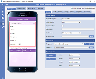
Page Designer

Segments can be any size and can have any number of Child segments within them, so you can have many levels of embedded segments if you wish.
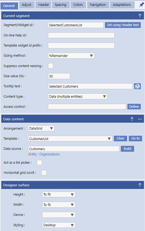
Each Segment can contain data, text, images, grids, etc. and is structured in the General tab area (Content Type).
Individual segments can be arranged in Rows or Columns and in this way you can have the configuration (look and feel) of a Page that you want.
Segments are structured by Templates and can be bound onto a Data Source for display and manipulation of data.
Add, Remove, Clone or manipulate Segments on a page using the Adjust tab in the Page UI design where additional information explaining Segments can also be found.
Building a Page provides an example of how to go about putting a basic new App Page (screen) together.

-
UI Design - The UI design section of Evoke allows for the design of Pages that will be used in your App.
The drop down menu on the UI design tab in the page designer provides multiple useful options when designing and editing Pages/Screens.
A full explanation of the UI design menu options (List mode, Layout mode, Bordered mode, Property name display/hide/show, Validate, Show validation list, suspend/resume adaptations, Serach for segment guid, etc.) is available by clicking on the link.
There is a representation of the Page (screen), that will use as much screen space as is available to display a representation of the actual app screen that a user will see, in edit/design mode on the left and a series of tabs, on the right, that assist with the structuring of the page. The following links provide quick access to information relating to each tab:-
The General tab is structured into 3 sections. The first two provide configuration settings for the currently selected Segment (including the Content Type and Access Control) and the Data Content of that Segment (including configuration of the CardView Data content type); the third section provides configuration settings for the currently displayed page design.
-
The Adjust (Managing Segments) tab is where you can add, remove or adjust segments.
-
The Headers tab allows you to structure Segment headers. Segment headers are usually used to provide information about a data segment but can also have an ellipsis menu that allows for both navigation and access to the Evoke Click Actions.
-
The Spacing tab is used to provide specific spacing settings for segments, data and other screen components on the current Page (screen) design.
-
The Colors tab is used to define the colors for various segment components/widgets. If colors were set in a theme they can be redefined for each device type/device operating system for the specific page.
-
The Navigation tab is used to provide navigation to other Pages within the app, as selected by the user from menus.
-
The Adaptations tab allows you to set, amend and manage UI Adaptations. Adaptations are what adjust each page to accommodate the screen size and shape that the App is running on. They also allow you to alter the look and feel of a Page to suit the requirements of your App. Using Adaptations you can show or hide, segments, columns or data within the segment, navigation options, alternate prompts or headings. You can merge segments to tabs and resize them as well as many more automatic Evoke adaptations. Please review the full list of current Evoke Adaptations. Adaptations can also be invoked by the Evoke Click Actions
-
-
Data Templates - If a Segment contains data, actions or is linked to a data object (i.e. a selection, button, etc) then the structure and how the data/image/button/etc is displayed on your screen is controlled by a Template. Templates are specified as either Single Entity templates or Multiple Entity templates. For each template you need to specify a name and a base Entity type or use one of the multiple, temporary, unbound-data areas available on each page. Templates are also used to link widgets that will select data from your database to populate Data Sources. For more information please click for a full description of Data Templates.
-
General Details - The General Details tab allows you to define the attributes and top level details of the selected page, such as the Page Name, title, specific a page background, etc.
-
Data Sources - The Data Sources tab offers a quick summary of the Data Sources set up in the Page Series Data Source area for this Page Series.
You can add new Data Sources for the Page Series, Change existing ones, remove a data Source, etc. Changes made here will be relevant to all the Pages in the Page Series.
Use the Build button to populate the DataSource field.


Evoke Click Actions

-
Populating Data Sources with information/data from the database, Saving data back to the backend database.
-
Assigning, adding, manipulating data/creating new records in the database
-
Processing Adaptations, showing hidden Segments, etc
-
Navigation, navigate down to Child pages, sideways to Siblings, up to parents/grandparents; All navigation
-
Retrieving related data associated with selected data
-
Print PDF from Page/Segment to create a local or stored PDF of a printable report. Please follow link to see configuration setup of this click action.
-
Conditional, If Then Else ElseIf etc, click actions.
-
Saving data, cancelling changes, setting static data values.
-
Validation, UI enable/disable, forcing events such as Save/cancel, opening external browsers sessions (to display a web page etc)
-
Plus multiple other actions

-
Action id.
-
Action Type
-
row-action/header-action menu only
On a multi entity DataSource - a datagrid (potentially multiple records) you should set the "current" instance/selected row if you are using a row action menu.
There are a few ways to do this. Either the first click action on the datagrid could be SETCURRENTASSELECTEDROW or on the Navigation screen there is a checkbox to set the "current" when the row action menu is displayed. You can also set the first row of a datagrid as the current in a template "general settings" but that method is not relevant for grid row navigation menu action.
If the "current" instance is not set then the "current" instance of "TheMultiEntityDatasource.current.xxxx" is not set and if you use that data (assign, display, etc.) it will NOT be correct - it could be from a different record, blank, etc.
Consider that you click the menu at the end of item 3 in the list - you have not selected the record by clicking on the line (just clicked the menu), it is not the "current" instance unless the checkbox is set or a click action actioned. There are multiple valid reasons why an app developer may not want to set the "current" instance when a menu is clicked or a line clicked on - however if you intend to rely on/access the "current" instance then it must be set.
-
If Row/header/tabear action only is ticked - any action with an ActionID will also include this action
-
If Row/header/tabear action only is not ticked - it is the same as "blank" - it will alwasy be actioned when the row is clicked on/selected.
Individual segments or an entire Page (screen) can be enabled for scrolling. To enable scrolling on a single segment that is not a Data Grid (remember data grids are automatically scrollable) use the "Is scrolling enabled" option (described in the General tab). In order to be part of a scrollable container segments must have a Sizing Method of Auto or Fixed to that the size of the screen can be calculated and maintained during the scrolling.